

css3图片与文字3D transform切换
作者:结一 日期:2012-09-06 点击:943

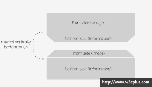
这是个3D的切换效果,不太明白,在我的概念里还没有建立好一个3D模型,不知道如何把一个二维的图形如何转成三维。更谈不上动画了,所以这个案例对于我来说,暂时只是欣赏。如有明白的可以给讲一下,先谢过。
如果你对3D也懂得话,可以从这里学习下,非常棒的一篇文章:http://www.zhangxinxu.com/wordpress/2012/09/css3-3d-transform-perspective-animate-transition/
css主要代码:
.wrapper {
  display: inline-block;
  width: 310px;
  height: 100px;
  vertical-align: top;
  margin: 1em 1.5em 2em 0;
  cursor: pointer;
  position: relative;
  font-family: Tahoma, Arial;
  perspective: 4000px;
}

.item {
  height: 100px;
  transform-style: preserve-3d;
  transition: transform .6s;
}
.item img {
  display: block;
  position: absolute;
  top: 0;
  border-radius: 3px;
  box-shadow: 0px 3px 8px rgba(0,0,0,0.3);
  transform: translateZ(50px);
  transition: all .6s;

}

.item .information {
  display: block;
  position: absolute;
  top: 0;
  height: 80px;
  width: 290px;
  text-align: left;
  border-radius: 15px;
  padding: 10px;
  font-size: 12px;
  text-shadow: 1px 1px 1px rgba(255,255,255,0.5);
  box-shadow: none;
  background: linear-gradient(to bottom,rgba(236,241,244,1) 0%,rgba(190,202,217,1) 100%);
  transform: rotateX(-90deg) translateZ(50px);
  transition: all .6s;

}
.item:hover {
  transform: translateZ(-50px) rotateX(95deg);
}

  .item:hover img {
    box-shadow: none;
    border-radius: 15px;
  }

  .item:hover .information {
    box-shadow: 0px 3px 8px rgba(0,0,0,0.3);
    border-radius: 3px;
  }
查看更多:http://www.webstuffshare.com/2012/04/showing-product-information-with-css3-3d-transform/


