

css3大背景运动
作者:结一 日期:2012-09-05 点击:910

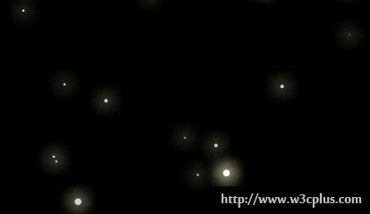
其实这个的大背景运用和之前背景运动的那个demo,核心点都是一样的,关键就是animation对背景定位的改变。只不过这里我们在一个标签中同时应用了三张图片,注意多背景图片时其层次与其书写顺序有关,其层次高低随着书写顺序依次递减,所以第一张图片在最高层,所以这个时候千万不要定义背景色啊,不然会把后面的全部覆盖了。如果要写背景色的话,请在最后一张图片上面加上。同理你可以做个简单的飘雪或蒲公英散落等一些零散的效果,当然首先得把背景图片设计好。
css主要代码:
body{
	background:url('../images/foreground.png') 5px 5px,url("../images/midground.png") 1050px 750px,url("../images/background.png") 1000px -50px;

	-moz-animation-name:bgmove;
	-moz-animation-duration:30s;
	-moz-animation-timing-function:linear;
	-moz-animation-delay:0;
	-moz-animation-iteration-count:infinite;

	-webkit-animation-name:bgmove;
	-webkit-animation-duration:30s;
	-webkit-animation-timing-function:linear;
	-webkit-animation-delay:0;
	-webkit-animation-iteration-count:infinite;

	animation-name:bgmove;
	animation-duration:30s;
	animation-timing-function:linear;
	animation-delay:0;
	animation-iteration-count:infinite;
}
@-moz-keyframes bgmove{
    0%{
        background:url('../images/foreground.png') 5px 5px,url("../images/midground.png") 1050px 750px,url("../images/background.png") 1000px -50px;
    }
    100%{
        background:url('../images/foreground.png') 2005px 1005px,url("../images/midground.png") 50px -250px,url("../images/background.png") 0 950px;

    }
}
@-webkit-keyframes bgmove{
    0%{
        background:url('../images/foreground.png') 5px 5px,url("../images/midground.png") 1050px 750px,url("../images/background.png") 1000px -50px;
    }
    100%{
        background:url('../images/foreground.png') 2005px 1005px,url("../images/midground.png") 50px -250px,url("../images/background.png") 0 950px;
    }
}灵感及文中所用图片来源:http://www.paulrhayes.com/2009-04/auto-scrolling-parallax-effect-without-javascript/


