

移动端重构系列10——侧边栏导航
作者:结一 日期:2014-07-05 点击:9066

本系列文章,如果没有特别说明,兼容安卓4.0.4+
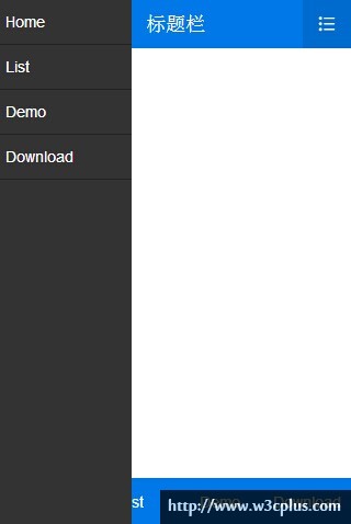
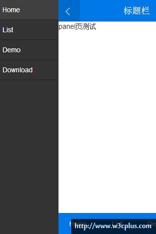
panel一般用来做侧边栏导航,铺满整屏高度,有两种展现形式:第一种直接盖在整块内容栏(包括header和footer部分)上面,如图一;第二种把整块内容栏推开panel的宽度,如图二
设计结构如下:
<header class="header"></header>
<div class="wrap-page">
    <section class="page"></section>
    ...
</div>
<footer class="footer"></footer>
<section class="panel"></section>
第一种实现方案:
先将panel通过translate偏移负的本身宽度,离开可视区域,然后通过切换active这个class来实现无偏移。当然除此之外,top和bottom的0实现了100%高度,z-index要保证大于header和footer的层级。
$panelWidth:      120px !default;
.panel{
    position: absolute;
    top: 0;
    bottom: 0;
    left: 0;
    z-index: 980;
    width: $panelWidth;
    background-color: #333;
    @include translate3d(-$panelWidth, 0, 0);
    @extend %transition-transform;
}
.panel.active{
    @include translate3d(0, 0, 0);
}
同样我们也可以通过给body添加删除class如panel-active来控制panel的位置。
第二种实现方案
demo 2,在demo1的基础上根据第二种方案顺便处理下了当panel出现时,内容禁止滚动
因为需要实现整块内容栏(包括header和footer部分)偏移panel的宽度,所以第一反应是应该有个div把整块内容栏包裹下,如下:
<div class="wrap-container">
    <header class="header"></header>
    <div class="wrap-page">
        <section class="page"></section>
        ...
    </div>
    <footer class="footer"></footer>
</div>
<section class="panel"></section>
多了一层结构,看起来有点不爽,不过使用起来还是很爽的。首先panel偏移负的本身宽度,接下来通过控制wrap-container的class来实现内容栏偏移panel的宽度
.panel{
    position: absolute;
    top: 0;
    bottom: 0;
    left: 0;
    z-index: $zIndexOverlay;
    width: $panelWidth;
    background-color: #333;
    @include translate3d(-$panelWidth, 0, 0);
}
.wrap-container{
    @extend %transition-transform;
}
.wrap-container.panel-active{
    @include translate3d($panelWidth, 0, 0);
}
既然这里需要一个父元素来实现一个偏移,为什么body不可以呢?所以果断干掉wrap-container,恢复最初的结构
.panel{
    position: absolute;
    top: 0;
    bottom: 0;
    left: 0;
    z-index: $zIndexOverlay;
    width: $panelWidth;
    background-color: #333;
    @include translate3d(-$panelWidth, 0, 0);
}
body.has-panel{
    @extend %transition-transform;
}
body.panel-active{
    @include translate3d($panelWidth, 0, 0);
}
总结
一般来说使用比较多的还是第二种方案,因为第一种直接把左边的那个点击图标遮盖住了。而panel实际使用的时候还是挺不太好办的,因为左边的第一个icon一般都是放首页,返回什么的,当然适用不适用还是根据各自业务需要走
如需转载,烦请注明出处:http://www.w3cplus.com/mobile/mobile-terminal-refactoring-sidebar-menu.html


