

CSS3制作小清新导航
作者:白牙 日期:2013-04-08 点击:1429

很简单的一个案例,就不多做注释了
HTML结构
<ul class="nav">
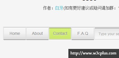
<li id="button1"><a href="#button1">Home</a></li>
<li id="button2"><a href="#button2">About</a></li>
<li id="button3"><a href="#button3">Contact</a></li>
<li id="button4"><a href="#button4">F.A.Q</a></li>
<li>
<a href="#">s</a>
<input type="search" placeholder="Type your search here..." />
</li>
</ul>
CSS代码
也没什么好注释的了
a {text-decoration:none !important;outline:none !important;}
body {background:rgb(245,245,245);}

.nav {
	margin:50px auto;
	text-align: center;
	width:591px;
	height:41px;
	border:1px solid;
	border-color:rgb(181,181,181) rgb(235,235,235) rgb(236,236,236) rgb(235,235,235);
	border-radius:2px;
	padding:1px;
	background:rgb(240,240,240);
	box-shadow:0 1px 0 rgb(255,255,255);
}
.nav li {
	float: left;
	position:relative;
}
.nav li:not(:last-child) a {
	display:block;
	color:rgb(138,138,138);
	width:75px;
	height:39px;
	font-size:14px;
	line-height: 39px;
	border:1px solid;
	border-color:rgb(213,213,213) rgb(216,216,216) rgb(197,197,197) rgb(216,216,216);
	border-radius:2px;
	margin-right:1px;
	text-shadow:0 1px 0 rgb(247,247,247);
	background:-webkit-linear-gradient(top,rgb(248,248,248),rgb(241,241,241) 50%,rgb(221,221,221));
	background:-moz-linear-gradient(top,rgb(248,248,248),rgb(241,241,241) 50%,rgb(221,221,221));
	background:-ms-linear-gradient(top,rgb(248,248,248),rgb(241,241,241) 50%,rgb(221,221,221));
	background:linear-gradient(top,rgb(248,248,248),rgb(241,241,241) 50%,rgb(221,221,221));
	box-shadow:inset 0 1px 0 rgb(255,255,255), 0 1px 0 rgb(134,134,134), 0 2px 0 rgb(193,193,193);
}
.nav li:not(:last-child):target a {
	background:-*-linear-gradient(top,rgb(214,243,119),rgb(203,232,107));
	box-shadow:inset 0 1px 0 rgb(116,133,59), inset 0 2px 0 rgba(116,133,59,0.1), inset 0 3px 0 rgba(116,133,59,0.05),inset 0 0 5px rgb(216,216,216),
	0 1px 0 rgb(250,250,250),0 2px 0 rgb(241,241,241);
}
.nav input[type="search"] {
	width:264px;
	height:39px;
	padding:0;
	padding-left:12px;
	margin-left:1px;
	border:1px solid;
	border-color:rgb(213,213,213) rgb(216,216,216);
	border-radius:2px;
	background:-webkit-linear-gradient(top,rgb(226,226,226),rgb(241,241,241) 50%,rgb(247,247,247) 90%,rgb(242,242,242));
	background:-moz-linear-gradient(top,rgb(226,226,226),rgb(241,241,241) 50%,rgb(247,247,247) 90%,rgb(242,242,242));
	background:-ms-linear-gradient(top,rgb(226,226,226),rgb(241,241,241) 50%,rgb(247,247,247) 90%,rgb(242,242,242));
	background:linear-gradient(top,rgb(226,226,226),rgb(241,241,241) 50%,rgb(247,247,247) 90%,rgb(242,242,242));
	box-shadow:inset 0 1px 0 rgb(138,138,138), inset 0 2px 0 rgb(206,206,206), inset 0 3px 0 rgb(217,217,217);
}
.nav li:last-child a {
	position:absolute;
	height:35px;
	width:34px;
	color:rgb(180,180,180);
	font:17px/35px icon-search;
	text-shadow:0 1px 0 rgb(255,255,255);
	border:1px solid;
	border-color:rgb(195,195,195) rgb(214,214,214) rgb(146,146,146) rgb(214,214,214);
	border-radius:2px;
	background:-webkit-linear-gradient(top,rgb(248,248,248),rgb(218,218,218));
	background:-moz-linear-gradient(top,rgb(248,248,248),rgb(218,218,218));
	background:-ms-linear-gradient(top,rgb(248,248,248),rgb(218,218,218));
	background:linear-gradient(top,rgb(248,248,248),rgb(218,218,218));
	box-shadow:inset 0 1px 0 rgb(255,255,255), 0 1px 0 rgb(185,185,185);
	top:3px;
	right:2px;
	-webkit-transition:color 500ms ease;
	-moz-transition:color 500ms ease;
	transition:color 500ms ease;
}
.nav li:last-child a:hover {color:rgb(190,218,100);}
.nav li:last-child a:active {background:-*-linear-gradient(top,rgb(218,218,218),rgb(242,242,242));}

@font-face {
	font-family: 'icon-search';
	src: url("font/icon-search.eot");
	src: url("font/icon-search.eot?#iefix") format('embedded-opentype'),
	url("../font/icon-search.woff") format('woff'),
	url("font/icon-search.ttf") format('truetype'),
	url("font/icon-search.svg#icon-search") format('svg');
	font-weight: normal;
	font-style: normal;
}
如需转载,烦请注明出处:http://www.w3cplus.com/demo/716.html


