

CSS3 Pictogram Button
作者:大漠 日期:2013-01-24 点击:608

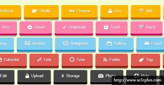
Buttons的制作,现在几乎无需任何图片就可以实现(当然需要忽略IE低版本),而且我现在做的项目,按钮基本上使用CSS3来制作,让那些不支持CSS3的浏览器就用纯色显示,让现代浏览器给用户带来更好的体验。至于Buttons的制作,在W3cplus上也是有很多案例了,今天我再次老调重弹,制作了Icon的button,而且制作了三种形态,3D立体按钮,内描边按钮,圆角按钮,而且配置了多个颜色,希望这些按钮能让你直接用到你的项目中(w3cplus的案例效果,已经有很多网站在直接使用(^_^))。
HTML CODE
制作按钮的结构非常的简单,可以使用任何标签元素制作,不过常用的是<a>和<button>标签,此处就是使用的<a>标签:
<!-- 制作3D按钮 -->
<a href="javascript:void(0)" class="button-bevel orange"> <span class="refresh"></span> Refresh </a>
<!-- 制作按钮 -->
<a href="javascript:void(0)" class="button orange"> <span class="refresh"></span> Refresh </a>
<!-- 制作圆角按钮 -->
<a href="javascript:void(0)" class="button rounded orange"> <span class="refresh"></span> Refresh </a>
这里需要注意一下,我们效果中有一个3D的效果使用了类名“button-bevel”;正常按钮使用类名“button”,而制作圆角按钮使用类名“rounded”,每个颜色使用一个类名,比如我们案例中使用了类名“orange”、“magenta”、“cyan”、“red”、“black”、“green”六个色,当然大家还可以根据自己的需求制作其他颜色的按钮。案例中的icon是通过span标签来实现的,在span定义不同的类名,从而控制不同的icon显示。
CSS CODE
其实制作按钮的样式非常的简单的,在我们按例中使用了渐变gradient来制作按钮的背景图片效果、通过box-shadow来实现立体效果和按钮阴影效果,使用@font-face来实现icon。当然从中还配有其他属性,但这几个属性是制作按钮常用到的属性。
简单的来看看按钮实现过程:
/*引入google fonts*/
@import url(http://fonts.googleapis.com/css?family=Arvo);
/*给body一个径向的渐变图像*/
body {
  background: #f8fcd4;
  background: radial-gradient(center, ellipse cover,  #f8fcd4 19%,#dbfacb 100%);
  background-attachment: fixed;
}
/*demo的基本布局*/
.demo {
  text-align: center;
  display: block;
  width: 800px;
  margin: 50px auto;
}
这里引用google的fonts来定义按钮的字体(仅适合英文字体),另外定义了一些基本样式。
@font-face {
  font-family: 'EntypoRegular';
  src: url('font/entypo-webfont.eot');
  src: url('font/entypo-webfont.eot?#iefix') format('embedded-opentype'),
       url('font/entypo-webfont.woff') format('woff'),
       url('font/entypo-webfont.ttf') format('truetype'),
       url('font/entypo-webfont.svg#EntypoRegular') format('svg');
  font-weight: normal;
  font-style: normal;
}
引用本地服务器字体,主要用来制作icon,具体制作方法就不多说了,因为在w3cplus上随处可见这样的教程和案例。
.button,
.button-bevel {
  font-family: Arial, Helvetica, sans-serif;
  font-size: 13px;
  color: #fff;
  text-decoration: none;
  display: inline-block;
  text-align: center;
  padding: 7px 20px 9px;
  margin: .5em .5em .5em 0;
  cursor: pointer;
  text-shadow: 0 1px 1px rgba(0,0,0,0.4);/*设置文本阴影*/
  text-transform: capitalize;
  transition: 0.1s linear;/*过渡改变属性*/
}

.button {
  border-radius: 2px;/*设置圆角*/
  box-shadow: inset rgba(255,255,255,0.3) 1px 1px 0;/*设置盒子阴影*/
}
/*按钮悬浮状态效果*/
.button:hover,
.button-bevel:hover {
  color: #fff;
  text-decoration: none;
}
/*按钮点击状态效果*/
.button:active {
  box-shadow: inset rgba(0,0,0,0.4) 0px 0px 6px;/*改变盒子阴影*/
}
/*圆角按钮效果*/
.rounded {
  border-radius: 20px;
}
上面是按钮的基本样式和各种状态下的样式。
/*橙色按钮*/
.orange {
  background: rgb(255,183,0);
  background: -*-linear-gradient(to bottom,  rgba(255,183,0,1) 0%,rgba(255,140,0,1) 100%);
  filter: progid:DXImageTransform.Microsoft.gradient( startColorstr='#ffb700', endColorstr='#ff8c00',GradientType=0 );
  border: 1px solid #e59500;
}

.orange:hover {
  background: rgb(255,203,72);
  background: -*-linear-gradient(to bottom,  rgba(255,203,72,1) 0%,rgba(255,156,35,1) 100%);
  filter: progid:DXImageTransform.Microsoft.gradient( startColorstr='#ffcb48', endColorstr='#ff9c23',GradientType=0 );
}
/*洋红色按钮*/
.magenta {
  background: rgb(255,130,172);
  background: -*-linear-gradient(to bottom,  rgba(255,130,172,1) 0%,rgba(247,37,129,1) 100%);
  filter: progid:DXImageTransform.Microsoft.gradient( startColorstr='#ff82ac', endColorstr='#f72581',GradientType=0 );
  border: 1px solid #c60a56;
}

.magenta:hover {
  background: rgb(255,155,189);
  background: -*-linear-gradient(to bottom,  rgba(255,155,189,1) 0%,rgba(248,62,143,1) 100%);
  filter: progid:DXImageTransform.Microsoft.gradient( startColorstr='#ff9bbd', endColorstr='#f83e8f',GradientType=0 );
}
/*蓝绿按钮*/
.cyan {
  background: rgb(130,207,241);
  background: -*-linear-gradient(to bottom,  rgba(130,207,241,1) 0%,rgba(56,174,234,1) 100%);
  filter: progid:DXImageTransform.Microsoft.gradient( startColorstr='#82cff1', endColorstr='#38aeea',GradientType=0 );
  border: 1px solid #3cafcf;
}

.cyan:hover {
  background: rgb(153,216,244);
  background: -*-linear-gradient(to bottom,  rgba(153,216,244,1) 0%,rgba(79,183,236,1) 100%);
  filter: progid:DXImageTransform.Microsoft.gradient( startColorstr='#99d8f4', endColorstr='#4fb7ec',GradientType=0 );
}
/*大红按钮*/
.red {
  background: #e25b53;
  background: -*-linear-gradient(to bottom,  #e25b53 0%,#dd2011 100%);
  filter: progid:DXImageTransform.Microsoft.gradient( startColorstr='#e25b53', endColorstr='#dd2011',GradientType=0 );
  border: 1px solid #c42222;
}

.red:hover {
  background: #dd7671;
  background: -*-linear-gradient(to bottom,  #dd7671 0%,#dd2011 100%);
  filter: progid:DXImageTransform.Microsoft.gradient( startColorstr='#dd7671', endColorstr='#dd2011',GradientType=0 );
}
/*黑色按钮*/
.black {
  background: #444444;
  background: -*-linear-gradient(to bottom,  #444444 0%,#1c1c1c 100%);
  filter: progid:DXImageTransform.Microsoft.gradient( startColorstr='#444444', endColorstr='#1c1c1c',GradientType=0 );
  border: 1px solid #2a2a2a;
}

.black:hover {
  background: #686868;
  background: -*-linear-gradient(to bottom,  #686868 0%,#1c1c1c 100%);
  filter: progid:DXImageTransform.Microsoft.gradient( startColorstr='#686868', endColorstr='#1c1c1c',GradientType=0 );
}
/*绿色按钮*/
.green {
  background: #82cc5d;
  background: -*-linear-gradient(to bottom,  #82cc5d 0%,#53b73c 100%);
  filter: progid:DXImageTransform.Microsoft.gradient( startColorstr='#82cc5d', endColorstr='#53b73c',GradientType=0 );
  border: 1px solid #429E34;
}

.green:hover {
  background: #99cc80;
  background: -*-linear-gradient(to bottom,  #99cc80 0%,#53b73c 100%);
  filter: progid:DXImageTransform.Microsoft.gradient( startColorstr='#99cc80', endColorstr='#53b73c',GradientType=0 );
}
上面代码是六种颜色按钮的实现代码,主要使用的是渐变gradient属性制作,当然大家可以根据自己的需求制作出更多颜色效果。如果你要是熟悉less或者sass,制作这样的按钮效果就更佳方便,要是你感兴趣,w3cplus站上有相关文章介绍,后期也还会加强这方面的分享。
/*3D按钮效果*/
.button-bevel {
  vertical-align: top;
  border-radius: 4px;
  border: none;
  padding: 10px 25px 12px;
}

.button-bevel:active {
  position: relative;
  top: 5px;
}

.button-bevel.orange {
  box-shadow: #c46d00 0 6px 0px, rgba(0, 0, 0, 0.3) 0 10px 3px;
}

.button-bevel.orange:active {
  box-shadow: #c46d00 0 3px 0, rgba(0, 0, 0, 0.2) 0 6px 3px;
}

.button-bevel.magenta {
  box-shadow: #ca075c 0 6px 0px, rgba(0, 0, 0, 0.3) 0 10px 3px;
}

.button-bevel.magenta:active {
  box-shadow: #ca075c 0 3px 0, rgba(0, 0, 0, 0.2) 0 6px 3px;
}

.button-bevel.cyan {
  box-shadow: #1994d3 0 6px 0px, rgba(0, 0, 0, 0.3) 0 10px 3px;
}

.button-bevel.cyan:active {
  box-shadow: #1994d3 0 3px 0, rgba(0, 0, 0, 0.2) 0 6px 3px;
 }

.button-bevel.red {
  box-shadow: #88180e 0 6px 0px, rgba(0, 0, 0, 0.3) 0 10px 3px;
}

.button-bevel.red:active {
  box-shadow: #88180e 0 3px 0, rgba(0, 0, 0, 0.2) 0 6px 3px;
}

.button-bevel.black {
  box-shadow: #000 0 6px 0px, rgba(0, 0, 0, 0.3) 0 10px 3px, inset rgba(255, 255, 255, 0.3) 0 0 3px;
}

.button-bevel.black:active {
  box-shadow: #000 0 3px 0, rgba(0, 0, 0, 0.2) 0 6px 3px, inset rgba(255, 255, 255, 0.3) 0 0 3px;
}

.button-bevel.green {
  box-shadow: #439230 0 6px 0px, rgba(0, 0, 0, 0.3) 0 10px 3px;
}

.button-bevel.green:active {
  box-shadow: #439230 0 3px 0, rgba(0, 0, 0, 0.2) 0 6px 3px;
}
这部分代码主要是针对于3D按钮效果的代码,通过box-shadow属性为每个颜色按钮制作3D效果,这个方法用来制作3D阴影效果非常方便,也是最常用的一种方法。
.button span,
.button-bevel span {
  font-family: 'EntypoRegular';
  font-size: 20px;
  font-weight: normal;
  vertical-align: middle;
  line-height: 0;
  margin-right: .1em;
}

.refresh:after { content: "h"; font-size: 34px; }
.shuffle:after { content: "f"; font-size: 34px; }
.preview:after { content: "M"; font-size: 34px; }
.tea:after { content: "u"; font-size: 34px; }
.wifi:after { content: "T"; font-size: 34px; }
.locator:after { content: "0"; font-size: 34px; }

.rss:after { content: "S"; font-size: 34px; }
.cloud:after { content: "y"; font-size: 34px; }
.download:after { content: "w"; font-size: 34px; }
.trash:after { content: "I"; font-size: 34px; }
.rack:after { content: "t"; font-size: 34px; }
.map:after { content: "1"; font-size: 34px; }

.setting:after { content: "@"; font-size: 34px; }
.identity:after { content: "."; font-size: 34px; }
.navigation:after { content: "2"; font-size: 34px; }
.gallery:after { content: "p"; font-size: 34px; }
.email:after { content: "%"; font-size: 34px; }
.users:after { content: "+"; font-size: 34px; }

.calendar:after { content: "P"; font-size: 34px; }
.link:after { content: ">"; font-size: 34px; }
.time:after { content: "N"; font-size: 34px; }
.folder:after { content: "s"; font-size: 34px; }
.tag:after { content: "C"; font-size: 34px; }
.share:after { content: "5"; font-size: 34px; }

.lock:after { content: "U"; font-size: 34px; }
.unlock:after { content: "V"; font-size: 34px; }
.mic:after { content: "O"; font-size: 34px; }
.love:after { content: "6"; font-size: 34px; }
.star:after { content: "7"; font-size: 34px; }
.like:after { content: "8"; font-size: 34px; }

.phone:after { content: "!"; font-size: 34px; }
.flag:after { content: "?"; font-size: 34px; }
.adduser:after { content: "-"; font-size: 34px; }
.attach:after { content: "'"; font-size: 34px; }
.comment:after { content: ":"; font-size: 34px; }
.edit:after { content: "&"; font-size: 34px; }

.upload:after { content: "v"; font-size: 34px; }
.storage:after { content: "x"; font-size: 34px; }
.photo:after { content: "D"; font-size: 34px; }
.help:after { content: "K"; font-size: 34px; }
.glass:after { content: "R"; font-size: 34px; }
.print:after { content: "<"; font-size: 34px; }

.gadget:after { content: '"'; font-size: 34px; }
看到这部分代码,大家应该知道是用来制作icon的图标,方法简单,但这里对应的类名有点不标签,建议使用@font-face制作icon时,使用w3cplus提供的了体库,这里我是随便找了一个来用的,所以有些和类名并不对应。
所有CSS代码
/*引入google fonts*/
@import url(http://fonts.googleapis.com/css?family=Arvo);
/*给body一个径向的渐变图像*/
body {
  background: #f8fcd4;
  background: radial-gradient(center, ellipse cover,  #f8fcd4 19%,#dbfacb 100%);
  background-attachment: fixed;
}
/*demo的基本布局*/
.demo {
  text-align: center;
  display: block;
  width: 800px;
  margin: 50px auto;
}
@font-face {
  font-family: 'EntypoRegular';
  src: url('font/entypo-webfont.eot');
  src: url('font/entypo-webfont.eot?#iefix') format('embedded-opentype'),
       url('font/entypo-webfont.woff') format('woff'),
       url('font/entypo-webfont.ttf') format('truetype'),
       url('font/entypo-webfont.svg#EntypoRegular') format('svg');
  font-weight: normal;
  font-style: normal;
}
.button,
.button-bevel {
  font-family: Arial, Helvetica, sans-serif;
  font-size: 13px;
  color: #fff;
  text-decoration: none;
  display: inline-block;
  text-align: center;
  padding: 7px 20px 9px;
  margin: .5em .5em .5em 0;
  cursor: pointer;
  text-shadow: 0 1px 1px rgba(0,0,0,0.4);/*设置文本阴影*/
  text-transform: capitalize;
  transition: 0.1s linear;/*过渡改变属性*/
}

.button {
  border-radius: 2px;/*设置圆角*/
  box-shadow: inset rgba(255,255,255,0.3) 1px 1px 0;/*设置盒子阴影*/
}
/*按钮悬浮状态效果*/
.button:hover,
.button-bevel:hover {
  color: #fff;
  text-decoration: none;
}
/*按钮点击状态效果*/
.button:active {
  box-shadow: inset rgba(0,0,0,0.4) 0px 0px 6px;/*改变盒子阴影*/
}
/*圆角按钮效果*/
.rounded {
  border-radius: 20px;
}
/*橙色按钮*/
.orange {
  background: rgb(255,183,0);
  background: -*-linear-gradient(to bottom,  rgba(255,183,0,1) 0%,rgba(255,140,0,1) 100%);
  filter: progid:DXImageTransform.Microsoft.gradient( startColorstr='#ffb700', endColorstr='#ff8c00',GradientType=0 );
  border: 1px solid #e59500;
}

.orange:hover {
  background: rgb(255,203,72);
  background: -*-linear-gradient(to bottom,  rgba(255,203,72,1) 0%,rgba(255,156,35,1) 100%);
  filter: progid:DXImageTransform.Microsoft.gradient( startColorstr='#ffcb48', endColorstr='#ff9c23',GradientType=0 );
}
/*洋红色按钮*/
.magenta {
  background: rgb(255,130,172);
  background: -*-linear-gradient(to bottom,  rgba(255,130,172,1) 0%,rgba(247,37,129,1) 100%);
  filter: progid:DXImageTransform.Microsoft.gradient( startColorstr='#ff82ac', endColorstr='#f72581',GradientType=0 );
  border: 1px solid #c60a56;
}

.magenta:hover {
  background: rgb(255,155,189);
  background: -*-linear-gradient(to bottom,  rgba(255,155,189,1) 0%,rgba(248,62,143,1) 100%);
  filter: progid:DXImageTransform.Microsoft.gradient( startColorstr='#ff9bbd', endColorstr='#f83e8f',GradientType=0 );
}
/*蓝绿按钮*/
.cyan {
  background: rgb(130,207,241);
  background: -*-linear-gradient(to bottom,  rgba(130,207,241,1) 0%,rgba(56,174,234,1) 100%);
  filter: progid:DXImageTransform.Microsoft.gradient( startColorstr='#82cff1', endColorstr='#38aeea',GradientType=0 );
  border: 1px solid #3cafcf;
}

.cyan:hover {
  background: rgb(153,216,244);
  background: -*-linear-gradient(to bottom,  rgba(153,216,244,1) 0%,rgba(79,183,236,1) 100%);
  filter: progid:DXImageTransform.Microsoft.gradient( startColorstr='#99d8f4', endColorstr='#4fb7ec',GradientType=0 );
}
/*大红按钮*/
.red {
  background: #e25b53;
  background: -*-linear-gradient(to bottom,  #e25b53 0%,#dd2011 100%);
  filter: progid:DXImageTransform.Microsoft.gradient( startColorstr='#e25b53', endColorstr='#dd2011',GradientType=0 );
  border: 1px solid #c42222;
}

.red:hover {
  background: #dd7671;
  background: -*-linear-gradient(to bottom,  #dd7671 0%,#dd2011 100%);
  filter: progid:DXImageTransform.Microsoft.gradient( startColorstr='#dd7671', endColorstr='#dd2011',GradientType=0 );
}
/*黑色按钮*/
.black {
  background: #444444;
  background: -*-linear-gradient(to bottom,  #444444 0%,#1c1c1c 100%);
  filter: progid:DXImageTransform.Microsoft.gradient( startColorstr='#444444', endColorstr='#1c1c1c',GradientType=0 );
  border: 1px solid #2a2a2a;
}

.black:hover {
  background: #686868;
  background: -*-linear-gradient(to bottom,  #686868 0%,#1c1c1c 100%);
  filter: progid:DXImageTransform.Microsoft.gradient( startColorstr='#686868', endColorstr='#1c1c1c',GradientType=0 );
}
/*绿色按钮*/
.green {
  background: #82cc5d;
  background: -*-linear-gradient(to bottom,  #82cc5d 0%,#53b73c 100%);
  filter: progid:DXImageTransform.Microsoft.gradient( startColorstr='#82cc5d', endColorstr='#53b73c',GradientType=0 );
  border: 1px solid #429E34;
}

.green:hover {
  background: #99cc80;
  background: -*-linear-gradient(to bottom,  #99cc80 0%,#53b73c 100%);
  filter: progid:DXImageTransform.Microsoft.gradient( startColorstr='#99cc80', endColorstr='#53b73c',GradientType=0 );
}
/*3D按钮效果*/
.button-bevel {
  vertical-align: top;
  border-radius: 4px;
  border: none;
  padding: 10px 25px 12px;
}

.button-bevel:active {
  position: relative;
  top: 5px;
}

.button-bevel.orange {
  box-shadow: #c46d00 0 6px 0px, rgba(0, 0, 0, 0.3) 0 10px 3px;
}

.button-bevel.orange:active {
  box-shadow: #c46d00 0 3px 0, rgba(0, 0, 0, 0.2) 0 6px 3px;
}

.button-bevel.magenta {
  box-shadow: #ca075c 0 6px 0px, rgba(0, 0, 0, 0.3) 0 10px 3px;
}

.button-bevel.magenta:active {
  box-shadow: #ca075c 0 3px 0, rgba(0, 0, 0, 0.2) 0 6px 3px;
}

.button-bevel.cyan {
  box-shadow: #1994d3 0 6px 0px, rgba(0, 0, 0, 0.3) 0 10px 3px;
}

.button-bevel.cyan:active {
  box-shadow: #1994d3 0 3px 0, rgba(0, 0, 0, 0.2) 0 6px 3px;
 }

.button-bevel.red {
  box-shadow: #88180e 0 6px 0px, rgba(0, 0, 0, 0.3) 0 10px 3px;
}

.button-bevel.red:active {
  box-shadow: #88180e 0 3px 0, rgba(0, 0, 0, 0.2) 0 6px 3px;
}

.button-bevel.black {
  box-shadow: #000 0 6px 0px, rgba(0, 0, 0, 0.3) 0 10px 3px, inset rgba(255, 255, 255, 0.3) 0 0 3px;
}

.button-bevel.black:active {
  box-shadow: #000 0 3px 0, rgba(0, 0, 0, 0.2) 0 6px 3px, inset rgba(255, 255, 255, 0.3) 0 0 3px;
}

.button-bevel.green {
  box-shadow: #439230 0 6px 0px, rgba(0, 0, 0, 0.3) 0 10px 3px;
}

.button-bevel.green:active {
  box-shadow: #439230 0 3px 0, rgba(0, 0, 0, 0.2) 0 6px 3px;
}
.button span,
.button-bevel span {
  font-family: 'EntypoRegular';
  font-size: 20px;
  font-weight: normal;
  vertical-align: middle;
  line-height: 0;
  margin-right: .1em;
}

.refresh:after { content: "h"; font-size: 34px; }
.shuffle:after { content: "f"; font-size: 34px; }
.preview:after { content: "M"; font-size: 34px; }
.tea:after { content: "u"; font-size: 34px; }
.wifi:after { content: "T"; font-size: 34px; }
.locator:after { content: "0"; font-size: 34px; }

.rss:after { content: "S"; font-size: 34px; }
.cloud:after { content: "y"; font-size: 34px; }
.download:after { content: "w"; font-size: 34px; }
.trash:after { content: "I"; font-size: 34px; }
.rack:after { content: "t"; font-size: 34px; }
.map:after { content: "1"; font-size: 34px; }

.setting:after { content: "@"; font-size: 34px; }
.identity:after { content: "."; font-size: 34px; }
.navigation:after { content: "2"; font-size: 34px; }
.gallery:after { content: "p"; font-size: 34px; }
.email:after { content: "%"; font-size: 34px; }
.users:after { content: "+"; font-size: 34px; }

.calendar:after { content: "P"; font-size: 34px; }
.link:after { content: ">"; font-size: 34px; }
.time:after { content: "N"; font-size: 34px; }
.folder:after { content: "s"; font-size: 34px; }
.tag:after { content: "C"; font-size: 34px; }
.share:after { content: "5"; font-size: 34px; }

.lock:after { content: "U"; font-size: 34px; }
.unlock:after { content: "V"; font-size: 34px; }
.mic:after { content: "O"; font-size: 34px; }
.love:after { content: "6"; font-size: 34px; }
.star:after { content: "7"; font-size: 34px; }
.like:after { content: "8"; font-size: 34px; }

.phone:after { content: "!"; font-size: 34px; }
.flag:after { content: "?"; font-size: 34px; }
.adduser:after { content: "-"; font-size: 34px; }
.attach:after { content: "'"; font-size: 34px; }
.comment:after { content: ":"; font-size: 34px; }
.edit:after { content: "&"; font-size: 34px; }

.upload:after { content: "v"; font-size: 34px; }
.storage:after { content: "x"; font-size: 34px; }
.photo:after { content: "D"; font-size: 34px; }
.help:after { content: "K"; font-size: 34px; }
.glass:after { content: "R"; font-size: 34px; }
.print:after { content: "<"; font-size: 34px; }

.gadget:after { content: '"'; font-size: 34px; }
如需转载,烦请注明出处:http://www.w3cplus.com/demo/css3-pictogram-button.html


