

藤藤每日一练——CSS3 Animation Breadcrumbs
作者:藤藤 日期:2012-12-11 点击:699

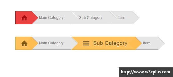
Breadcrumbs(面包屑),在网站上也是常见的一种UI效果,但这种效果大家看到的都是很普通普通的效果,使用CSS3制作的一些特殊效果,可能很少见吧。虽然早前在《CSS 制作Breadcrumbs》一文中搜集和制作了一些效果,但这些效果都没有运用动画效果。今天这个案例使用CSS3的几个属性制作了一个带有动画的Breadcrumbs效果,感兴趣的可以看看。
HTML CODE
<ul class="nav_block clearfix item1">
  <li><a href="#" class="active"><i>Home</i></a></li>
  <li><a href="#"><i>Main Category</i></a></li>
  <li><a href="#"><i>Sub Category</i></a></li>
  <li><a href="#"><i>Item</i></a></li>
</ul>
<ul class="nav_block clearfix item2">
  <li><a href="#" class="active"><i>Home</i></a></li>
  <li><a href="#"><i>Main Category</i></a></li>
  <li><a href="#"><i>Sub Category</i></a></li>
  <li><a href="#"><i>Item</i></a></li>
</ul>
CSS CODE
.demo {
   width: 500px;
  margin: 0 auto;
}
.nav_block {
  margin-top: 40px;
  float: left;
  border-width: 1px;
  border-style: solid;
  border-color: #dedede transparent #b5b4b0 #c6c6c5;
}
.nav_block li {
  float: left;
  text-shadow: 0 1px 0 #fff;
  background-color: #e6e6e6;
}
.nav_block li a {
  position: relative;
  display: block;
  color: #7d7c7c;
  padding: 0 25px;
  height: 40px;
  line-height: 40px;
}
.nav_block li a:before {
  position: absolute;
  font-family: 'entypo';
  font-style: normal;
  speak: none;
  font-weight: normal;
  font-smoothing: antialiased;
  font-size: 22px;
  margin-right: 8px;
  text-indent: 8px;
  z-index: 3;
  transform: translateY(-60px);
}
.nav_block li a:after {
  position: absolute;
  top: 5px;
  right: -14px;
  content: "";
  width: 32px;
  height: 35px;
  box-shadow: 0 1px 0 #c6c6c5 inset,-1px 0 0 #c6c6c5 inset, 1px 0 0 #fff,0 -1px 0 #fff;
  background-color: #e6e6e6;
   clip: rect(-1px 31px 29px 1px);
  transform: rotate(45deg);
  z-index: 2;
}
.nav_block li a:hover,
  .nav_block li .active {
  text-decoration: none;
  margin: -1px;
}
.item1 li a:hover,
  .item1 li .active {
  color: #aa1010;
  text-shadow: 0 1px 0 #f28383;
  border:1px solid #e00e0e;
  box-shadow: 0 1px 0 #f17a7a inset;
  background-color: #eb4141;
}
.item2 li a:hover,
  .item2 li .active {
  color: #825812;
  text-shadow: 0 1px 0 #fff9ee;
  border:1px solid #edb524;
  box-shadow: 0 1px 0 #ffd692 inset;
  background-color: #ffc15b;
}
.nav_block li a i {
  display: inline-block;
  font-style: normal;
}
.nav_block li a:not(.active):hover i {
  animation: moveText 300ms ease;
  padding-left: 45px;
  font-size: 18px;
}
.item1 li a:not(.active):hover:after,
  .item1 li .active:after {
  background-color: #eb4141;
  box-shadow: 0 1px 0 #e00e0e inset,-1px 0 0 #e00e0e inset, 1px 0 0 #d4aead,0 -1px 0 #d4aead;
}
.item2 li a:not(.active):hover:after,
  .item2 li .active:after {
  background-color: #ffbd51;
  box-shadow: 0 1px 0 #e6b42e inset,-1px 0 0 #e6b42e inset, 1px 0 0 #d4aead,0 -1px 0 #d4aead;
}
.nav_block li:nth-child(1) a:before {
  content: "\e00c";
}
.nav_block li:nth-child(2) a:hover:before {
  content: "\e02d";
}
.nav_block li:nth-child(3) a:hover:before {
  content: "\e01f";
}
.nav_block li:nth-child(4) a:hover:before {
  content: "\e036";
}
.nav_block li a:not(.active):hover:before {
  transform: translateY(0px);
  animation: moveIcon 300ms ease;
  font-size: 30px;
}
.nav_block li .active {
  font-size: 0;
}
.nav_block li .active:before {
  text-indent: -8px;
  transform: translateY(0px);
}
.nav_block li .active:after {
  right: -15px;
}
.nav_block li .active:hover:before,
  .nav_block li .active:hover i {
  animation: none;
}
@keyframes moveText {
   from {
      transform: translateY(80px);
      opacity: 0.1;
   }
   to {
      transform: translate(0);
      opacity: 1;
   }
}
@keyframes moveIcon {
   from {
      transform: translateY(-80px);
      opacity: 0.1;
   }
   to {
      transform: translate(0);
      opacity: 1;
   }
}
@font-face {
  font-family: 'entypo';
  src:url('fonts/entypo.eot');
  src:url('fonts/entypo.eot?#iefix') format('embedded-opentype'),
    url('fonts/entypo.svg#entypo') format('svg'),
    url('fonts/entypo.woff') format('woff'),
    url('fonts/entypo.ttf') format('truetype');
  font-weight: normal;
  font-style: normal;
}
如需转载,烦请注明出处:http://www.w3cplus.com/demo/CSS3-Animation-Breadcrumbs.html


