

藤藤每日一练——Pure CSS3 Animation Menu
作者:藤藤 日期:2012-11-09 点击:482

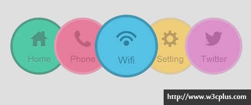
这个效果是没有任何设计图,也没有任何参照样版,藤藤从设计到效果一线完成。使用了CSS3的animation、transform、transition制作了一个动画导航效果,其中利用了Ligature Icon UI制作了导航中的ICON图标。当然还使用了CSS3的其他属性,比如说圆角属性制作了一个圆形,使用opacity控制菜单的动效果效果,最明显的效果是鼠标悬浮时会放大当前菜单项,怎么实现的,你知道?我想你知道的,要是不知道就继续往下看吧。
HTML CODE
<nav class="nav">
  <ul>
   <li>
     <a href="#"><span>Home</span></a>
   </li>
   <li>
     <a href="#"><span>Phone</span></a>
   </li>
   <li>
     <a href="#"><span>Wifi</span></a>
   </li>
   <li>
     <a href="#"><span>Setting</span></a>
   </li>
   <li>
     <a href="#"><span>Twitter</span></a>
   </li>
  </ul>
</nav><!--/nav-->
CSS Code
body {
 background-color: #dfdfdf;
 -webkit-backface-visibility: hidden;
}
.demo {
 margin: 60px auto 0;
 text-align:center;
}
.nav li	{
 position: relative;
 display: inline-block;
 margin-left: -50px;
 -webkit-transition: all 0.4s linear;
 -moz-transition: all 0.4s linear;
 -o-transition: all 0.4s linear;
 -ms-transition: all 0.4s linear;
 transition: all 0.4s linear;
}
.nav li a {
 display: inline-block;
 width: 120px;
 height: 120px;
 padding: 30px;
 border-radius: 50%;
 border-width: 8px;
 border-style: solid;
}
.nav li:hover {
 z-index: 11;
 -webkit-transform: scale(1.1);
 -moz-transform: scale(1.1);
 -o-transform: scale(1.1);
 -ms-transform: scale(1.1);
 transform: scale(1.1);
}
.nav li:hover a {
 text-decoration: none;
}
.nav li:hover span {
 -webkit-transition: all 0.4s linear;
 -moz-transition: all 0.4s linear;
 -o-transition: all 0.4s linear;
 -ms-transition: all 0.4s linear;
 transition: all 0.4s linear;
 -webkit-animation: moveFromBottom 0.3s ease;
 -moz-animation: moveFromBottom 0.3s ease;
 -o-animation: moveFromBottom 0.3s ease;
 -ms-animation: moveFromBottom 0.3s ease;
 animation: moveFromBottom 0.3s ease;
}
.nav li:nth-child(1) a {
 color: #4d9683;
 text-shadow: 0 1px 0 #9de3cf;
 border-color: #549e89;
 background-color: #51c9a7;
}
.nav li:nth-child(2) a {
 color: #be607e;
 text-shadow: 0 1px 0 #de8ba5;
 border-color: #e499b0;
 background-color: #e67b9c;
}
.nav li:nth-child(3) a {
 color: #5e9eb4;
 text-shadow: 0 1px 0 #adddec;
 border-color: #a2cfde;
 background-color: #7ec9e3;
}
.nav li:nth-child(4) a {
 color: #ba9d5e;
 text-shadow: 0 1px 0 #f5e0ad;
 border-color: #dcc999;
 background-color: #f0cd78;
}
.nav li:nth-child(5) a {
 color: #b468a2;
 text-shadow: 0 1px 0 #e8acd8;
 border-color: #d8abcd;
 background-color: #dd91cb;
}
.nav li:nth-child(1):hover a {
 color: #0f775c;
 text-shadow: 0 1px 0 #81e6c9;
 border-color: #0a8462;
 background-color: #00c18c;
}
.nav li:nth-child(2):hover a {
 color: #b12a55;
 text-shadow: 0 1px 0 #ff95b7;
 border-color: #ba335c;
 background-color: #ea5180;
}
.nav li:nth-child(3):hover a {
 color: #2883a2;
 text-shadow: 0 1px 0 #9cdef2;
 border-color: #4397b3;
 background-color: #55c1e5;
}
.nav li:nth-child(4):hover a {
 color: #ab8228;
 text-shadow: 0 1px 0 #ffe199;
 border-color: #b08f3e;
 background-color: #f8c64d;
}
.nav li:nth-child(5):hover a {
 color: #a33689;
 text-shadow: 0 1px 0 #ec97d6;
 border-color: #b7569f;
 background-color: #dd70c3;
}
.nav span {
 display: block;
 line-height:70px;
 font-size: 30px;
 font-style: normal;
}
.nav span:before {
 display: block;
}
.nav li:nth-child(1) span:before {
 content: "home";
}
.nav li:nth-child(2) span:before {
 content: "phone";
}
.nav li:nth-child(3) span:before {
 content: "wifi";
}
.nav li:nth-child(4) span:before {
 content: "setting";
}
.nav li:nth-child(5) span:before {
 content: "twitter";
}
@-webkit-keyframes moveFromBottom {
  from {
    -webkit-transform: translateY(120%) scale(0.5) ;
    opacity: 0;
  }
 to {
   -webkit-transform: translateY(0%) scale(1);
   opacity: 1;
 }
}
@-moz-keyframes moveFromBottom {
  from {
    -moz-transform: translateY(120%) scale(0.5) ;
    opacity: 0;
  }
  to {
    -moz-transform: translateY(0%) scale(1);
    opacity: 1;
  }
}
@-ms-keyframes moveFromBottom {
  from {
    -ms-transform: translateY(120%) scale(0.5) ;
    opacity: 0;
  }
  to {
   -ms-transform: translateY(0%) scale(1);
   opacity: 1;
 }
}
@-o-keyframes moveFromBottom {
  from {
    -o-transform: translateY(120%) scale(0.5) ;
    opacity: 0;
  }
  to {
   -o-transform: translateY(0%) scale(1);
   opacity: 1;
 }
}
@keyframes moveFromBottom {
  from {
    transform: translateY(120%) scale(0.5) ;
    opacity: 0;
  }
  to {
   transform: translateY(0%) scale(1);
   opacity: 1;
 }
}
.nav span:before {
 font-family: 'LigatureSymbols';
 text-rendering: optimizeLegibility;
 -webkit-font-smoothing: antialiased;
 -moz-font-smoothing: antialiased;
 -ms-font-smoothing: antialiased;
 -o-font-smoothing: antialiased;
 font-smoothing: antialiased;
 -webkit-font-feature-settings: "liga" 1, "dlig" 1;
 -moz-font-feature-settings: "liga=1, dlig=1";
 -ms-font-feature-settings: "liga" 1, "dlig" 1;
 font-feature-settings: "liga" 1, "dlig" 1;
 font-size: 80px;
}
@font-face {
 font-family: 'LigatureSymbols';
 src: url('font/LigatureSymbols-2.05.eot');
 src: url('font/LigatureSymbols-2.05.eot?#iefix') format('embedded-opentype'),
   url('font/LigatureSymbols-2.05.woff') format('woff'),
   url('font/LigatureSymbols-2.05.ttf') format('truetype'),
   url('font/LigatureSymbols-2.05.svg#LigatureSymbols') format('svg');
 font-weight: normal;
 font-style: normal;
}
如需转载,烦请注明出处:http://www.w3cplus.com/demo/pure-css3-animation-menu.html


