

CSS3制作卷角菜单
作者:大漠 日期:2012-09-22 点击:1213

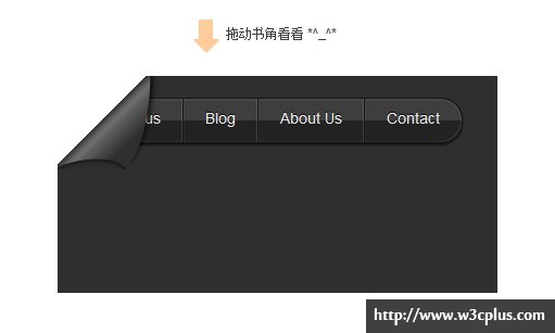
这个案例是由@猫仔同学提供的。最大的亮点就是使用了CSS3制作了卷边效果,配上js的移动效果,真是与众不同。在这个demo中主要运用了border-radius制作卷边效果,使用gradient实现了导航的渐变效果,而且还使用了border绘制了向上的箭头,同时给箭头配上了一个css3的动画效果。真的不错哟。
HTML 结构
<div class="notice"><div class="arrow"></div>拖动书角看看 *^_^*</div>
 <div class="form" id="form">
 <div class="corner" id="corner"></div>
  <ul class="button">
    <li><a href="">W3cplus</a></li>
    <li><a href="">Blog</a></li>
    <li class="navcurrent"><a href="">About Us</a></li>
    <li class="borderno"><a href="">Contact</a></li>
  </ul>
</div>
CSS代码:
ul,li{
  list-style-type:none;
  padding:0;
}
.form{
  width:405px;
  height:200px;
  background:#2f2f2f;
  position:relative;
  overflow:hidden;
  margin:30px auto;
}
.corner{
  background: -webkit-linear-gradient(45deg, #2e2e2e 24%, #5F5F5F 40%,#6f6f6f 43%,#5F5F5F 46%,#2F2F2F 50%,#fff 50%,#fff);
  background: -moz-linear-gradient(45deg, #2e2e2e 24%, #5F5F5F 40%,#6f6f6f 43%,#5F5F5F 46%,#2F2F2F 50%,#fff 50%,#fff);height: 90px;
  background: -o-linear-gradient(45deg, #2e2e2e 24%, #5F5F5F 40%,#6f6f6f 43%,#5F5F5F 46%,#2F2F2F 50%,#fff 50%,#fff);height: 90px;
  background: -ms-linear-gradient(45deg, #2e2e2e 24%, #5F5F5F 40%,#6f6f6f 43%,#5F5F5F 46%,#2F2F2F 50%,#fff 50%,#fff);height: 90px;
  background: linear-gradient(45deg, #2e2e2e 24%, #5F5F5F 40%,#6f6f6f 43%,#5F5F5F 46%,#2F2F2F 50%,#fff 50%,#fff);height: 90px;
  width: 90px;
  height:90px;
  border-radius: 0 0 0px 90px / 0 0 0 30px;
  -webkit-transform: rotate(-90deg);
  -moz-transform: rotate(-90deg);
  -o-transform: rotate(-90deg);
  -ms-transform: rotate(-90deg);
  transform: rotate(-90deg);
  position: absolute;
  left:-4px;
  top: -4px;
  box-shadow: 5px 2px 8px black;
  overflow:hidden;
  -webkit-transition:all 0.3s linear 0s;
  -moz-transition:all 0.3s linear 0s;
  -o-transition:all 0.3s linear 0s;
  -ms-transition:all 0.3s linear 0s;
  transition:all 0.3s linear 0s;
}

.corner:after{
  height:100%;
  width:100%;
  position: absolute;
  content: "";
  top: -15px;
  left: -82px;
  border-radius: 90px 90px 0px 0 / 40px 40px 0 0;
  z-index: 1;
  background: #2F2F2F;
  -webkit-transform: rotate(77deg);
  -moz-transform: rotate(77deg);
  -o-transform: rotate(77deg);
  -ms-transform: rotate(77deg);
  transform: rotate(77deg);
  box-shadow: 0px 0px 8px black inset;
}
.button{
  float: left;
  height:40px;
  margin:20px 20px;
  border-radius:30px;
  border:1px solid #151515;
  box-shadow:0px 2px 2px rgba(0,0,0,0.6);
  overflow:hidden;
 }
.button li {
  float: left;
}
.button li a{
  float:left;
  display:block;
  text-decoration:none;
  padding: 0 20px;
  height:40px;
  line-height:36px;
  font-size:14px;
  color:#eee;
  text-align:center;
  border-right:1px solid #151515;
  box-shadow:-1px 0px 0px rgba(255,255,255,0.1) inset,inset 0px -1px 1px rgba(200,200,200,0.1),inset 0px 1px 2px rgba(255,255,255,0.1);
  text-shadow:0px -1px 0px #000;
  background:-webkit-linear-gradient(top,rgba(200,200,200,0.1) 0%,rgba(200,200,200,0.1) 50%,#222 50%,#222);
  background:-moz-linear-gradient(top,rgba(200,200,200,0.1) 0%,rgba(200,200,200,0.1) 50%,#222 50%,#222);
  background:-o-linear-gradient(top,rgba(200,200,200,0.1) 0%,rgba(200,200,200,0.1) 50%,#222 50%,#222);
  background:-ms-linear-gradient(top,rgba(200,200,200,0.1) 0%,rgba(200,200,200,0.1) 50%,#222 50%,#222);
  background:linear-gradient(top,rgba(200,200,200,0.1) 0%,rgba(200,200,200,0.1) 50%,#222 50%,#222);
}
.button li:first-child a{
  border-radius:30px 0 0 30px;
}
.button li:last-child a{
  border-radius:0px 30px 30px 0;
  border-right: none;
}
.button li a:hover{
  cursor:pointer;
  background:-webkit-linear-gradient(top,rgba(50,50,50,0.4) 20%,rgba(100,100,100,0.3));
  background:-moz-linear-gradient(top,rgba(50,50,50,0.4) 20%,rgba(100,100,100,0.3));
  background:-o-linear-gradient(top,rgba(50,50,50,0.4) 20%,rgba(100,100,100,0.3));
  background:-ms-linear-gradient(top,rgba(50,50,50,0.4) 20%,rgba(100,100,100,0.3));
  background:linear-gradient(top,rgba(50,50,50,0.4) 20%,rgba(100,100,100,0.3));
  box-shadow:0px 2px 4px rgba(0,0,0,0.8) inset;
  color:#b7def5;
  text-shadow:0px 0px 8px rgba(0,162,255,0.8);
}

.notice{
  position:relative;
  padding:10px 0 0 25px;
  margin: 20px auto;
  width: 120px;
}
.arrow{
  width:13px;
  height:20px;
  background:#FC9;
  position:absolute;
  top:0px;
  left:0px;
  -webkit-animation:notices linear 0.8s infinite ;
  -moz-animation:notices linear 0.8s infinite ;
  -o-animation:notices linear 0.8s infinite ;
  -ms-animation:notices linear 0.8s infinite ;
  animation:notices linear 0.8s infinite ;
}
.arrow:after{
  width:0;
  height:0;
  border-width:12px;
  border-style:solid dashed dashed dashed;
  border-color:#FC9 transparent transparent transparent;
  position:absolute;
  bottom:-22px;
  left:-5px;
  display:block;
  content:"";
}
@-webkit-keyframes notices{
  0%{top:0px;}
  50%{top:10px;}
  100%{top:0px;}
}
@-moz-keyframes notices{
  0%{top:0px;}
  50%{top:10px;}
  100%{top:0px;}
}
@-o-keyframes notices{
  0%{top:0px;}
  50%{top:10px;}
  100%{top:0px;}
}
@-ms-keyframes notices{
  0%{top:0px;}
  50%{top:10px;}
  100%{top:0px;}
}
@keyframes notices{
  0%{top:0px;}
  50%{top:10px;}
  100%{top:0px;}
}
JavaScript代码
(function(){
	var form=document.getElementById("form");
	var corner=document.getElementById("corner")
	var ftop=form.offsetTop;
	var fleft=form.offsetLeft;
	var switchopen=0;
	corner.onmousedown=function(e){
		e.preventDefault();
        form.style.cursor="move";
		switchopen=1;
		}
	form.onmousemove=function(e){
		if(switchopen==1){
			if(e.pageX-fleft>90 ||e.pageY-ftop>90){
				corner.style.width=corner.style.height=90+"px";
				corner.style.left=corner.style.top=-4+"px"
				}
			else{
				corner.style.width=corner.style.height=e.pageY-ftop+"px";

				}
		}
	}
	form.onmouseup=function(){
		switchopen=0;
                this.style.cursor="default";
		}
	})()
如需转载烦请注明出处:http://www.w3cplus.com/demo/filed-corner-menu.html


