

藤藤每日一练——CSS3制作登录表单
作者:大漠 日期:2012-09-21 点击:198

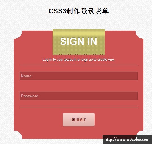
今天藤藤给大家带来的是一个CSS3制作的登录表单效果,这个效果有两上亮点,第一是渐变制作内凹圆角效果,第二个就是渐变制作花边效果。可以说这两个效果的实现都有一定的难度,如果你对css3的渐变属性gradient和CSS3的多背景不了解的话,你是无法实现的。如果你对这个效果感兴趣,那就自己动手一试吧。
HTML 结构
<div class="box">
  <form>
    <div class="tag">SIGN IN</div>
    <div>Log in to your account or sign up to create one.</div>
    <div>
      <input type="text" id="inputName"  placeholder="Name:">
    </div>
    <div>
      <input type="password" id="inputPassword"  placeholder="Password:">
    </div>
    <div>
      <button type="submit" class="btn">SUBMIT</button>
    </div>
  </form>
</div>
CSS 代码
body{
  padding: 30px;
  background-image: url(data:image/png;base64,...==);}
a{
  color:#000;
}
ul{
  list-style-type: none;
  margin-top: -20px;
}
.box{
  position: relative;
  z-index: 1;
  width: 456px;
  height: 380px;
  margin:50px auto 0;
  text-align: center;
  color:#fff;
  text-shadow:0 1px 0 #333;
  background:
    -webkit-radial-gradient(0 100%, circle, rgba(204,0,0,0) 29px, #d05353 29px),
    -webkit-radial-gradient(100% 100%, circle, rgba(204,0,0,0) 29px, #d05353 29px),
    -webkit-radial-gradient(100% 0, circle, rgba(204,0,0,0) 29px, #d05353 29px),
    -webkit-radial-gradient(0 0, circle, rgba(204,0,0,0) 29px, #d05353 29px);
  background:
    -moz-radial-gradient(0 100%, circle, rgba(204,0,0,0) 29px, #d05353 29px),
    -moz-radial-gradient(100% 100%, circle, rgba(204,0,0,0) 29px, #d05353 29px),
    -moz-radial-gradient(100% 0, circle, rgba(204,0,0,0) 29px, #d05353 29px),
    -moz-radial-gradient(0 0, circle, rgba(204,0,0,0) 29px, #d05353 29px);
  background:
    -o-radial-gradient(0 100%, circle, rgba(204,0,0,0) 29px, #d05353 29px),
    -o-radial-gradient(100% 100%, circle, rgba(204,0,0,0) 29px, #d05353 29px),
    -o-radial-gradient(100% 0, circle, rgba(204,0,0,0) 29px, #d05353 29px),
    -o-radial-gradient(0 0, circle, rgba(204,0,0,0) 29px, #d05353 29px);
  background:
    -ms-radial-gradient(0 100%, circle, rgba(204,0,0,0) 29px, #d05353 29px),
    -ms-radial-gradient(100% 100%, circle, rgba(204,0,0,0) 29px, #d05353 29px),
    -ms-radial-gradient(100% 0, circle, rgba(204,0,0,0) 29px, #d05353 29px),
    -ms-radial-gradient(0 0, circle, rgba(204,0,0,0) 29px, #d05353 29px);
  background:
    radial-gradient(0 100%, circle, rgba(204,0,0,0) 29px, #d05353 29px),
    radial-gradient(100% 100%, circle, rgba(204,0,0,0) 29px, #d05353 29px),
    radial-gradient(100% 0, circle, rgba(204,0,0,0) 29px, #d05353 29px),
    radial-gradient(0 0, circle, rgba(204,0,0,0) 29px, #d05353 29px);
  background-position: bottom left, bottom right, top right, top left;
  background-size: 50% 50%;
  background-repeat: no-repeat;
}
.tag{
  position: relative;
  top: -5px;
  left: 50%;
  margin-left: -92px;
  width: 184px;
  height: 87px;
  color:#fff;
  font-size: 36px;
  font-weight: bold;
  line-height: 87px;
  text-shadow:0 -1px 0 rgba(0,0,0,.2);
  background-color: #b5ae63;
  background-size: 2px 2px;
  background-image: -webkit-linear-gradient(45deg, #c0b96a 25%, transparent 25%, transparent 75%, #c0b96a 75%, #c0b96a),
    -webkit-linear-gradient(-45deg, #c0b96a 25%, transparent 25%, transparent 75%, #c0b96a 75%, #c0b96a);
  background-image: -moz-linear-gradient(45deg, #c0b96a 25%, transparent 25%, transparent 75%, #c0b96a 75%, #c0b96a),
    -moz-linear-gradient(-45deg, #c0b96a 25%, transparent 25%, transparent 75%, #c0b96a 75%, #c0b96a);
  background-image: -o-linear-gradient(45deg, #c0b96a 25%, transparent 25%, transparent 75%, #c0b96a 75%, #c0b96a),
    -o-linear-gradient(-45deg, #c0b96a 25%, transparent 25%, transparent 75%, #c0b96a 75%, #c0b96a);
  background-image: -ms-linear-gradient(45deg, #c0b96a 25%, transparent 25%, transparent 75%, #c0b96a 75%, #c0b96a),
    -ms-linear-gradient(-45deg, #c0b96a 25%, transparent 25%, transparent 75%, #c0b96a 75%, #c0b96a);
  background-image: linear-gradient(45deg, #c0b96a 25%, transparent 25%, transparent 75%, #c0b96a 75%, #c0b96a),
   linear-gradient(-45deg, #c0b96a 25%, transparent 25%, transparent 75%, #c0b96a 75%, #c0b96a);
}
.tag:after,
.tag:before{
  position:absolute;
  left:0;
  content: "";
  width: 100%;
  z-index: 8
}
.tag:after{
  height: 30px;
  top: 0px;
  background: -webkit-linear-gradient(top,rgba(226,217,124,0) 0%,rgba(226,217,124,1) 40%,rgba(226,217,124,1) 60%,rgba(226,217,124,0) 100%);
  background: -moz-linear-gradient(top,rgba(226,217,124,0) 0%,rgba(226,217,124,1) 40%,rgba(226,217,124,1) 60%,rgba(226,217,124,0) 100%);
  background: -o-linear-gradient(top,rgba(226,217,124,0) 0%,rgba(226,217,124,1) 40%,rgba(226,217,124,1) 60%,rgba(226,217,124,0) 100%);
  background: -ms-linear-gradient(top,rgba(226,217,124,0) 0%,rgba(226,217,124,1) 40%,rgba(226,217,124,1) 60%,rgba(226,217,124,0) 100%);
  background: linear-gradient(top,rgba(226,217,124,0) 0%,rgba(226,217,124,1) 40%,rgba(226,217,124,1) 60%,rgba(226,217,124,0) 100%);
}
.tag:before{
  height:8px;
  bottom: -5px;
  z-index: -1;
  background: -webkit-radial-gradient(ellipse closest-side, #b8b165, #b8b165 0%, #b8b165 70%,#732e2e 99%, transparent);
  background: -moz-radial-gradient(ellipse closest-side, #b8b165, #b8b165 0%, #b8b165 70%,#732e2e 99%, transparent);
  background: -o-radial-gradient(ellipse closest-side, #b8b165, #b8b165 0%, #b8b165 70%,#732e2e 99%, transparent);
  background: -ms-radial-gradient(ellipse closest-side, #b8b165, #b8b165 0%, #b8b165 70%,#732e2e 99%, transparent);
  background: radial-gradient(ellipse closest-side, #b8b165, #b8b165 0%, #b8b165 70%,#732e2e 99%, transparent);
  background-size:8px 8px;
}
form div:nth-of-type(3):before,
form div:nth-of-type(5):before{
  content: "";
  display: block;
  width: 100%;
  height: 5px;
  border:1px solid #c9938a;
  border-color:#c9938a transparent;
}
form{
  margin: 0 20px;
  line-height: 30px;
}
form input:not([type="checkbox"]){
  background: #aa3e3e;
  box-shadow:inset 0 0 5px rgba(0,0,0,.5),0 1px 1px #da6262;
  border: none;
  height: 30px;
  width: 100%;
  padding-left: 5px;
  padding-right: -5px;
  margin:20px 0;
  -webkit-transition: border linear 0.2s, box-shadow linear 0.2s;
  -moz-transition: border linear 0.2s, box-shadow linear 0.2s;
  -o-transition: border linear 0.2s, box-shadow linear 0.2s;
  -ms-transition: border linear 0.2s, box-shadow linear 0.2s;
  transition: border linear 0.2s, box-shadow linear 0.2s;
  -webkit-box-sizing: border-box;
  -moz-box-sizing: border-box;
  -o-box-sizing: border-box;
  -ms-box-sizing: border-box;
  box-sizing: border-box;
}
form input:not([type="checkbox"]):focus{
  outline: 0 none;
  box-shadow: inset 0 1px 3px rgba(255,255,255,0.1), 0 0 8px rgba(255,255,255, 0.6);
}
::-webkit-input-placeholder {
  color:#d6aaaa;
  font-weight: bold;
}
form .btn{
  position: relative;
  top: 0;
  border: none;
  width: 112px;
  height: 44px;
  font-weight: bold;
  color: #b74242;
  text-shadow:0 -1px 0 #000;
  border-radius: 3px;
  box-shadow: 0 -1px 0 #feeae7,0 1px 0 #976159;
  background: -webkit-linear-gradient(top,#f8d3cf,#dfafa8);
  background: -moz-linear-gradient(top,#f8d3cf,#dfafa8);
  background: -o-linear-gradient(top,#f8d3cf,#dfafa8);
  background: -ms-linear-gradient(top,#f8d3cf,#dfafa8);
  background: linear-gradient(top,#f8d3cf,#dfafa8);
  margin-top: 20px;
  -webkit-transition: all 0.25s ease-out 0.05s;
  -moz-transition: all 0.25s ease-out 0.05s;
  -o-transition: all 0.25s ease-out 0.05s;
  -ms-transition: all 0.25s ease-out 0.05s;
  transition: all 0.25s ease-out 0.05s;
}
form .btn:hover{
  top: 1px;
  box-shadow: 0 -1px 0 #feeae7,0 2px 0 #976159;
  background: -webkit-linear-gradient(top,#dfafa9,#e1b2ac);
  background: -moz-linear-gradient(top,#dfafa9,#e1b2ac);
  background: -o-linear-gradient(top,#dfafa9,#e1b2ac);
  background: -ms-linear-gradient(top,#dfafa9,#e1b2ac);
  background: linear-gradient(top,#dfafa9,#e1b2ac);
}
如需转载烦请注明出处:http://www.w3cplus.com/demo/css3-create-login-form.html


