

css3进度条动画
作者:结一 日期:2012-08-23 点击:922

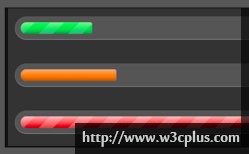
这个进度条是应用css3的渐变背景做出来的,然后应用background-size属性设置大小,然后以这个size为单位平铺。分析的时候你可以先禁用animation这个动画,然后可以用firebug设置background-repeat:no-repeat;来查看它一个单元的渐变背景。得到非动画的原理,我们再来研究动画部分,背景图片的运动,当然是用background-position了。
css主要代码:
.meter {
    height: 20px;  /* Can be anything */
    position: relative;
    margin: 60px 0 20px 0; /* Just for demo spacing */
    background: #555;
    -moz-border-radius: 25px;
    -webkit-border-radius: 25px;
    border-radius: 25px;
    padding: 10px;
    -webkit-box-shadow: inset 0 -1px 1px rgba(255,255,255,0.3);
    -moz-box-shadow   : inset 0 -1px 1px rgba(255,255,255,0.3);
    box-shadow        : inset 0 -1px 1px rgba(255,255,255,0.3);
}
.meter > span {
    display: block;
    height: 100%;
       -webkit-border-top-right-radius: 8px;
    -webkit-border-bottom-right-radius: 8px;
           -moz-border-radius-topright: 8px;
        -moz-border-radius-bottomright: 8px;
               border-top-right-radius: 8px;
            border-bottom-right-radius: 8px;
        -webkit-border-top-left-radius: 20px;
     -webkit-border-bottom-left-radius: 20px;
            -moz-border-radius-topleft: 20px;
         -moz-border-radius-bottomleft: 20px;
                border-top-left-radius: 20px;
             border-bottom-left-radius: 20px;
    background-color: rgb(43,194,83);
    background-image: -webkit-gradient(
      linear,
      left bottom,
      left top,
      color-stop(0, rgb(43,194,83)),
      color-stop(1, rgb(84,240,84))
     );
    background-image: -moz-linear-gradient(
      center bottom,
      rgb(43,194,83) 37%,
      rgb(84,240,84) 69%
     );
    -webkit-box-shadow:
      inset 0 2px 9px  rgba(255,255,255,0.3),
      inset 0 -2px 6px rgba(0,0,0,0.4);
    -moz-box-shadow:
      inset 0 2px 9px  rgba(255,255,255,0.3),
      inset 0 -2px 6px rgba(0,0,0,0.4);
    box-shadow:
      inset 0 2px 9px  rgba(255,255,255,0.3),
      inset 0 -2px 6px rgba(0,0,0,0.4);
    position: relative;
    overflow: hidden;
}
.meter > span:after, .animate > span > span {
    content: "";
    position: absolute;
    top: 0; left: 0; bottom: 0; right: 0;
    background-image:
       -webkit-gradient(linear, 0 0, 100% 100%,
          color-stop(.25, rgba(255, 255, 255, .2)),
          color-stop(.25, transparent), color-stop(.5, transparent),
          color-stop(.5, rgba(255, 255, 255, .2)),
          color-stop(.75, rgba(255, 255, 255, .2)),
          color-stop(.75, transparent), to(transparent)
       );
    background-image:
        -moz-linear-gradient(
          -45deg,
          rgba(255, 255, 255, .2) 25%,
          transparent 25%,
          transparent 50%,
          rgba(255, 255, 255, .2) 50%,
          rgba(255, 255, 255, .2) 75%,
          transparent 75%,
          transparent
       );
    z-index: 1;
    -webkit-background-size: 50px 50px;
    -moz-background-size: 50px 50px;
    background-size: 50px 50px;
    -webkit-animation: move 2s linear infinite;
    -moz-animation: move 2s linear infinite;
       -webkit-border-top-right-radius: 8px;
    -webkit-border-bottom-right-radius: 8px;
           -moz-border-radius-topright: 8px;
        -moz-border-radius-bottomright: 8px;
               border-top-right-radius: 8px;
            border-bottom-right-radius: 8px;
        -webkit-border-top-left-radius: 20px;
     -webkit-border-bottom-left-radius: 20px;
            -moz-border-radius-topleft: 20px;
         -moz-border-radius-bottomleft: 20px;
                border-top-left-radius: 20px;
             border-bottom-left-radius: 20px;
    overflow: hidden;
}

.animate > span:after {
    display: none;
}

@-webkit-keyframes move {
    0% {
       background-position: 0 0;
    }
    100% {
       background-position: 50px 50px;
    }
}

@-moz-keyframes move {
    0% {
       background-position: 0 0;
    }
    100% {
       background-position: 50px 50px;
    }
}


.orange > span {
    background-color: #f1a165;
    background-image: -moz-linear-gradient(top, #f1a165, #f36d0a);
    background-image: -webkit-gradient(linear,left top,left bottom,color-stop(0, #f1a165),color-stop(1, #f36d0a));
    background-image: -webkit-linear-gradient(#f1a165, #f36d0a);
}

.red > span {
    background-color: #f0a3a3;
    background-image: -moz-linear-gradient(top, #f0a3a3, #f42323);
    background-image: -webkit-gradient(linear,left top,left bottom,color-stop(0, #f0a3a3),color-stop(1, #f42323));
    background-image: -webkit-linear-gradient(#f0a3a3, #f42323);
}

.nostripes > span > span, .nostripes > span:after {
    -webkit-animation: none;
    -moz-animation: none;
    background-image: none;
}


