

CSS filter effects in action
作者:大漠 日期:2012-07-10 点击:529

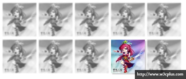
这个DEMO效果是使用了几个CSS3新特性制作的,其主要由CSS3的filter特性,但这种特性到目前为止仅有webkit内核的浏览器支持,另外使用了CSS3的选择器,伪类选择器中的:nth-child()和:not()选择器的支持。同时采用inline-block布局。换句简单的话说,这个demo中使用inline-block布局,使用CSS3的filter和伪类结构选择器制作的特效。
这个demo效果其实非常的简单,先来看其结构:
<ul class="gallery">
<li>
<img alt="" src="http://www.w3cplus.com/sites/default/files/filter.jpg" />
</li>
...
<li>
<img alt="" src="http://www.w3cplus.com/sites/default/files/filter.jpg" />
</li>
</ul>
主要是选择器的使用
.gallery li:nth-child(2){
  -webkit-filter:grayscale(1);
}
.gallery li:nth-child(3){
  -webkit-filter:sepia(1);
}
.gallery li:nth-child(4){
  -webkit-filter:saturate(0.5);
}
.gallery li:nth-child(5){
  -webkit-filter:hue-rotate(90deg);
}
.gallery li:nth-child(6){
  -webkit-filter:invert(1);
}
.gallery li:nth-child(7){
  -webkit-filter:opacity(0.2);
}
.gallery li:nth-child(8){
  -webkit-filter:blur(3px);
}
.gallery li:nth-child(9){
  -webkit-filter:drop-shadow(5px 5px 5px #ccc);
}
.gallery li:nth-child(10){
  -webkit-filter: saturate(6) hue-rotate(361deg) brightness(.09);
}
.gallery:hover li:not(:hover){
 -webkit-filter: blur(2px) grayscale(1);
 opacity: .7;
}
上面代码是实现效果的部分代码,其中最关键的是:
.gallery:hover li:not(:hover){
 -webkit-filter: blur(2px) grayscale(1);
 opacity: .7;
}
详细的代码大家可以参考:W3cplus Demo中的《CSS filter effects in action》,要是你感兴趣还可以下载源码到本地学习。
如需转载烦请注明出处:http://www.w3cplus.com/demo/css-filter-effects-in-action


