

CSS3制作Breadcrumbs
作者:大漠 日期:2012-03-20 点击:2089

“Breadcrumb”直译过来就是“面包屑”的意思(后面我直接说“breadcrumb”)。那么Breadcrumb是什么东东呢?我也不想对他进行详细的描述,大家直接看下面的截图,比我说的要更清楚:
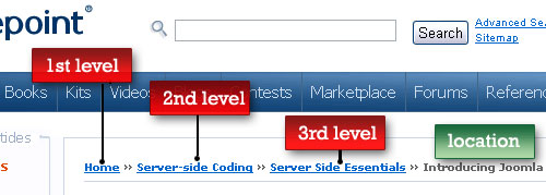
上图次导航的效果,我想大家在制作Web的时候肯定有碰到,一些简单的效果当然没话说,三下五除二就解决了,但一些特殊的效果还着实让人头痛。那么今天我和大家一起来学习Rea-Team用CSS3制作的几种效果,另外在此基础上我增加了几种效果,希望大家会喜欢。
拿上面的Demo效果来说,在CSS2中我们必须依赖图片或者增加额外的标签来实现效果,就如上面第一个效果,他就是用背景较片来实现的。那么今天根据Rea-Team的做法,不在需要使用背景图片或额外标签,只需使用CSS3的相关属性就能完成,下面我们一起来看看是怎么实现的吧。
HTML Markup
制作“Breadcrumb”效果时所用的标签都可以按下面的结构来写:
			<ul id="yourId">
			  <li><a href="#">Home</a></li>
			  <li><a href="#">Level #1</a></li>
			  <li><a href="#">Level #1-1</a></li>
			  <li><a href="#">Level #1-1-1</a></li>
			  <li>Current Level</li>
			</ul>
第一个实例中,在最后一个li中加了一个“current”类名。后面所有CSS3制作的效果无需加任何类名。
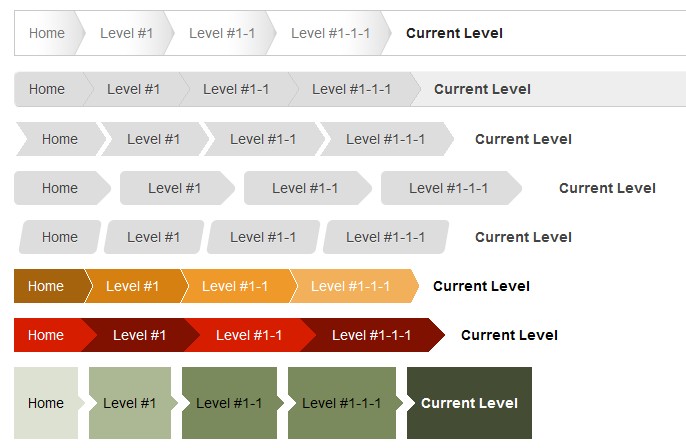
接下来我使用一个截图来说一下“Breadcrumbs”层级关系:

上图所表示的是一个“Breadcrumbs”层级关系,先找到“HOME”项,接下来“Level #1”是“Home”的子项,“Level #1-1”是“Level #1”的子项,依此类推,而“Current Level”就是你当前页面项。方便了解页面的层级关系。这个也是“breadcrumbs”在页面中所起在做用。
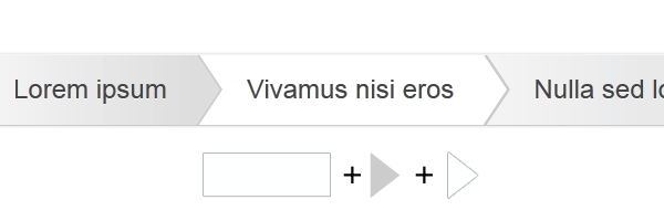
首先来看一个CSS2制作的效果:

制作上图效果所需的HTML结构在开始就列出来了,这里不在多说。制作这个效果,关键之处需要一个三角的渐变背景图:

有了这张图,我们制作就简单的多了,下面我们来看具体的CSS代码:
重置样式:
			*{
				margin: 0;
				padding:0;
			}

			body {
				font:14px Arial,Helvetica;
				color: #444;
				margin: 50px auto;
				padding: 50px;
				width: 80%;
			}

			ul {
				list-style:none outside none;
				margin-bottom: 15px;
			}

			ul li {
				float: left;
				display: inline;
			}

			ul a {
				text-decoration: none;
			}
后面所有DEMO如无做特殊说明,都以上面的代码重置。
具体制作的样式代码如下:
			/*Breadcrumbs Zero*/
			#breadcrumbs-zero {
				overflow: hidden;
				border: 1px solid #c9c9c9;
				width: 70%;
			}
			#breadcrumbs-zero li {
				float: left;
				color: #777;
				padding-left: 1em;
			}

			#breadcrumbs-zero a {
				background: url("images/breadcrums.jpg") no-repeat right center;
				float: left;
				padding: 1em 1.5em 1em 0;
				color: #777;
			}

			#breadcrumbs-zero a:hover {
				color: #222;
			}
			#breadcrumbs-zero li.current {
				padding: 1em 1.5em 1em 1em;
				font-weight: bold;
				color: #222;
			}
这里关键之处,就是在a标签中使用了背景图片。
上面展示的是CSS2制作的一个效果,下面我们来看几个纯CSS3制作的效果:
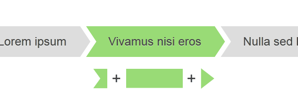
DEMO一:
这个实例关键之处是采用了CSS3伪类选择器中的“::before”和“::after”配合“CSS3制作的图形”达到一些特殊效果。
代码如下:
			/*Breadcrumbs one*/
			#breadcrumbs-one {
				background-color: #eee;
				border: 1px solid #ccc;
				border-color: #f5f5f5 #e5e5e5 #ccc;
				-moz-border-radius: 5px;
				-webkit-border-radius: 5px;
				border-radius: 5px;
				-moz-box-shadow: 0 0 2px rgba(0,0,0,0.2);
				-webkit-border-radius: 5px;
				border-radius: 5px;
				overflow: hidden;
				width: 70%;
			}

			#breadcrumbs-one a,
			#breadcrumbs-one li:last-child	{
				padding: 0.7em 1em 0.7em 2em;
				float: left;
				color: #444;
				position: relative;
				text-shadow: 0 1px 0 rgba(255,255,255,0.5);
				background-color: #ddd;
				background-image: -moz-linear-gradient(to right, #f5f5f5, #ddd);
				background-image: -webkit-linear-gradient(to right, #f5f5f5, #ddd);
				background-image: -o-linear-gradient(to right, #f5f5f5, #ddd);
				background-image: linear-gradient(to right, #f5f5f5, #ddd);
			}

			#breadcrumbs-one li:first-child a {
				padding-left: 1em;
				-moz-border-radius: 5px 0 0 5px;
				-webkit-border-radius: 5px 0 0 5px;
				border-radius: 5px 0 0 5px;
			}

			#breadcrumbs-one a:hover {
				background: #fff;
			}

			#breadcrumbs-one a::after,
			#breadcrumbs-one a::before{
				content: "";
				position: absolute;
				top: 50%;
				margin-top: -1.5em;
				border-top: 1.5em solid transparent;
				border-bottom: 1.5em solid transparent;
				border-left: 1em solid;
				right: -1em;
			}


			#breadcrumbs-one a::after {
				z-index: 2;
				border-left-color: #ddd;
			}
			#breadcrumbs-one a::before {
				border-left-color: #ccc;
				right: -1.1em;
				z-index: 1;
			}
			#breadcrumbs-one a:hover::after {
				border-left-color: #fff;
			}

			#breadcrumbs-one li:last-child {
				font-weight: bold;
				background: none;
			}
DEMO二
这个DEMO制作原理是一样的,只是换了一个图形和位置:
			/*Breadcrumbs two*/
		#breadcrumbs-two {
			overflow: hidden;
			width: 70%;
		}

		#breadcrumbs-two li {
			float: left;
			margin:0 0.5em 0 1em;
		}

		#breadcrumbs-two a,
		#breadcrumbs-two li:last-child {
			background: #ddd;
			padding: 0.7em 1em;
			float: left;
			color: #444;
			text-shadow: 0 1px 0 rgba(255,255,255,0.5);
			position: relative;
		}
		#breadcrumbs-two a:hover {
			background: #99db76;
		}

		#breadcrumbs-two a::before,
		#breadcrumbs-two a::after {
			content:"";
			position: absolute;
			top: 50%;
			margin-top: -1.5em;
		}

		#breadcrumbs-two a::before {
			border-style: solid;
			border-width: 1.5em 0 1.5em 1em;
			border-color: #ddd #ddd #ddd transparent;
			left: -1em;
		}

		#breadcrumbs-two a:hover::before {
			border-color: #99db76 #99db76 #99db76 transparent;
		}

		#breadcrumbs-two a::after {
			border-top: 1.5em solid transparent;
			border-bottom: 1.5em solid transparent;
			border-left: 1em solid #ddd;
			right: -1em;
		}

		#breadcrumbs-two a:hover::after {
			border-left-color: #99db76;
		}

		#breadcrumbs-two li:last-child {
			font-weight: bold;
			background: none;
		}
DEMO三

			/*breadcrumbs Three*/
		#breadcrumbs-three {
			overflow: hidden;
			width: 70%;
		}

		#breadcrumbs-three li {
			float: left;
			margin: 0 2em 0 0;
		}

		#breadcrumbs-three a,
		#breadcrumbs-three li:last-child {
			padding: 0.7em 1em 0.7em 2em;
			float: left;
			color: #444;
			background: #ddd;
			position: relative;
			z-index: 1;
			text-shadow: 0 1px 0 rgba(255,255,255,0);
			-moz-border-radius: 0.4em 0 0 0.4em;
			-webkit-border-radius: 0.4em 0 0 0.4em;
			border-radius: 0.4em 0 0 0.4em;
		}

		#breadcrumbs-three a:hover {
			background: #abe0ef;
		}

		#breadcrumbs-three a::after {
			content:"";
			background: #ddd;
			height: 2.5em;
			position: absolute;
			right: -1em;
			top: 50%;
			width: 2.5em;
			margin-top: -1.25em;
			z-index: -1;
			-moz-transform: rotate(45deg);
			-webkit-transform: rotate(45deg);
			-o-transform: rotate(45deg);
			-ms-transform: rotate(45deg);
			transform: rotate(45deg);
			-moz-border-radius: 0.4em;
			-webkit-border-radius: 0.4em;
			border-radius: 0.4em;
		}

		#breadcrumbs-three a:hover::after {
			background: #abe0ef;
		}

		#breadcrumbs-three li:last-child {
			font-weight: bold;
			background: none;
		}
DEMO四
			/*Breadcrumbs Four*/
		#breadcrumbs-four {
			overflow: hidden;
			width: 70%;
		}

		#breadcrumbs-four li {
			float: left;
			margin: 0 0.5em 0 1em;
		}

		#breadcrumbs-four a,
		#breadcrumbs-four li:last-child {
			float: left;
			background: #ddd;
			padding: 0.7em 1em;
			color: #444;
			text-shadow: 0 1px 0 rgba(255,255,255,0.5);
			position: relative;
		}

		#breadcrumbs-four a:hover {
			background: #efc9ab;
		}

		#breadcrumbs-four a::before,
		#breadcrumbs-four a::after {
			content: "";
			position: absolute;
			top:0;
			bottom:0;
			background: #ddd;
			width: 1em;
			-moz-transform: skew(-10deg);
			-webkit-transform: skew(-10deg);
			-o-transform: skew(-10deg);
			-ms-transform: skew(-10deg);
			transform: skew(-10deg);
		}

		#breadcrumbs-four a::before {
			left: -0.5em;
			-moz-border-radius: 5px 0 0 5px;
			-webkit-border-radius: 5px 0 0 5px;
			border-radius: 5px 0 0 5px;
		}

		#breadcrumbs-four a:hover::before {
			background: #efc9ab;
		}

		#breadcrumbs-four a::after {
			right: -0.5em;
			-moz-border-radius: 0 5px 5px 0;
			-webkit-border-radius: 0 5px 5px 0;
			border-radius: 0 5px 5px 0;
		}

		#breadcrumbs-four a:hover::after {
			background: #efc9ab;
		}
		#breadcrumbs-four li:last-child {
			font-weight: bold;
			background: none;
		}
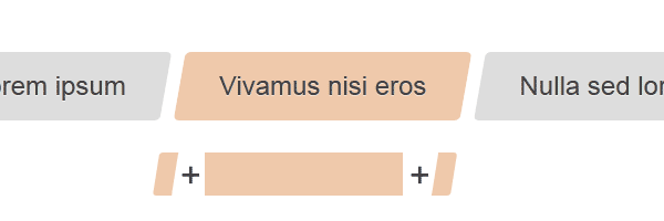
特别声明:上面四个DEMO的代码和图片来自于Rea-Team的《CSS3 breadcrumbs》。
DEMO五
这个DEMO在前面的基础上采了CSS3的HSLA来控制不同的色彩。其他的基本上和上面的是一样的。
			/*Breadcrumbs Five*/
		#breadcrumbs-five {
			overflow: hidden;
			width: 70%;
		}

		#breadcrumbs-five li {
			float: left;
		}

		#breadcrumbs-five a,
		#breadcrumbs-five li:last-child {
			color: #fff;
			padding: 0.7em 1em 0.7em 2em;
			background: brown;
			background: hsla(34,85%,35%,1);
			position: relative;
			float: left;
		}

		#breadcrumbs-five a::after,
		#breadcrumbs-five a::before{
			content:"";
			border-top: 2em solid transparent;
			border-bottom: 2em solid transparent;
			border-left: 1em solid hsla(34,85%,35%,1);
			position: absolute;
			top: 50%;
			margin-top: -2em;
			left: 100%;
			z-index: 2
		}

		#breadcrumbs-five a::before {
			margin-left: 1px;
			z-index: 1;
			border-left-color: #fff;
		}

		#breadcrumbs-five li:first-child a {
			padding-left: 1em;
		}

		#breadcrumbs-five li:nth-child(2) a {
			background: hsla(34,85%,45%,1);
		}
		#breadcrumbs-five li:nth-child(2) a::after {
			border-left-color: hsla(34,85%,45%,1);
		}

		#breadcrumbs-five li:nth-child(3) a {
			background: hsla(34,85%,55%,1);
		}
		#breadcrumbs-five li:nth-child(3) a::after {
			border-left-color: hsla(34,85%,55%,1);
		}

		#breadcrumbs-five li:nth-child(4) a {
			background: hsla(34,85%,65%,1);
		}
		#breadcrumbs-five li:nth-child(4) a::after {
			border-left-color: hsla(34,85%,65%,1);
		}

		#breadcrumbs-five li a:hover {
			background: hsla(34,85%,25%,1);
		}

		#breadcrumbs-five li a:hover::after {
			border-left-color: hsla(34,85%,25%,1) !important;
		}

		#breadcrumbs-five li:last-child {
			font-weight: bold;
			background: none;
			color: #000;
		}
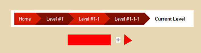
DEMO六
这个DEMO使用了“nth-child(2n)”使用偶数位置设置了不同的颜色。
			/*Breadcrumb Six*/
		#breadcrumbs-six {
			overflow: hidden;
			width: 70%;
		}

		#breadcrumbs-six li {
			float:left;
		}

		#breadcrumbs-six a,
		#breadcrumbs-six li:last-child	{
			float: left;
			background:#D61D00;
			color: #fff;
			padding: 0.7em 1em 0.7em 2.5em;
			position: relative;
		}
		#breadcrumbs-six li:first-child a {
			padding-left:1em;
		}
		#breadcrumbs-six li:nth-child(2n) a{
			background: #801100;
		}

		#breadcrumbs-six a::after {
			content: "";
			position: absolute;
			border-style: solid;
			border-width: 1.5em 0 1.5em 1.5em;
			border-color: transparent transparent transparent #D61D00;
			right: -1.4em;
			top: 50%;
			margin-top: -1.5em;
			z-index:2;
		}

		#breadcrumbs-six li:nth-child(2n) a::after {
			border-color:transparent transparent transparent #801100;
		}
		#breadcrumbs-six li a:hover {
			background: #000;
		}
		#breadcrumbs-six li a:hover::after {
			border-color:transparent transparent transparent #000;
		}
		#breadcrumbs-six li:last-child {
			background: none;
			font-weight: bold;
			color: #000;
		}
DEMO七
			/*Breadcrumb Seven*/
		#breadcrumbs-seven {
			overflow: hidden;
			width: 70%;
		}
		#breadcrumbs-seven li {
			float: left;
			margin-right: 0.8em;
		}

		#breadcrumbs-seven a,
		#breadcrumbs-seven li:last-child{
			float: left;
			padding: 2em 1em;
			background: hsla(80,20%,85%,1);
			color: #000;
			position: relative;
		}
		#breadcrumbs-seven a::after,
		#breadcrumbs-seven a::before,
		#breadcrumbs-seven li:last-child::before	{
			content: "";
			position:absolute;
			border: 8px solid hsla(80,20%,85%,1);
			border-color: transparent transparent transparent hsla(80,20%,85%,1);
			top: 50%;
			margin-top: -8px;
			z-index:2;
		}
		#breadcrumbs-seven li:last-child::before,
		#breadcrumbs-seven a::before {
			left: 0;
			border-left-color: #fff;
		}

		#breadcrumbs-seven a::after {
			right: -15px;
		}

		#breadcrumbs-seven li:first-child a::before {
			content: normal;
		}

		#breadcrumbs-seven li:nth-child(2n) a {
			background: hsla(80,20%,65%,1);
		}
		#breadcrumbs-seven li:nth-child(2n) a::after {
			border-left-color: hsla(80,20%,65%,1);
		}
		#breadcrumbs-seven li:nth-child(3n) a {
			background: hsla(80,20%,45%,1);
		}
		#breadcrumbs-seven li:nth-child(3n) a::after {
			border-left-color: hsla(80,20%,45%,1);
		}
		#breadcrumbs-seven li:nth-child(4n) a {
			background: hsla(80,20%,45%,1);
		}
		#breadcrumbs-seven li:nth-child(4n) a::after {
			border-left-color: hsla(80,20%,45%,1);
		}
		#breadcrumbs-seven li a:hover{
			background: hsla(80,20%,25%,1);
			color: #fff;
		}

		#breadcrumbs-seven li a:hover::after {
			border-left-color:hsla(80,20%,25%,1);
		}
		#breadcrumbs-seven li:last-child {
			background: hsla(80,20%,25%,1);
			font-weight: bold;
			color: #fff;
		}
上面展示了七个使用CSS3相关属性制作的“breadcrumbs”效果。如果你喜欢的话可以自己动手做做。
那么今天有关于breadcrumbs的制作就介绍到这里了,在这里需要特别感谢Rea-Team写的教程,让我在从中找到一些灵感,制作了下面的三种效果。同时希望大家喜欢这些效果,如果你不喜欢不要紧,你不仿看看下面的一些教程:
- Simple scalable CSS based breadcrumbs
- Create apple.com-like breadcrumb using simple CSS
- Breadcrumbs In Web Design: Examples And Best Practices
- How to Create Nice Scalable CSS Based Breadcrumbs
- Breadcrumb navigation with css arrows
- 11 cool Breadcrumbs for user friendly navigation
我想你在从中能找到你所需的,当然也能学到你想要的知识。如果你有更好的创意,可以在下面的评论中与我们一起共享。
如需转载烦请注明出处:W3CPLUS


