

Tabs with Round Out Borders
作者:大漠 日期:2012-09-26 点击:544

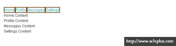
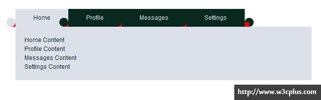
前几天藤藤在每一练中写了一个《CSS3制作Twitter信息框》效果,酷似Chrome浏览器的tabs效果:
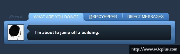
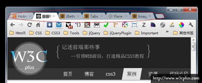
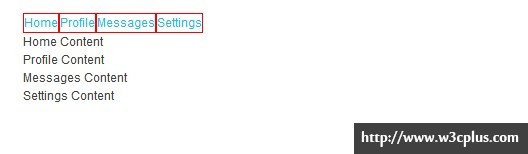
从上面的效果图上来看,似乎有点棘手,特别是tabs底部的内凹圆角之处的处理。当初转这个设计图的时候,我们一起都没有思路,后来在css-tricks中找到了一篇类似于这种设计的教程,仔细阅读后才知道其原理。今天稍有空闲,将其教程Tabs with Round Out Borders介绍的方法转译成中文与大家分享。直接不来,只好转述其文章中的思想精髓,希望对大家有所帮助。
CSS3的border-radius出现,让广大Web前端人员制作圆角不在像以前那样苦逼,直接一个属性就能搞定了。但话说回来,border-radius制作一些普通圆角是方便,但制作类似于前面截图所示的圆角效果(这里称为内凹圆角)还是有一定难度的。用来一个更具形像的图来解释,要比我说的更清楚:
HTML Markup
在网站制作过程中,什么样的视觉效果都有可能出现,当然你可以使用图片来制作这一切效果。但在这里不考虑任何图片来实现,而且还想创造一个尽可能简洁的结构(为得是尽可能的更新快,至于会不会比图片快,我也不知道,没测试过),因此需要先创建一个模板:
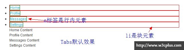
<ul class="nav nav-tabs" id="myTab">
  <li class="active"><a href="#home">Home</a></li>
  <li><a href="#profile">Profile</a></li>
  <li><a href="#messages">Messages</a></li>
  <li><a href="#settings">Settings</a></li>
</ul>

<div class="tab-content">
  <div class="tab-pane active" id="home">...</div>
  <div class="tab-pane" id="profile">...</div>
  <div class="tab-pane" id="messages">...</div>
  <div class="tab-pane" id="settings">...</div>
</div>
这是一个典型的tabs的结构,上面的结构代码来自于Bootstrap中的Tabs部分,如果你还不了解Bootstrap,你可以先点击我了解一下。
如何制作底部的内凹圆角效果?
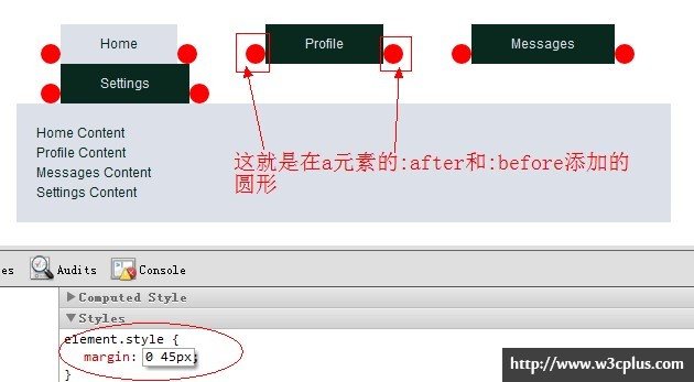
前面也说了,制作前面DEMO所示效果最棘手的问题是如何制作tabs菜单底部的内凹圆角效果,原因是我们无法直接使用border-radius来实现,需要使用别的形状贴出来。为了保证结构的整洁,这里考虑不添加额外的标签,而直接使用元素的伪元素(或者伪类选择器)。如果您还是第一次听说这两个概念,你可以点击这里或者这里进行了解。从本质上说,可以添加额外的标签,通过样式来实现,但是每个元素都可以有“:after”(或“::after”)和“:before”(或“::before”),因此在这里选择了他们而没有添加额外的标签,在四个选项卡中,使用了“<li>”和“<a>”两个元素的“:after”与“:before”。
接下来我们一步一步来看实现的过程:
1、默认状态
默认状态下,li是块状,a是行内元素,为了更好的显示效果,在这两个元素上先暂时添加了border样式:
2、li浮动
将li进行左浮动,列表项相互依靠在旁边,并且缩小了与内部a标签的间距:
3、相同尺寸
如果li内没有任何margin和padding值,那么li和a元素将具有相同尺寸大小
先给以上几步加上一个简单的样式:
.nav:after,
.nav:before {
  content:"";
  display: table;
}
.nav:after {
  clear:both;
  overflow:hidden;
}
.nav {
  zoom: 1;
}
.nav li {
  list-style: none outside none;
  float: left;
}
.nav li a {
  float: left;
  padding: 10px 40px;
  text-decoration: none;
  color: rgb(220, 225, 233);
  background: rgb(10, 41, 30);
}
.nav .active a {
  background: rgb(220, 225, 233);
  color:rgb(10, 41, 30);
}
.tab-content {
  background: rgb(220, 225, 233);
  color:rgb(10, 41, 30);
  padding: 20px;
}
4、焦点放在一个列表项上
这个时候,我们将列表项放在一个焦点之上,然后来看tabs底部内凹圆角的实现:
5、添加圆
接下来利用a的“:after”和“:before”给每个选项卡添加两个圆,先集中在一个选项卡上看效果:
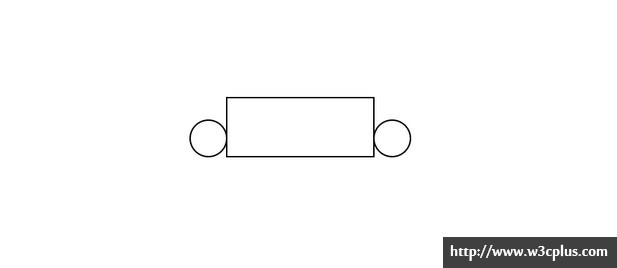
这里两上圆是直接使用border-radius绘制的圆形(详细的制作方法可以点击和这里)。
接下来看实际代码带来的效果:
.demo {
  width: 660px;
  margin: 20px auto;
}
.nav:after,
.nav:before {
  content:"";
  display: table;
}
.nav:after {
  clear:both;
  overflow:hidden;
}
.nav {
  zoom: 1;
}
.nav li {
  list-style: none outside none;
  float: left;
  position: relative;/*这个很重要*/
}
.nav li a {
  float: left;
  padding: 10px 40px;
  text-decoration: none;
  color: rgb(220, 225, 233);
  background: rgb(10, 41, 30);
}
.nav .active a {
  background: rgb(220, 225, 233);
  color:rgb(10, 41, 30);
}

/*制作圆角*/
.nav li a:before,
.nav li a:after {
  content:"";
  position: absolute;
  bottom: 0;
  width: 20px;
  height: 20px;
  border-radius: 10px;
  background: red;
}
.nav li a:before {
  left:-20px;
}
.nav li a:after {
  right: -20px;
}

.tab-content {
  background: rgb(220, 225, 233);
  color:rgb(10, 41, 30);
  padding: 20px;
}
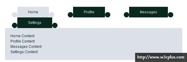
此时每个列表项的前与后添加了一个圆形:

为了更好的看清楚新添加的圆,暂时在li上添加一个margin样式
接下来将圆形的颜色换成和选项卡颜色一样,并且把当前项的颜色也换回来:
.demo {
  width: 660px;
  margin: 20px auto;
}
.nav:after,
.nav:before {
  content:"";
  display: table;
}
.nav:after {
  clear:both;
  overflow:hidden;
}
.nav {
  zoom: 1;
}
.nav li {
  list-style: none outside none;
  float: left;
  position: relative;/*这个很重要*/
}
.nav li a {
  float: left;
  padding: 10px 40px;
  text-decoration: none;
  color: rgb(220, 225, 233);
  background: rgb(10, 41, 30);
}
.nav .active a {
  background: rgb(220, 225, 233);
  color:rgb(10, 41, 30);
}

.nav li a:before,
.nav li a:after {
  content:"";
  position: absolute;
  bottom: 0;
  width: 20px;
  height: 20px;
  border-radius: 10px;
  background: rgb(10, 41, 30);
}

/*设置当前选项卡的圆形背景色*/
.nav .active a:before,
.nav .active a:after {
  background: rgb(220, 225, 233);
}

.nav li a:before {
  left:-20px;
}
.nav li a:after {
  right: -20px;
}

.tab-content {
  background: rgb(220, 225, 233);
  color:rgb(10, 41, 30);
  padding: 20px;
}
6、添加距形
接下来利用li的“:after”和“:before”给每个选项卡添加两个距形,先集中在一个选项卡上看效果:
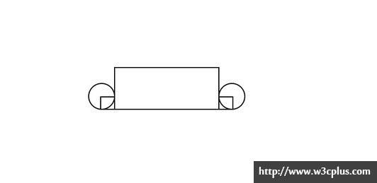
同样的,将这效果应用 到每个列表项上:
.demo {
  width: 660px;
  margin: 20px auto;
}
.nav:after,
.nav:before {
  content:"";
  display: table;
}
.nav:after {
  clear:both;
  overflow:hidden;
}
.nav {
  zoom: 1;
}
.nav li {
  list-style: none outside none;
  float: left;
  position: relative;/*这个很重要*/
}

/*添加正方形*/
.nav li:before,
.nav li:after {
  content:"";
  position: absolute;
  bottom:0;
  background: red;
  width: 10px;
  height: 10px;
}
.nav li:before {
  left: -10px;
}
.nav li:after {
  right: -10px;
}

.nav li a {
  float: left;
  padding: 10px 40px;
  text-decoration: none;
  color: rgb(220, 225, 233);
  background: rgb(10, 41, 30);
}
.nav .active a {
  background: rgb(220, 225, 233);
  color:rgb(10, 41, 30);
}

.nav li a:before,
.nav li a:after {
  content:"";
  position: absolute;
  bottom: 0;
  width: 20px;
  height: 20px;
  border-radius: 10px;
  background: rgb(10, 41, 30);
}
.nav .active a:before,
.nav .active a:after {
  background: rgb(220, 225, 233);
}
.nav li a:before {
  left:-20px;
}
.nav li a:after {
  right: -20px;
}

.tab-content {
  background: rgb(220, 225, 233);
  color:rgb(10, 41, 30);
  padding: 20px;
}
这个时候的效如下所示:
从上面的效果图中可以看出,此时的圆形和正方形层级关系并不正确,接下来,我们需要使用z-index来改变他们的层级关系:
.demo {
  width: 660px;
  margin: 20px auto;
}
.nav:after,
.nav:before {
  content:"";
  display: table;
}
.nav:after {
  clear:both;
  overflow:hidden;
}
.nav {
  zoom: 1;
}
.nav li {
  list-style: none outside none;
  float: left;
  position: relative;/*这个很重要*/
}

.nav .active {
  z-index: 3;/*当前项在最顶端*/
}

.nav li:before,
.nav li:after {
  content:"";
  position: absolute;
  bottom:0;
  background: red;
  width: 10px;
  height: 10px;
}
.nav li:before {
  left: -10px;
}
.nav li:after {
  right: -10px;
}
.nav li a {
  float: left;
  padding: 10px 40px;
  text-decoration: none;
  color: rgb(220, 225, 233);
  background: rgb(10, 41, 30);
}
.nav .active a {
  background: rgb(220, 225, 233);
  color:rgb(10, 41, 30);
}

.nav li a:before,
.nav li a:after {
  content:"";
  position: absolute;
  bottom: 0;
  width: 20px;
  height: 20px;
  border-radius: 10px;
  background: rgb(10, 41, 30);
  z-index: 2;/*圆形在矩形上面*/
}
.nav .active a:before,
.nav .active a:after {
  background: rgb(220, 225, 233);
}
.nav li a:before {
  left:-20px;
}
.nav li a:after {
  right: -20px;
}

/*当前项的:after和:before的z-index值为1*/
.nav .active:before,
.nav .active:after {
  z-index: 1;/*当前项的矩形在圆形下面*/
}

.tab-content {
  background: rgb(220, 225, 233);
  color:rgb(10, 41, 30);
  padding: 20px;
}
将颜色换正:
.demo {
  width: 660px;
  margin: 20px auto;
}
.nav:after,
.nav:before {
  content:"";
  display: table;
}
.nav:after {
  clear:both;
  overflow:hidden;
}
.nav {
  zoom: 1;
}
.nav li {
  list-style: none outside none;
  float: left;
  position: relative;/*这个很重要*/
}
.nav .active {
  z-index: 3;/*当前项在最顶端*/
}
.nav li:before,
.nav li:after {
  content:"";
  position: absolute;
  bottom:0;
  background: rgb(10, 41, 30);
  width: 10px;
  height: 10px;
}
.nav li:before {
  left: -10px;
}
.nav li:after {
  right: -10px;
}
.nav li a {
  float: left;
  padding: 10px 40px;
  text-decoration: none;
  color: rgb(220, 225, 233);
  background: rgb(10, 41, 30);
}
.nav .active a {
  background: rgb(220, 225, 233);
  color:rgb(10, 41, 30);
}

.nav li a:before,
.nav li a:after {
  content:"";
  position: absolute;
  bottom: 0;
  width: 20px;
  height: 20px;
  border-radius: 10px;
  background: rgb(10, 41, 30);
  z-index: 2;/*圆形在矩形上面*/
}
.nav .active a:before,
.nav .active a:after {
  background: rgb(220, 225, 233);
}
.nav li a:before {
  left:-20px;
}
.nav li a:after {
  right: -20px;
}
/*当前项的:after和:before的z-index值为1*/
.nav .active:before,
.nav .active:after {
  z-index: 1;/*当前项的矩形在圆形下面*/
  background: rgb(220, 225, 233);
}
.tab-content {
  background: rgb(220, 225, 233);
  color:rgb(10, 41, 30);
  padding: 20px;
}
此时的效果就越来越接近我们需要了:

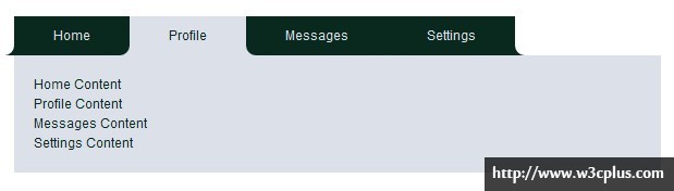
上面的效果离我们最终效果仅仅就差那么一顶点,效果图明显告诉我们,当前项的圆形背景色不能与相邻的其它选项容合,那么这一点很好办,我们只要将其背景色换成相邻选项卡的背景色一样就Ok了:
.demo {
  width: 660px;
  margin: 20px auto;
}
.nav:after,
.nav:before {
  content:"";
  display: table;
}
.nav:after {
  clear:both;
  overflow:hidden;
}
.nav {
  zoom: 1;
}
.nav li {
  list-style: none outside none;
  float: left;
  position: relative;/*这个很重要*/
}
.nav .active {
  z-index: 3;/*当前项在最顶端*/
}
.nav li:before,
.nav li:after {
  content:"";
  position: absolute;
  bottom:0;
  background: rgb(10, 41, 30);
  width: 10px;
  height: 10px;
}
.nav li:before {
  left: -10px;
}
.nav li:after {
  right: -10px;
}
.nav li a {
  float: left;
  padding: 10px 40px;
  text-decoration: none;
  color: rgb(220, 225, 233);
  background: rgb(10, 41, 30);
}
.nav .active a {
  background: rgb(220, 225, 233);
  color:rgb(10, 41, 30);
}

.nav li a:before,
.nav li a:after {
  content:"";
  position: absolute;
  bottom: 0;
  width: 20px;
  height: 20px;
  border-radius: 10px;
  background: rgb(10, 41, 30);
  z-index: 2;/*圆形在矩形上面*/
}
.nav .active a:before,
.nav .active a:after {
  background: rgb(10, 41, 30);
}
.nav li a:before {
  left:-20px;
}
.nav li a:after {
  right: -20px;
}
/*当前项的:after和:before的z-index值为1*/
.nav .active:before,
.nav .active:after {
  z-index: 1;/*当前项的矩形在圆形下面*/
  background: rgb(220, 225, 233);
}
.tab-content {
  background: rgb(220, 225, 233);
  color:rgb(10, 41, 30);
  padding: 20px;
}
还有一个明显的问题,那就是第一个选 项卡和最后一个选项卡,圆形背景色没有处理,那么我们按同样的方法将其处理。
.demo {
  width: 660px;
  margin: 20px auto;
}
.nav:after,
.nav:before {
  content:"";
  display: table;
}
.nav:after {
  clear:both;
  overflow:hidden;
}
.nav {
  zoom: 1;
}
.nav li {
  list-style: none outside none;
  float: left;
  position: relative;/*这个很重要*/
}
.nav .active {
  z-index: 3;/*当前项在最顶端*/
}
.nav li:before,
.nav li:after {
  content:"";
  position: absolute;
  bottom:0;
  background: rgb(10, 41, 30);
  width: 10px;
  height: 10px;
}
.nav li:before {
  left: -10px;
}
.nav li:after {
  right: -10px;
}
.nav li a {
  float: left;
  padding: 10px 40px;
  text-decoration: none;
  color: rgb(220, 225, 233);
  background: rgb(10, 41, 30);
}
.nav .active a {
  background: rgb(220, 225, 233);
  color:rgb(10, 41, 30);
}

.nav li a:before,
.nav li a:after {
  content:"";
  position: absolute;
  bottom: 0;
  width: 20px;
  height: 20px;
  border-radius: 10px;
  background: rgb(10, 41, 30);
  z-index: 2;/*圆形在矩形上面*/
}
.nav .active a:before,
.nav .active a:after {
  background: rgb(10, 41, 30);
}
.nav li a:before {
  left:-20px;
}
.nav li a:after {
  right: -20px;
}
/*当前项的:after和:before的z-index值为1*/
.nav .active:before,
.nav .active:after {
  z-index: 1;/*当前项的矩形在圆形下面*/
  background: rgb(220, 225, 233);
}

/*第一个选项卡的:before和最后一个选项卡的:after背景色不一样*/
.nav li:first-child a:before,
.nav li:last-child a:after {
  background-color: #fff;
}

.tab-content {
  background: rgb(220, 225, 233);
  color:rgb(10, 41, 30);
  padding: 20px;
}
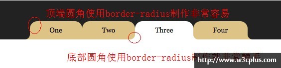
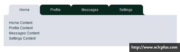
底部内凹圆角效果,可算是完成了,为了让效果更佳完美,给每个选项卡顶部加上圆角效果,并且将选项卡向右移动些许px:
.demo {
  width: 660px;
  margin: 20px auto;
}
.nav:after,
.nav:before {
  content:"";
  display: table;
}
.nav:after {
  clear:both;
  overflow:hidden;
}
.nav {
  zoom: 1;
  margin-left: 20px;
}
.nav li {
  list-style: none outside none;
  float: left;
  position: relative;/*这个很重要*/
}
.nav .active {
  z-index: 3;/*当前项在最顶端*/
}
.nav li:before,
.nav li:after {
  content:"";
  position: absolute;
  bottom:0;
  background: rgb(10, 41, 30);
  width: 10px;
  height: 10px;
}
.nav li:before {
  left: -10px;
}
.nav li:after {
  right: -10px;
}
.nav li a {
  float: left;
  padding: 10px 40px;
  text-decoration: none;
  color: rgb(220, 225, 233);
  background: rgb(10, 41, 30);
  border-radius: 10px 10px 0 0;/*给选项卡顶部添加圆角效果*/
}
.nav .active a {
  background: rgb(220, 225, 233);
  color:rgb(10, 41, 30);
}

.nav li a:before,
.nav li a:after {
  content:"";
  position: absolute;
  bottom: 0;
  width: 20px;
  height: 20px;
  border-radius: 10px;
  background: rgb(10, 41, 30);
  z-index: 2;/*圆形在矩形上面*/
}
.nav .active a:before,
.nav .active a:after {
  background: rgb(10, 41, 30);
}
.nav li a:before {
  left:-20px;
}
.nav li a:after {
  right: -20px;
}
/*当前项的:after和:before的z-index值为1*/
.nav .active:before,
.nav .active:after {
  z-index: 1;/*当前项的矩形在圆形下面*/
  background: rgb(220, 225, 233);
}
/*第一个选项卡的:before和最后一个选项卡的:after背景色不一样*/
.nav li:first-child a:before,
.nav li:last-child a:after {
  background-color: #fff;
}
.tab-content {
  background: rgb(220, 225, 233);
  color:rgb(10, 41, 30);
  padding: 20px;
}
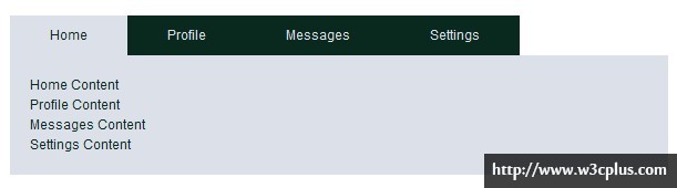
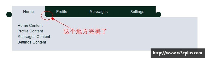
此时的效果就完美了:
最终css代码:
.demo {
  width: 660px;
  margin: 20px auto;
}
.nav:after,
.nav:before {
  content:"";
  display: table;
}
.nav:after {
  clear:both;
  overflow:hidden;
}
.nav {
  zoom: 1;
  margin-left: 20px;
}
.nav li {
  list-style: none outside none;
  float: left;
  position: relative;/*这个很重要*/
}
.nav .active {
  z-index: 3;/*当前项在最顶端*/
}
.nav li:before,
.nav li:after,
.nav  a:before,
.nav  a:after {
  content:"";
  position: absolute;
  bottom:0;

}
.nav li:before,
.nav li:after {
  background: rgb(10, 41, 30);
  width: 10px;
  height: 10px;
}
.nav li:before {
  left: -10px;
}
.nav li:after {
  right: -10px;
}
.nav a {
  float: left;
  padding: 10px 40px;
  text-decoration: none;
  color: rgb(220, 225, 233);
  background: rgb(10, 41, 30);
  border-radius: 10px 10px 0 0;
}
.nav .active a {
  background: rgb(220, 225, 233);
  color:rgb(10, 41, 30);
}

.nav  a:before,
.nav  a:after {
  width: 20px;
  height: 20px;
  border-radius: 10px;
  background: rgb(10, 41, 30);
  z-index: 2;/*圆形在矩形上面*/
}
.nav .active a:before,
.nav .active a:after {
  background: rgb(10, 41, 30);
}
.nav  a:before {
  left:-20px;
}
.nav  a:after {
  right: -20px;
}
/*当前项的:after和:before的z-index值为1*/
.nav .active:before,
.nav .active:after {
  z-index: 1;/*当前项的矩形在圆形下面*/
  background: rgb(220, 225, 233);
}
/*第一个选项卡的:before和最后一个选项卡的:after背景色不一样*/
.nav li:first-child a:before,
.nav li:last-child a:after {
  background-color: #fff;
}
.tab-content {
  background: rgb(220, 225, 233);
  color:rgb(10, 41, 30);
  padding: 20px;
}
7、添加JavaScript代码:
为了效果更像tabs选项卡效果,直接将Bootstrap的Tabs效果用上来:
<script type="text/javascript" src="jquery.js"></script>
<script type="text/javascript" src="bootstrap-tab.js"></script>
<script type="text/javascript">
  $(function(){
    $('#myTab a').click(function (e) {
      e.preventDefault();
      $(this).tab('show');
    })
  });
</script>
同时加上对应的tabs同内容的样式:
.tab-pane {
  display: none;
}
.tab-pane.active {
  display: block;
}
这样一来,我们就算是大功告成了,最终效果可以点击下面的demo:
那么这个效果制作过程就算是完成了,不知道你有没有整清楚。如果没有整清楚的话不仿动手一试。
特别感谢css-tricks提供的敏捷思路——Tabs with Round Out Borders,不过这个效果还不是最佳效果,离我们最开始截的浏览器窗口效果还略有差别,不过大家放心,后面还有一个完善版本。如果您对这个感兴趣的,请观注本站的相关更新。
如需转载,烦请注明出处:http://www.w3cplus.com/css3/tabs-with-round-out-borders.html


