

Responsive列布局
作者:大漠 日期:2012-12-04 点击:1225

本文根据Nick La的《Responsive Column Layouts 》所译,整个译文带有自己的理解与思想,如果译得不好或不对之处还请同行朋友指点。如需转载此译文,需注明英文出处:http://webdesignerwall.com/tutorials/responsive-column-layouts,以及作者相关信息
作者:Nick La
译者:大漠
布局在W3cplus说的也比较多了,但Responsive的列布局还是第一回说,(如果你是第一次听说Responsive这个词,建议你点击这和先了解Responsive)。今天看到一篇有关于Responsive的列布局教程,觉得值得一读,将其译成中文,希望对有需要的同学有所帮助。
通常我们进行列布局,都需要在第一列添加一个类名“first”,在最后一列添加一个类名“last”,主要用来清除他们之间的margin,(有关这方面的介绍可以详细阅读为之写的《CSS解决方案》中的《项目列表解决方安》,这里详细介绍了类似于列布局的相关方法,或者点击这里了解如何避免重复列末尾的Margin。)而且还通过添加类名“clearfix”来清除浮动。这些都是比较古老的解决方案了,今天我们一起来看一个新方案,就是使用CSS3的伪元素选择器“nth-of-type”来实现一个简单的Responsive列布局效果。Nick La使用这种方法制作了一些WordPress主题模板。制作这些模板中,他没有使用“first”和“last”类名就实现了多列在不同设备下都能自适应,换句话说,他就是能实现四列、三列、两列等等之间的切换。
接下来,我们一起看看具体是如何实现的。
很不方便的“first”和"last"类名
通常情况下,我们都是添加“first”和“last”类名来清除涉浮动在网格中列的margin值,添加“first”和"last"类名是特别烦人的事情,特别是在Responsive布局中,你无法确认哪列在什么时候是处第一列,以及哪列在什么时候处最后一列,几乎是个死题,无解。
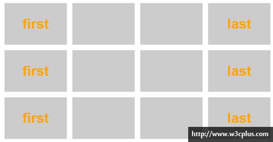
针对这种情况,我们来看一个示例图,假设我有一个四列的布局,总容器宽度“960px”,其中每列是“225px”,而且给每列设置了“margin-left”和“margin-right”为"10px"的列间距,为了让最后一列不掉下来,我们通常会给“1、5、9”添加“first”类名,在“4、8、12”列添加“last”类名,这个时候在类名“first”上清除“margin-left”为“0”,而在“last”类名上清除“margin-right”为“0”,这样布局才会正常。
HTML结构
<div class="layout clearfix">
  <div class="first">first</div>
  <div></div>
  <div></div>
  <div class="last">last</div>
  <div class="first">first</div>
  <div></div>
  <div></div>
  <div class="last">last</div>
  <div class="first">first</div>
  <div></div>
  <div></div>
  <div class="last">last</div>
</div>
CSS代码
.layout {
  width: 960px;
  margin: 20px auto;
}
.layout div {
  width: 225px;
  height: 150px;
  background: #ccc;
  margin: 10px;
  float: left;
  /*font style*/
  font-size: 50px;
  font-weight:bold;
  color:orange;
  text-align: center;
  line-height: 150px;
}
.layout .first {
  margin-left: 0px;
}
.layout .last {
  margin-right: 0px;
}
这个时候布局非常的完美:
大家都知道Responsive设计最主要的就是能适应各种设备下的屏幕渲染,此处我简单的来模仿一下,我现在在另一个分辨率下,只想显示成三列,这个时候我们的结构是没办法改变了,我们来看看效果(我将容器模拟成放三列的宽度:225*3+40=715px);
.layout {
  width: 715px;
  margin: 20px auto;
}
这个时候的布局真是惨不忍睹呀:
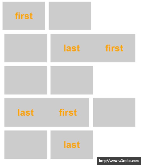
在这里我只是想通过这个模拟Responsive的例子来说明一个问题,就是列布局,使用添加类名的方法,在Responsive中是行不通的,至于什么原因,我想不用我说,大家都懂的。
使用nth-of-type
既然添加类名的方法做不到,我们就需要去思考别的方案,所幸的是,CSS3提供了一个先进的选择器“nth-of-type”,我们可以使用":nth-of-type(An+B)"表达来代替“first”和“last”类名清除相对应的margin值。例如:
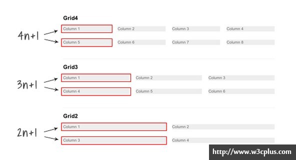
- .grid4.col:nth-of-type(4n+1)=四列布局中的第一个(相当于first类名),也就是说等于在“1,5,9”列上添加类名“first”
- .grid3.col:nth-of-type(3n+1)=三列布局中的第一个(相当于first类名),也就是说等于“1,4,7”列上添加类名“first”
- .grid2.col:nth-of-type(2n+1)=两列布局中的第一个(相当于first类名),也就是说等于“1,3,5”列上添加类名“first”
.grid4 .col:nth-of-type(4n+1),
.grid3 .col:nth-of-type(3n+1),
.grid2 .col:nth-of-type(2n+1) {
  margin-left: 0;
  clear: left;
}
使用Media Queries实现Responsive
至于什么是“Media Queries”在这里就不多说了,感兴趣的可以点击这里了解,此处我们还是回到正题,前面介绍使用“nth-of-type”来实现代替“first”"last"类名的方案,为了实现真正的Responsive列布局效果,我们使用流体网格,而不是像素网格:
/* col */
.col {
  background: #eee;
  float: left;
  margin-left: 3.2%;
  margin-bottom: 30px;
}

/* grid4 col */
.grid4 .col {
  width: 22.6%;
}

/* grid3 col */
.grid3 .col {
  width: 31.2%;
}

/* grid2 col */
.grid2 .col {
  width: 48.4%;
}
1、实现四列向三列转换
当视窗小于740px的宽度时,将实现四列向三列转换,在这个转换过程中我们要做的是:
- 将“.grid4.col”的列宽度调整到“31.2%”(相当于三分之一的宽度);
- 重置"margin-left"和“clear”值;
- 重新使用“nth-of-type(3n+1)”设置margin和clear的值。
@media screen and (max-width: 740px) {
  .grid4 .col {
    width: 31.2%;
  }
  .grid4 .col:nth-of-type(4n+1) {
    margin-left: 3.2%;
    clear: none;
  }
  .grid4 .col:nth-of-type(3n+1) {
    margin-left: 0;
    clear: left;
  }
}
此时效果就由四列向三列转换了。

2、由四列和三列向两列转换
当视窗的宽度小于“600px”时,我们列布局由四列和三列向两列转换,表面上看来好像要复杂一些,其实他们使用的原理和前面的是一样的,先分别调整列宽和重置margin与clear:
@media screen and (max-width: 600px) {
  /* change grid4 to 2-column */
  .grid4 .col {
    width: 48.4%;
  }
  .grid4 .col:nth-of-type(3n+1) {
    margin-left: 3.2%;
    clear: none;
  }
  .grid4 .col:nth-of-type(2n+1) {
    margin-left: 0;
    clear: left;
  }

  /* change grid3 to 2-column */
  .grid3 .col {
    width: 48.4%;
  }
  .grid3 .col:nth-of-type(3n+1) {
    margin-left: 3.2%;
    clear: none;
  }
  .grid3 .col:nth-of-type(2n+1) {
    margin-left: 0;
    clear: left;
  }
}
所有列全屏显示
当视窗宽度小于“400px”时,设置所有列的宽度为“100%”,同时重置margin和float:
@media screen and (max-width: 400px) {
  .col {
    width: 100% !important;
    margin-left: 0 !important;
    clear: none !important;
  }
}
IE的兼容性
Media Queries和“nth-of-type”都不支持IE8以及其以下版本。你可以使用selectivizr.js脚本来提供nth-of-type在IE下的兼容问题和使用respond.js来做Media Queries在IE下的兼容。不过遗憾的是这两个脚本不能很好的在一起运行(比如说,nth-of-type无法在Media Queries内运行)。也就是说在IE底下无法实现Responsive列布局的四列向三列或两列转换。
上面简单的介绍了如何使用“nth-of-type”和“media queries”实现Responsive列布局,如果你对这方面知识感兴趣,你可以继续阅读下面文章:
- Responsive Layout
- Beating Borders: The Bane of Responsive Layout
- The Goldilocks Approach
- Design sites using the Responsive Grid System
- Responsive jQuery Masonry
译者手语:整个翻译依照原文线路进行,并在翻译过程略加了个人对技术的理解。如果翻译有不对之处,还烦请同行朋友指点。谢谢!
如需转载烦请注明出处:
英文原文:http://webdesignerwall.com/tutorials/responsive-column-layouts
中文译文:http://www.w3cplus.com/css3/responsive-column-layouts.html


