

使用css sprites来优化你的网站在Retina屏幕下显示
作者:大漠 日期:2012-12-18 点击:2833

特别声明:此篇文章根据Maykel的英文文章《Using CSS Sprites to optimize your website for Retina Displays》进行翻译,整个译文带有我们自己的理解与思想,如果译得不好或不对之处还请同行朋友指点。如需转载此译文,需注明英文出处:http://miekd.com/articles/using-css-sprites-to-optimize-your-website-for-retina-displays/以及作者相关信息
作者:Maykel
译者:大漠
CSS sprites(CSS图片精灵)已经存在很久了。事实上,八年前就有CSS Sprites的详细介绍。CSS Sprites为一些大型的网站节约了带宽,让提高了用户的加载速度和用户体验,不需要加载更多的图片。
对于小型网站,CSS Sprites并没有带来很大的变化,或许这样使用并不理想。但在是高分辨率的显示屏幕下,比如说Retina屏幕下,CSS Sprites将会起来越重要。
优化高分辨的屏幕
优化高分辨率下的屏幕下效果,你需要通过“media queries”准备一张大的图片。所以在正常分辨率下加载的是“@1x”图像,在高分辨率下加载的是@2像素下的效果。这就意味着,你的图片数要增加两倍,而且CSS样式中也需要增加两倍。
是的,我们通过javascript可以解决,但是我们没有找到通过代码真正解决的方法。但是通过css sprites技术,我们只需要通过CSS的选择器来覆盖@1x的图片。
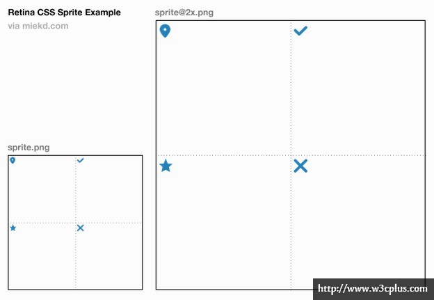
接下来的例子中,我们只通地四个选择器来控制不同的图片资源。首先会使用Retina技术,你可以为独立的元素使用不同的代码。然后在非视网膜屏幕下使用200x200px的的CSS Sprites图片。
span.location {
  background: url(location.png) no-repeat 0 0;
}

span.success {
  background: url(success.png) no-repeat 0 0;
}

a.delete {
  background: url(delete.png) no-repeat 0 -100px;
}

.content a.fav-link {
  background: url(favorite.png) no-repeat 0 0;
}

@media only screen and (-webkit-min-device-pixel-ratio: 2),
only screen and (min-device-pixel-ratio: 2) {
  span.location {
    background-image: url(location@2x.png);
    background-size: 16px 14px;
  }

  span.success {
    background-image: url(success@2x.png);
    background-size: 13px 14px;
  }

  a.delete {
    background: url(delete@2x.png) no-repeat 0 -100px;
  }

.content a.fav-link {
  background-image: url(favorite@2x.png);
  background-size: 11px 13px;
  }
}
span.location {
  background: url(sprite.png) no-repeat 0 0;
}

span.success {
  background: url(sprite.png) no-repeat -100px 0;
}

a.delete {
  background: url(sprite.png) no-repeat -100px -100px;
}

.content a.fav-link {
  background: url(sprite.png) no-repeat 0 -100px;
}

@media only screen and (-webkit-min-device-pixel-ratio: 2),
only screen and (min-device-pixel-ratio: 2) {
  span.location,
  span.success,
  a.delete,
  .content a.fav-link {
    /* Reference the @2x Sprite */
    background-image: url(sprite@2x.png);
    /* Translate the @2x sprite's dimensions back to 1x */
    background-size: 200px 200px;
  }
}
注:记住上面的这个例子仅适用于Retina屏幕下的设备,目前仅在IOS的移动设备iPhone4s、iPhone5、iPad、iPod和Mackbook Pro。对于Android系统下,要取决于你的系统,采用不同的“min-device-pixel-ratio”。
总结
- 不应该将所有的资源引入一个文件中,应该使用CSS sprite来集成图片。
- 创建@2x的sprites图,这个图刚好是普通图的两倍,而且具有双向扩展
- 在Retina屏幕下,对应的元素上使用相同的Scripts图片
- 使用background-size属性来确保你的@2x Sprites图正确定位
注意,这只是一个简单的例子,里面对三个元素设置了背景图,你可以根据需要在你的站点上使用更多的图片,按这种方式。在Retina屏幕下,使用这种方法,不仅节约了http的请求,还让你的代码简洁易于维护,同时在Retina下也更高效。
译者手语:初次翻译前端技术博文,整个翻译依照原文线路进行,并在翻译过程略加了个人对技术的理解。如果翻译有不对之处,还烦请同行朋友指点。谢谢!
如需转载烦请注明出处:
英文原文:http://miekd.com/articles/using-css-sprites-to-optimize-your-website-for-retina-displays
中文译文:http://www.w3cplus.com/css/using-css-sprites-to-optimize-your-website-for-retina-displays.html


