

CSS——Bootstrap From Twitter
作者:大漠 日期:2011-08-27 点击:4114

Bootstrap这个东东不好直译,如果直译过来就是“引导”,这里暂且不译,直呼其名“Bootstrap”。Bootstrap是来自国外有名的一个社交网站Twitter。我也是最近得到的资源,公司要求培训这方面的东西,所以今天整理出一份贴上来与大家一起分享Twitter网前端攻城师们给我们事来的成果。
Mark Otto(马克奥托)是这样说的“我们很高兴宣布,Bootstrap是快速开发Web应用程序的前端工具包。它是一个CSS和HTML的集合,它使用了最新的浏览器技术,给你的Web开发提供了时尚的版式,表单,buttons,表格,网格系统等等。”下面我们就一起来分享这个Bootstrap。
关于Bootstrap
在Twitter的早期,Twitter的前端工程师们就使用Bootstrap,用来满足所有Web前端开发的需求,但是在各个Web应用程序之间存在不一致性,所以难以形成规模,并开始停止不前。后来在Twitter许多工程师的探讨和研究后,Bootstrap有了明显的成长,并且成熟起来,不仅包括基本样式,还有更优雅的和持久的前端设计模式。有关于更多的Bootstrap大家可以点击:dev.twitter.com
浏览器的兼容性
现代主流浏览器都支持Bootstrap,比如说Safari,Google Chrome,Firefox4+,IE7+等
Bootstrap内容
Bootstrap包括些什么呢?Bootstrap主要包括了以下几个部分的内容:
- Less模板文件,比如说reset.less之类;
- 全部完成的css或正在修改的css;
- 样式文档;
- 实例
现在Bootstrap有些已经开源了,你可以到这里下载所有的代码:Bootstrap on GitHub »
下面我们一起一个部分一个部分来看Bootstrap。
一、重置样式——reset.css
有关于重置样式,版本实在太多了,比如说:Eric Meyer' reset stylesheet、YUI reset stylesheet、HTML5 reset stylesheet,这几种是应用比较多的,但很多攻城师们是在这些基础上修改过的,我以前在《Drupal主题的基础样式—Reset、Base、Layout、Print》和《Html5的Reset 和Base样式的结合》有介绍过修改后的reset.css样式。同样Bootstrap也在Eric Meyer' reset stylesheet基础上进行了修改,但我个人认为还是有许多没用的标签样式加进来了,今天我在这里贴出的是基于CSSShare站长为之修改的一份重置样式表,针对我们来说更实用,更简洁一点,代码如下
Reset stylesheet
				@charset "utf-8";
				/**
				*  Author:airenLiao
				*  Blog: http://www.w3cplus.com
				*/
				body,ul,ol,dd{
					margin:0;
					padding:0;
				}
				table {
					border-collapse:collapse;
					border-spacing:0;
				}
				ol, ul {
				  list-style: none outside none;
				}
				article, aside, dialog, figure, footer, header,hgroup, nav, section {
					display:block;
				}
二、网格系统——Grids
网格系统,我曾经在《OOCSS——核心篇》简单的介绍过一种网格系统,目前在网络上也有许多种不同的网格系统,如:960s、YUI Grids、Blueprint CSS、YAML、1140Grids、Columnal等,他们实现的方法是不一样,但他们的基本核心是一致的。Bootstrap中也有一个网格系统,他采用的是960s中的16列格子系,但Bootstrap不在格子上设置任何的margin和padding。同样我在Bootstrap的基础上稍作了一些修改,让我们的类名更有语义化:
Grids Markup:
				<div class="container claearfix">
					<div class="col5 column mln">5</div>
					<div class="col11 column">11</div>
				</div>
				<div class="container claearfix">
					<div class="col4 column mln">4</div>
					<div class="col8 column">8</div>
					<div class="col4 column">4</div>
				</div>
CSS Code:
				.container {
				  margin: 0 auto;
				  width: 940px;
				}
				.column {
				  display: inline;
				  float:left;
				  margin-left: 20px;
				}
				.col1 {
				  width: 40px;
				}
				.col2 {
				  width: 100px;
				}
				.col3 {
				  width: 160px;
				}
				.col4 {
				  width: 220px;
				}
				.col5 {
				  width: 280px;
				}
				.col6 {
				  width: 340px;
				}
				.col7 {
				  width: 400px;
				}
				.col8 {
				  width: 460px;
				}
				.col9 {
				  width: 520px;
				}
				.col10 {
				  width: 580px;
				}
				.col11 {
				  width: 640px;
				}
				.col12 {
				  width: 700px;
				}
				.col13 {
				  width: 760px;
				}
				.col14 {
				  width: 820px;
				}
				.col15 {
				  width: 880px;
				}
				.col16 {
				  width: 940px;
				}
其中clearfix是用来滁浮动的,而在第一列中加入一个mln是让第一列不具有左边距,如果不用考虑ie6的话,还可以使用:first-child来设置。接着我们一直来看看其效果:

上面只是展示了部分grid效果,其实大家可以根据自己的需求定制出适合自己的grid系统。感兴趣的朋友可以参考960s、YUI Grids、Blueprint CSS、YAML、1140Grids、Columnal这些网格系统。
布局——Layout
在Bootstrap中使用了两种布局模板,一个是固定布局(Fixed Layout)另一个是流体布局(Fluid Layout)也有人称之为自适应布局。
固定布局:960水平居中布局是我们见过最多的布局风格,但随着显屏的增大,1140s布局越来越多,如果使用960s布局的话,那么这种固定布局就很像上面说的Grids。我们来看一个模板
				<div class="container clearfix">
					<div id="left" class="sidebar column col4 mln">left sidebar</div>
					<div id="main" class="column col8">main section</div>
					<div id="right" class="sidebar column col4">right sidebar</div>
				</div>
这种布局结构,我不说大家都知道,这个就是我们使用的960s网格系统,当然大家也可以定制自己怕Layout。下面我们接着来看一个流体布局结构:
				<div class="containerFluid clearfix">
					<div id="left" class="sidebar column mln">left sidebar</div>
					<div id="main" class="section content">main section</div>
				</div>
和固定布局相比,结构上是没有很大的区别,只是他们外面使用的类名不同而以,如固定的使用“container”而流体使用的是“containerFluid”,接着我们来看一下Bootstrap中有关于这部分的样式代码
				/*fixed layout*/
				.container {
				  width: 940px;
				  margin: 0 auto;
				}
				/*fluid layout*/
				.containerFluid {
				  padding: 0 20px;
				}

				.containerFluid .sidebar {
				  float: left;
				  width: 220px;
				}

				.containerFluid .content {
				  min-width: 700px;
				  max-width: 1180px;
				  margin-left: 240px;
				}
固定布局中有关于网格部分代码略去未写,大家可以参考前面的代码,这里最关键的是流体布局。一个灵活的流体布局,最好是配上min-width和max-width,以及一个固定边栏的宽度。当然也可以全部使用流体式布局。这里只是为了讲述是一种思想,做一个简单的展示,如果大家对布局感兴趣可以狠狠点击他们:Layout Gala、Dynamic Drive CSS Layouts、Nice and Free CSS Layouts、Maxdesign、ThreeColumnLayouts, by CSS Discuss、CSS Intensivstation、Little Boxes、csscreator、Free css Layout.com、neuroticweb、 Matthewjamestaylor、website layouts等,这些网站收集了许多优秀的布局,你想要的都能找到。
排版——Typography
Bootstrap中排版是针对web页面中的标题(h1~h6),段落(p),列表(ul,ol,dl)以及其他的行内元素的样式设置,我个人认为这一部分也是特别细,变化因子太多,下面我列出Bootstrap以供大家参考:
				/* Typography.less
				 * Headings, body text, lists, code, and more for a versatile and durable typography system
				 * ---------------------------------------------------------------------------------------- */
				p {
				  font-size: 13px;
				  font-weight: normal;
				  line-height: 18px;
				  margin-bottom: 9px;
				}
				p small {
				  font-size: 11px;
				  color: #bfbfbf;
				}
				h1,
				h2,
				h3,
				h4,
				h5,
				h6 {
				  font-weight: bold;
				  color: #404040;
				}
				h1 small,
				h2 small,
				h3 small,
				h4 small,
				h5 small,
				h6 small {
				  color: #bfbfbf;
				}
				h1 {
				  margin-bottom: 18px;
				  font-size: 30px;
				  line-height: 36px;
				}
				h1 small {
				  font-size: 18px;
				}
				h2 {
				  font-size: 24px;
				  line-height: 36px;
				}
				h2 small {
				  font-size: 14px;
				}
				h3,
				h4,
				h5,
				h6 {
				  line-height: 36px;
				}
				h3 {
				  font-size: 18px;
				}
				h3 small {
				  font-size: 14px;
				}
				h4 {
				  font-size: 16px;
				}
				h4 small {
				  font-size: 12px;
				}
				h5 {
				  font-size: 14px;
				}
				h6 {
				  font-size: 13px;
				  color: #bfbfbf;
				  text-transform: uppercase;
				}
				ul, ol {
				  margin: 0 0 18px 25px;
				}
				ul ul,
				ul ol,
				ol ol,
				ol ul {
				  margin-bottom: 0;
				}
				ul {
				  list-style: disc;
				}
				ol {
				  list-style: decimal;
				}
				li {
				  line-height: 18px;
				  color: #808080;
				}
				ul.unstyled {
				  list-style: none;
				  margin-left: 0;
				}
				dl {
				  margin-bottom: 18px;
				}
				dl dt, dl dd {
				  line-height: 18px;
				}
				dl dt {
				  font-weight: bold;
				}
				dl dd {
				  margin-left: 9px;
				}
				hr {
				  margin: 0 0 19px;
				  border: 0;
				  border-bottom: 1px solid #eee;
				}
				strong {
				  font-style: inherit;
				  font-weight: bold;
				  line-height: inherit;
				}
				em {
				  font-style: italic;
				  font-weight: inherit;
				  line-height: inherit;
				}
				.muted {
				  color: #e6e6e6;
				}
				blockquote {
				  margin-bottom: 18px;
				  border-left: 5px solid #eee;
				  padding-left: 15px;
				}
				blockquote p {
				  font-size: 14px;
				  font-weight: 300;
				  line-height: 18px;
				  margin-bottom: 0;
				}
				blockquote small {
				  display: block;
				  font-size: 12px;
				  font-weight: 300;
				  line-height: 18px;
				  color: #bfbfbf;
				}
				blockquote small:before {
				  content: '\2014 \00A0';
				}
				address {
				  display: block;
				  line-height: 18px;
				  margin-bottom: 18px;
				}
				code, pre {
				  padding: 0 3px 2px;
				  font-family: Monaco, Andale Mono, Courier New, monospace;
				  font-size: 12px;
				  -webkit-border-radius: 3px;
				  -moz-border-radius: 3px;
				  border-radius: 3px;
				}
				code {
				  background-color: #fee9cc;
				  color: rgba(0, 0, 0, 0.75);
				  padding: 1px 3px;
				}
				pre {
				  background-color: #f5f5f5;
				  display: block;
				  padding: 17px;
				  margin: 0 0 18px;
				  line-height: 18px;
				  font-size: 12px;
				  border: 1px solid #ccc;
				  border: 1px solid rgba(0, 0, 0, 0.15);
				  -webkit-border-radius: 3px;
				  -moz-border-radius: 3px;
				  border-radius: 3px;
				  white-space: pre-wrap;
				}
个人认为上面代码需要根据自己的需求去定制,并不完全适合每个人,有兴趣的可以自己看看用了哪些了。
表格——table
表格table对于大家来说一点不陌生,早期用来进行布局,现在一般人使用于数据显示,当然也有使用在布局中,我们今天主要来看Bootstrap写的三种表格风格。
1、普通表格(commonTable)
普通表格也就是我们常见的默认表格,他的样式就是自动的,只有一点边界,好让大家更方便阅读,和更好的维护,如:
Html code:
				<table class="commonTable">
					<thead>
					 <tr>
					 	<th></th>
					 	<th></th>
					 	<th></th>
					 </tr>
					</thead>
					<tbody>
						<tr>
							<td></td>
							<td></td>
							<td></td>
						</tr>
					</tbody>
					<tfoot>
						<tr>
							<td></td>
							<td></td>
							<td></td>
						</tr>
					</tfoot>
				</table>
CSS Code:
				table {
				  width: 100%;
				  margin-bottom: 18px;
				  padding: 0;
				}
				table th,
				table td {
				  padding: 10px 10px 9px;
				  line-height: 13.5px;
				  text-align: left;
				  vertical-align: middle;
				  border-bottom: 1px solid #ddd;
				}
				table th {
				  padding-top: 9px;
				  font-weight: bold;
				  border-bottom-width: 2px;
				}
上面的样式仅供用于参考,大家在实际生产中可以根据自己需求定制。
2、斑马线表格——Zebra-striped
斑马线表格也就是在默认表格的基础上进行了一下修饰,给表格中单多或双数的行加了一个背景色。实现这样的效果很简单,只需要在表格中加上一个类名“zebraStriped”,如:
				<table class="zebraStriped">
					...
				</table>
CSS Code:
				.zebraStriped tbody tr:nth-child(odd) td {
				  background-color: #f9f9f9;
				}
				.zebraStriped tbody tr:hover td {
				  background-color: #f5f5f5;
				}
样式很简单,只要在tr:odd 或tr:even加上不同的背景色就实现了,如果你需要在ie低版本中实现这样的效果,你就要在相对应的tr加加上类名"odd"或"even",并加上样式,因为在ie7以下版本不支持“nth-chidl(odd)”选择器,(前面在《CSS3 选择器——伪类选择器》有介绍过相关这方面的知识)。
3、表格排序
这里主要在前面的基础上介绍一种排序表格,也就是说可以通过表格的标题实现表格的排序。实现这样的功能我们需要借助jQuery的jquery.js版本库(点击这里有更多的jquery版本库)和Tablesorter插件。接下来我们只需要在前面的基础上追加一个id名:
					<table class="zebraStriped" id="sorterTable">
						...
					</table>
CSS Code:
				.zebraStriped .header {
				  cursor: pointer;
				}
				.zebraStriped .header:after {
				  content: "";
				  float: right;
				  margin-top: 7px;
				  border-width: 0 4px 4px;
				  border-style: solid;
				  border-color: #000 transparent;
				  visibility: hidden;
				}
				.zebraStriped .headerSortUp,
				.zebraStriped .headerSortDown {
				  background-color: rgba(141, 192, 219, 0.25);
				  text-shadow: 0 1px 1px rgba(255, 255, 255, 0.75);
				  -webkit-border-radius: 3px 3px 0 0;
				  -moz-border-radius: 3px 3px 0 0;
				  border-radius: 3px 3px 0 0;
				}
				.zebraStriped .header:hover:after {
				  visibility: visible;
				}
				.zebraStriped .headerSortDown:after,
				.zebraStriped .headerSortDown:hover:after {
				  visibility: visible;
				  filter: alpha(opacity=60);
				  -khtml-opacity: 0.6;
				  -moz-opacity: 0.6;
				  opacity: 0.6;
				}
				.zebraStriped .headerSortUp:after {
				  border-bottom: none;
				  border-left: 4px solid transparent;
				  border-right: 4px solid transparent;
				  border-top: 4px solid #000;
				  visibility: visible;
				  -webkit-box-shadow: none;
				  -moz-box-shadow: none;
				  box-shadow: none;
				  filter: alpha(opacity=60);
				  -khtml-opacity: 0.6;
				  -moz-opacity: 0.6;
				  opacity: 0.6;
				}
上面使用了部分css3效果,用来制作排序的三角形,如果你需要兼容更多浏览器,请使用背景图片制作。
样式写好后,我们需要把jquery.js版本库tabesorter插件引进你的项目:
				<script type="text/javascript" src="js/jquery.min.js"></script>
				<script type="text/javascript" src="js/tablesorter.js"></script>
最后在表格止应用这个排序效果:
				<script type="text/javascript">
					$(document).ready(function(){
					   $("#sorterTable").tablesorter( {sortList: [[0,0], [1,0]]} );
					});
				</script>
有关于更详细的表格排序制作,大家可以拼命点这。
表单——Forms
表单这一块主要分成三个部分,第一是表单元素横向排列,第二部分是表单元素纵向排列,第三部分是buttons,下面我们分别来看Bootstrap如何写这几个部分:
1、默认表单样式(横响排列)
先来看Bootstrap是怎么写默认表单的,我将其代码全部Copy过来了,
				<form>
						        <fieldset>
						          <legend>Example form legend</legend>
						          <div class="clearfix formField">
						            <label for="">X-Large Input</label>
						            <div class="input">
						              <input type="text" class="xlarge" id="xlInput" name="xlInput" size="30">
						            </div>
						          </div> <!-- /clearfix formField -->
						          <div class="clearfix formField">
						            <label for="">Select</label>
						            <div class="input">
						              <select>
						                <option>1</option>
						                <option>2</option>
						                <option>3</option>
						                <option>4</option>
						                <option>5</option>
						              </select>
						            </div>
						          </div> <!-- /clearfix formField -->
						          <div class="clearfix formField">
						            <label for="">Select</label>
						            <div class="input">
						              <select class="medium">
						                <option>1</option>
						                <option>2</option>
						                <option>3</option>
						                <option>4</option>
						                <option>5</option>
						              </select>
						            </div>
						          </div> <!-- /clearfix formField -->
						          <div class="clearfix formField">
						            <label>Uneditable Input</label>
						            <div class="input">
						              <span class="uneditable-input">Some Value Here</span>
						            </div>
						          </div> <!-- /clearfix formField -->
						          <div class="clearfix formField">
						            <label for="disabledInput">Disabled Input</label>
						            <div class="input">
						              <input type="text" class="xlarge disabled" id="disabledInput" name="disabledInput" size="30" placeholder="Disabled input here… carry on." disabled="">
						            </div>
						          </div> <!-- /clearfix formField -->
						          <div class="clearfix formField error">
						            <label for="xlInput">X-Large Input</label>
						            <div class="input">
						              <input type="text" class="xlarge error" id="xlInput" name="xlInput" size="30">
						              <span class="help-inline">Small snippet of help text</span>
						            </div>
						          </div> <!-- /clearfix formField -->
						        </fieldset>
						        <fieldset>
						          <legend>Example form legend</legend>
						          <div class="clearfix formField">
						            <label for="prependedInput">Prepended Text</label>
						            <div class="input">
						              <div class="input-prepend">
						                <span class="add-on">@</span>
						                <input type="text" class="medium" id="prependedInput" name="prependedInput" size="16">
						              </div>
						            </div>
						          </div> <!-- /clearfix formField -->
						          <div class="clearfix formField">
						            <label for="prependedInput2">Prepended Checkbox</label>
						            <div class="input">
						              <div class="input-prepend">
						                <label class="add-on"><input type="checkbox" name="" id="" value=""></label>
						                <input type="text" class="mini" id="prependedInput2" name="prependedInput2" size="16">
						              </div>
						            </div>
						          </div> <!-- /clearfix formField -->
						          <div class="clearfix formField">
						            <label for="appendedInput">Appended Checkbox</label>
						            <div class="input">
						              <div class="input-append">
						                <input type="text" class="mini" id="appendedInput" name="appendedInput" size="16">
						                <label class="add-on active"><input type="checkbox" name="" id="" value="" checked="checked"></label>
						              </div>
						            </div>
						          </div> <!-- /clearfix formField -->
						          <div class="clearfix formField">
						            <label for="xlInput">File Input</label>
						            <div class="input">
						              <input type="file" class="input-file" id="fileInput" name="fileInput">
						            </div>
						          </div> <!-- /clearfix formField -->
						        </fieldset>
						        <fieldset>
						          <legend>Example form legend</legend>
						          <div class="clearfix formField">
						            <label id="optionsCheckboxes">List of Options</label>
						            <div class="input">
						              <ul class="inputs-list">
						                <li>
						                  <label>
						                    <input type="checkbox" name="optionsCheckboxes" value="option1">
						                    <span>Option one is this and that—be sure to include why it’s great</span>
						                  </label>
						                </li>
						                <li>
						                  <label>
						                    <input type="checkbox" name="optionsCheckboxes" value="option2">
						                    <span>Option two can also be checked and included in form results</span>
						                  </label>
						                </li>
						                <li>
						                  <label>
						                    <input type="checkbox" name="optionsCheckboxes" value="option2">
						                    <span>Option three can—yes, you guessed it—also be checked and included in form results</span>
						                  </label>
						                </li>
						                <li>
						                  <label class="disabled">
						                    <input type="checkbox" name="optionsCheckboxes" value="option2" disabled="">
						                    <span>Option four cannot be checked as it is disabled.</span>
						                  </label>
						                </li>
						              </ul>
						              <span class="help-block">
						                <strong>Note:</strong> Labels surround all the options for much larger click areas and a more usable form.
						              </span>
						            </div>
						          </div> <!-- /clearfix formField -->
						          <div class="clearfix formField">
						            <label>Date Range</label>
						            <div class="input">
						              <div class="inline-inputs">
						                <input type="text" class="small" value="May 1, 2011">
						                <input type="text" class="mini" value="12:00am">
						                to
						                <input type="text" class="small" value="May 8, 2011">
						                <input type="text" class="mini" value="11:59pm">
						                <span class="help-inline">All times are shown as Pacific Standard Time (GMT -08:00).</span>
						              </div>
						            </div>
						          </div> <!-- /clearfix formField -->
						          <div class="clearfix formField">
						            <label for="textarea">Textarea</label>
						            <div class="input">
						              <textarea class="xxlarge" id="textarea" name="textarea"></textarea>
						              <span class="help-block">
						                Block of help text to describe the field above if need be.
						              </span>
						            </div>
						          </div> <!-- /clearfix formField -->
						          <div class="clearfix formField">
						            <label id="optionsRadio">List of Options</label>
						            <div class="input">
						              <ul class="inputs-list">
						                <li>
						                  <label>
						                    <input type="checkbox" name="optionsCheckboxes" value="option1">
						                    <span>Option one is this and that—be sure to include why it’s great</span>
						                  </label>
						                </li>
						                <li>
						                  <label>
						                    <input type="checkbox" name="optionsCheckboxes" value="option2">
						                    <span>Option two can also be checked and included in form results</span>
						                  </label>
						                </li>
						              </ul>
						            </div>
						          </div> <!-- /clearfix formField -->
						          <div class="actions">
						            <button type="submit" class="btn primary">Save Changes</button> <button type="reset" class="btn">Cancel</button>
						          </div>
						        </fieldset>
						      </form>
上面的是HTML Markup,当然你也可按你自己的需求进行书写,下在我们来看看其CSS样式代码:
				form{
				  margin-bottom: 18px;
				}
				fieldset {
				  margin-bottom: 18px;
				  padding-top: 18px;
				}
				legend {
				  display: block;
				  margin-left: 150px;
				  font-size: 20px;
				  line-height: 1;
				  *margin: 0 0 5px 145px;
				  /* IE6-7 */

				  *line-height: 1.5;
				  /* IE6-7 */

				  color: #404040;
				}
				.formField {
				  margin-bottom: 18px;
				}
				label,
				input,
				select,
				textarea {
				  font-family: "Helvetica Neue", Helvetica, Arial, sans-serif;
				  font-size: 13px;
				  font-weight: normal;
				  line-height: normal;
				}
				label {
				  padding-top: 6px;
				  font-size: 13px;
				  line-height: 18px;
				  float: left;
				  width: 130px;
				  text-align: right;
				  color: #404040;
				}
				div.input {
				  margin-left: 150px;
				}
				input[type=checkbox], input[type=radio] {
				  cursor: pointer;
				}
				input[type=text],
				input[type=password],
				textarea,
				select,
				.uneditable-input {
				  display: inline-block;
				  width: 210px;
				  margin: 0;
				  padding: 4px;
				  font-size: 13px;
				  line-height: 18px;
				  height: 18px;
				  color: #808080;
				  border: 1px solid #ccc;
				  -webkit-border-radius: 3px;
				  -moz-border-radius: 3px;
				  border-radius: 3px;
				}
				select, input[type=file] {
				  height: 27px;
				  line-height: 27px;
				}
				textarea {
				  height: auto;
				}
				.uneditable-input {
				  background-color: #eee;
				  display: block;
				  border-color: #ccc;
				  -webkit-box-shadow: inset 0 1px 2px rgba(0, 0, 0, 0.075);
				  -moz-box-shadow: inset 0 1px 2px rgba(0, 0, 0, 0.075);
				  box-shadow: inset 0 1px 2px rgba(0, 0, 0, 0.075);
				}
				:-moz-placeholder {
				  color: #bfbfbf;
				}
				::-webkit-input-placeholder {
				  color: #bfbfbf;
				}
				input[type=text],
				input[type=password],
				select,
				textarea {
				  -webkit-transition: border linear 0.2s, box-shadow linear 0.2s;
				  -moz-transition: border linear 0.2s, box-shadow linear 0.2s;
				  transition: border linear 0.2s, box-shadow linear 0.2s;
				  -webkit-box-shadow: inset 0 1px 3px rgba(0, 0, 0, 0.1);
				  -moz-box-shadow: inset 0 1px 3px rgba(0, 0, 0, 0.1);
				  box-shadow: inset 0 1px 3px rgba(0, 0, 0, 0.1);
				}
				input[type=text]:focus, input[type=password]:focus, textarea:focus {
				  outline: none;
				  border-color: rgba(82, 168, 236, 0.8);
				  -webkit-box-shadow: inset 0 1px 3px rgba(0, 0, 0, 0.1), 0 0 8px rgba(82, 168, 236, 0.6);
				  -moz-box-shadow: inset 0 1px 3px rgba(0, 0, 0, 0.1), 0 0 8px rgba(82, 168, 236, 0.6);
				  box-shadow: inset 0 1px 3px rgba(0, 0, 0, 0.1), 0 0 8px rgba(82, 168, 236, 0.6);
				}
				div.error {
				  background: #fae5e3;
				  padding: 10px 0;
				  margin: -10px 0 10px;
				  -webkit-border-radius: 4px;
				  -moz-border-radius: 4px;
				  border-radius: 4px;
				}
				div.error > label, div.error span.help-inline, div.error span.help-block {
				  color: #9d261d;
				}
				div.error input[type=text], div.error input[type=password], div.error textarea {
				  border-color: #c87872;
				  -webkit-box-shadow: 0 0 3px rgba(171, 41, 32, 0.25);
				  -moz-box-shadow: 0 0 3px rgba(171, 41, 32, 0.25);
				  box-shadow: 0 0 3px rgba(171, 41, 32, 0.25);
				}
				div.error input[type=text]:focus, div.error input[type=password]:focus, div.error textarea:focus {
				  border-color: #b9554d;
				  -webkit-box-shadow: 0 0 6px rgba(171, 41, 32, 0.5);
				  -moz-box-shadow: 0 0 6px rgba(171, 41, 32, 0.5);
				  box-shadow: 0 0 6px rgba(171, 41, 32, 0.5);
				}
				div.error .input-prepend span.add-on, div.error .input-append span.add-on {
				  background: #f4c8c5;
				  border-color: #c87872;
				  color: #b9554d;
				}
				.input-mini,
				input.mini,
				textarea.mini,
				select.mini {
				  width: 60px;
				}
				.input-small,
				input.small,
				textarea.small,
				select.small {
				  width: 90px;
				}
				.input-medium,
				input.medium,
				textarea.medium,
				select.medium {
				  width: 150px;
				}
				.input-large,
				input.large,
				textarea.large,
				select.large {
				  width: 210px;
				}
				.input-xlarge,
				input.xlarge,
				textarea.xlarge,
				select.xlarge {
				  width: 270px;
				}
				.input-xxlarge,
				input.xxlarge,
				textarea.xxlarge,
				select.xxlarge {
				  width: 530px;
				}
				textarea.xxlarge {
				  overflow-y: scroll;
				}
				input[readonly]:focus, textarea[readonly]:focus, input.disabled {
				  background: #f5f5f5;
				  border-color: #ddd;
				  -webkit-box-shadow: none;
				  -moz-box-shadow: none;
				  box-shadow: none;
				}
				.actions {
				  background: #f5f5f5;
				  margin-top: 18px;
				  margin-bottom: 18px;
				  padding: 17px 20px 18px 150px;
				  border-top: 1px solid #ddd;
				  -webkit-border-radius: 0 0 3px 3px;
				  -moz-border-radius: 0 0 3px 3px;
				  border-radius: 0 0 3px 3px;
				}
				.actions .secondary-action {
				  float: right;
				}
				.actions .secondary-action a {
				  line-height: 30px;
				}
				.actions .secondary-action a:hover {
				  text-decoration: underline;
				}
				.help-inline, .help-block {
				  font-size: 12px;
				  line-height: 18px;
				  color: #bfbfbf;
				}
				.help-inline {
				  padding-left: 5px;
				  *position: relative;
				  /* IE6-7 */

				  *top: -5px;
				  /* IE6-7 */

				}
				.help-block {
				  display: block;
				  max-width: 600px;
				}
				.inline-inputs {
				  color: #808080;
				}
				.inline-inputs span, .inline-inputs input[type=text] {
				  display: inline-block;
				}
				.inline-inputs input.mini {
				  width: 60px;
				}
				.inline-inputs input.small {
				  width: 90px;
				}
				.inline-inputs span {
				  padding: 0 2px 0 1px;
				}
				.input-prepend input[type=text], .input-append input[type=text] {
				  -webkit-border-radius: 0 3px 3px 0;
				  -moz-border-radius: 0 3px 3px 0;
				  border-radius: 0 3px 3px 0;
				}
				.input-prepend .add-on, .input-append .add-on {
				  background: #f5f5f5;
				  float: left;
				  display: block;
				  width: auto;
				  min-width: 16px;
				  padding: 4px 4px 4px 5px;
				  color: #bfbfbf;
				  font-weight: normal;
				  line-height: 18px;
				  height: 18px;
				  text-align: center;
				  text-shadow: 0 1px 0 #fff;
				  border: 1px solid #ccc;
				  border-right-width: 0;
				  -webkit-border-radius: 3px 0 0 3px;
				  -moz-border-radius: 3px 0 0 3px;
				  border-radius: 3px 0 0 3px;
				}
				.input-prepend .active, .input-append .active {
				  background: #a9dba9;
				  border-color: #46a546;
				}
				.input-prepend .add-on {
				  *margin-top: 1px;
				  /* IE6-7 */

				}
				.input-append input[type=text] {
				  float: left;
				  -webkit-border-radius: 3px 0 0 3px;
				  -moz-border-radius: 3px 0 0 3px;
				  border-radius: 3px 0 0 3px;
				}
				.input-append .add-on {
				  -webkit-border-radius: 0 3px 3px 0;
				  -moz-border-radius: 0 3px 3px 0;
				  border-radius: 0 3px 3px 0;
				  border-right-width: 1px;
				  border-left-width: 0;
				}
				.inputs-list {
				  margin: 0 0 5px;
				  width: 100%;
				}
				.inputs-list li {
				  display: block;
				  padding: 0;
				  width: 100%;
				}
				.inputs-list li label {
				  display: block;
				  float: none;
				  width: auto;
				  padding: 0;
				  line-height: 18px;
				  text-align: left;
				  white-space: normal;
				}
				.inputs-list li label strong {
				  color: #808080;
				}
				.inputs-list li label small {
				  font-size: 12px;
				  font-weight: normal;
				}
				.inputs-list li ul.inputs-list {
				  margin-left: 25px;
				  margin-bottom: 10px;
				  padding-top: 0;
				}
				.inputs-list li:first-child {
				  padding-top: 5px;
				}
				.inputs-list input[type=radio], .inputs-list input[type=checkbox] {
				  margin-bottom: 0;
				}
这是一个默认表单的基本样式,制作出来的效果的确很靓,专业的前端就是与众不同,同学们可以修改上面部分代码,让他成为你自己的风格。
2、纵向表单——Stacked forms
纵向表单所讲的意思就是,label和各选项元素不在同一水平位置,制作这样的效果,Bootstrap告诉我们只需要在form元素中加入一个类名"form-stacked",如:
				<form action="" class="form-stacked">
				...
				</form>
相应的样式
				form.form-stacked {
				  padding-left: 20px;
				}
				form.form-stacked fieldset {
				  padding-top: 9px;
				}
				form.form-stacked legend {
				  margin-left: 0;
				}
				form.form-stacked label {
				  display: block;
				  float: none;
				  width: auto;
				  font-weight: bold;
				  text-align: left;
				  line-height: 20px;
				  padding-top: 0;
				}
				form.form-stacked .clearfix {
				  margin-bottom: 9px;
				}
				form.form-stacked .clearfix div.input {
				  margin-left: 0;
				}
				form.form-stacked .inputs-list {
				  margin-bottom: 0;
				}
				form.form-stacked .inputs-list li {
				  padding-top: 0;
				}
				form.form-stacked .inputs-list li label {
				  font-weight: normal;
				  padding-top: 0;
				}
				form.form-stacked div.error {
				  padding-top: 10px;
				  padding-bottom: 10px;
				  padding-left: 10px;
				  margin-top: 0;
				  margin-left: -10px;
				}
				form.form-stacked .actions {
				  margin-left: -20px;
				  padding-left: 20px;
				}
3、Buttons
按钮在每个Web页面都会需要用到,我们每一次都要重复的去制作这样的按钮,那么Bootstrap提供了一套的按钮制作,我们只需要在你需的按钮上加上不同的类名。Bootstrap使用了几种标签来制作:<input>,>button>,<a>三种,分别制作了"常用(btn)","主按钮(primary)","删除按钮(Delete)","取消按钮(Cancel)","大按钮(lagre)","小按钮(small)",“禁用按钮(disabled)”,我们一起来看其实现的代码:
				<div class="container clearfix" style="margin-top: 20px;">
					<div class="column col4 mln">
						<h3>button</h3>
						<button class="btn primary" type="submit">Submit</button><br/>
						<button class="btn cancel" type="submit">Cancel</button><br/>
						<button class="btn delete" type="submit">Delete</button><br/>
						<button class="btn large" type="sumbit">Large Button</button><br/>
						<button class="btn small" type="submit">Small Button</button><br/>
						<button class="btn disabled" type="submit">Disabled Button</button>
					</div>
					<div class="column col4">
						<h3>input</h3>
						<input type="submit" class="btn primary" value="Submit" /><br />
						<input type="submit" class="btn cancel" value="Cancel" /><br />
						<input type="submit" class="btn delete" value="Delete" /><br />
						<input type="submit" class="btn large" value="Large Button" /><br />
						<input type="submit" class="btn small" value="Small Button" /><br />
						<input type="submit" class="btn disabled" value="Disabled Button" /><br />
					</div>
					<div class="column col4">
						<h3>button(No type)</h3>
						<button class="btn primary">Submit</button><br/>
						<button class="btn cancel">Cancel</button><br/>
						<button class="btn delete">Delete</button><br/>
						<button class="btn large">Large Button</button><br/>
						<button class="btn small">Small Button</button><br/>
						<button class="btn disabled">Disabled Button</button>
					</div>
					<div class="column col4">
						<h3>link</h3>
						<a class="btn primary" href="#">Submit</a><br/>
						<a class="btn cancel" href="#">Cancel</a><br/>
						<a class="btn delete" href="#">Delete</a><br/>
						<a class="btn large" href="#">Large Button</a><br/>
						<a class="btn small" href="#">Small Button</a><br/>
						<a class="btn disabled" href="#">Disabled Button</a>
					</div>
				</div>
CSS Code:
				.btn {
					display: inline-block;
					background-color: #e6e6e6;
					background-repeat: no-repeat;
					background-image: -webkit-gradient(linear, 0 0, 0 100%, from(#ffffff), color-stop(0.25, #ffffff), to(#e6e6e6));
					background-image: -webkit-linear-gradient(#ffffff, #ffffff 0.25, #e6e6e6);
					background-image: -moz-linear-gradient(#ffffff, #ffffff 0.25, #e6e6e6);
					background-image: -ms-linear-gradient(#ffffff, #ffffff 0.25, #e6e6e6);
					background-image: -o-linear-gradient(#ffffff, #ffffff 0.25, #e6e6e6);
					background-image: linear-gradient(#ffffff, #ffffff 0.25, #e6e6e6);
					padding: 4px 14px;
					text-shadow: 0 1px 1px rgba(255, 255, 255, 0.75);
					color: #333;
					font-size: 13px;
					line-height: 18px;
					border: 1px solid #ccc;
					border-bottom-color: #bbb;
					-webkit-border-radius: 4px;
					-moz-border-radius: 4px;
					border-radius: 4px;
					-webkit-box-shadow: inset 0 1px 0 rgba(255, 255, 255, 0.2), 0 1px 2px rgba(0, 0, 0, 0.05);
					-moz-box-shadow: inset 0 1px 0 rgba(255, 255, 255, 0.2), 0 1px 2px rgba(0, 0, 0, 0.05);
					box-shadow: inset 0 1px 0 rgba(255, 255, 255, 0.2), 0 1px 2px rgba(0, 0, 0, 0.05);
					text-decoration: none;
				}
				.btn:hover {
					background-position: 0 -15px;
					color: #333;
					text-decoration: none;
				}
				.primary {
					background-color: #0064cd;
					background-repeat: repeat-x;
					background-image: -khtml-gradient(linear, left top, left bottom, from(#049cdb), to(#0064cd));
					background-image: -moz-linear-gradient(#049cdb, #0064cd);
					background-image: -ms-linear-gradient(#049cdb, #0064cd);
					background-image: -webkit-gradient(linear, left top, left bottom, color-stop(0%, #049cdb), color-stop(100%, #0064cd));
					background-image: -webkit-linear-gradient(#049cdb, #0064cd);
					background-image: -o-linear-gradient(#049cdb, #0064cd);
					background-image: linear-gradient(#049cdb, #0064cd);
					color: #fff;
					text-shadow: 0 -1px 0 rgba(0, 0, 0, 0.25);
					border: 1px solid #004b9a;
					border-bottom-color: #003f81;
				}
				.primary:hover {
					color: #fff;
				}
				.btn {
					-webkit-transition: 0.1s linear all;
					-moz-transition: 0.1s linear all;
					transition: 0.1s linear all;
				}
				.primary {
					color: #fff;
					text-shadow: 0 -1px 0 rgba(0, 0, 0, 0.25);
					border-color: #0064cd #0064cd #003f81;
					border-color: rgba(0, 0, 0, 0.1) rgba(0, 0, 0, 0.1) rgba(0, 0, 0, 0.25);
				}

				.cancel,
				.delete {
					background-color: #9D261D;
					background-image: -khtml-gradient(linear, left top, left bottom, from(#D83A2E), to(#9D261D));
					background-image: -moz-linear-gradient(#D83A2E, #9D261D);
					background-image: -ms-linear-gradient(#D83A2E, #9D261D);
					background-image: -webkit-gradient(linear, left top, left bottom, color-stop(0%, #D83A2E), color-stop(100%, #9D261D));
					background-image: -webkit-linear-gradient(#D83A2E, #9D261D);
					background-image: -o-linear-gradient(#D83A2E, #9D261D);
					background-image: linear-gradient(#D83A2E, #9D261D);
					background-repeat: repeat-x;
					border-color: rgba(0, 0, 0, 0.1) rgba(0, 0, 0, 0.1) rgba(0, 0, 0, 0.25);
					color: #fff;
					text-shadow: 0 -1px 0 rgba(0, 0, 0, 0.25);
				}
				.cancel:hover,
				.delete:hover,
				.primary:hover {
					color: #fff;
				}
				.large {
					font-size: 16px;
					line-height: 28px;
					-webkit-border-radius: 6px;
					-moz-border-radius: 6px;
					border-radius: 6px;
				}
				.small {
					padding-right: 9px;
					padding-left: 9px;
					font-size: 11px;
				}
				.disabled {
					background-image: none;
					filter: alpha(opacity=65);
					-khtml-opacity: 0.65;
					-moz-opacity: 0.65;
					opacity: 0.65;
					cursor: default;
				}
				.btn:disabled {
					background-image: none;
					filter: alpha(opacity=65);
					-khtml-opacity: 0.65;
					-moz-opacity: 0.65;
					opacity: 0.65;
					cursor: default;
					color: #fff;
				}
				.btn:active {
					-webkit-box-shadow: inset 0 3px 7px rgba(0, 0, 0, 0.1), 0 1px 2px rgba(0, 0, 0, 0.05);
					-moz-box-shadow: inset 0 3px 7px rgba(0, 0, 0, 0.1), 0 1px 2px rgba(0, 0, 0, 0.05);
					box-shadow: inset 0 3px 7px rgba(0, 0, 0, 0.1), 0 1px 2px rgba(0, 0, 0, 0.05);
				}
				button.btn::-moz-focus-inner, input[type=submit].btn::-moz-focus-inner {
					padding: 0;
					border: 0;
				}
				a.btn {
					line-height: 15px;
				}
				a.large {
					line-height: 19px;
				}
				a.small {
					line-height: 13px;
				}
效果:
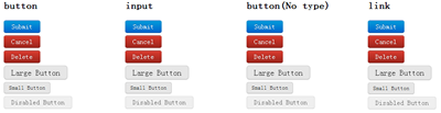
当然大家可以根据自己地需求改变大小,并改变适合自己的色系,也可以在上面的基础上制作出,active,focus等效果。如果大家对buttons的制作感兴趣,大家可以去学习一下G爸的按钮样式,绝对是一流的水平。大家也可以点击pixify.com学习google+的按钮制作,要么你直接这里下载源码自己研究去。
导航——Navigation
导航这一部分涉及的内容太多了,Bootstrap主要讲了"固定的顶栏(Fixed Topbar)","tabs","导航",“分页(Pagination)”,我主要想提两个部分出来和大家一起分享,因为这两个部分较为通用的部分,其中一个是“tabs”的制作,另一个则是“分页(Pagination)”的制作。我们先来看第一个部分。
1、Tabs制作
HTML Markup
				<ul class="tabs">
					<li class="active"><a href="#">Home</a></li>
					<li><a href="#">Profile</a></li>
					<li><a href="#">Messages</a></li>
					<li><a href="#">Settings</a></li>
					<li><a href="#">Contact</a></li>
				</ul>
CSS Code:
				.tabs {
					margin: 0 0 20px;
					padding: 0;
					width: 100%;
					border-bottom: 1px solid #bfbfbf;
				}

				.tabs li {
					display: inline;
				}

				.tabs li a {
					float: left;
					width: auto;
					margin-bottom: -1px;
					margin-right: 2px;
					padding: 0 15px;
					line-height: 35px;
					-webkit-border-radius: 3px 3px 0 0;
					-moz-border-radius: 3px 3px 0 0;
					border-radius: 3px 3px 0 0;
					text-decoration: none;
				}

				.tabs li a:hover {
					background-color: #e6e6e6;
					border-bottom: 1px solid #bfbfbf;
				}

				.tabs li.active a {
					background-color: #fff;
					padding: 0 14px;
					border: 1px solid #ccc;
					border-bottom: 0;
					color: #808080;
				}
2、分页——Pagination
制作分页效果也是我们平时在制作中常见的一种,代码如下:
HTML Markup:
				<div class="pagination">
					<ul>
						<li class="prev"><a href="#">← Previous</a></li>
						<li><a href="#">10</a></li>
						<li><a href="#">11</a></li>
						<li><a href="#">12</a></li>
						<li><a href="#">13</a></li>
						<li><a href="#">14</a></li>
						<li class="active"><a href="#">15</a></li>
						<li><a href="#">16</a></li>
						<li><a href="#">17</a></li>
						<li><a href="#">18</a></li>
						<li><a href="#">19</a></li>
						<li><a href="#">20</a></li>
						<li class="next"><a href="#">Next →</a></li>
					</ul>
				</div>
CSS Code:
				.pagination {
					height: 36px;
					margin: 18px 0;
				}
				.pagination ul {
					float: left;
					margin: 0;
					border: 1px solid #ddd;
					border: 1px solid rgba(0, 0, 0, 0.15);
					-webkit-border-radius: 3px;
					-moz-border-radius: 3px;
					border-radius: 3px;
					-webkit-box-shadow: 0 1px 2px rgba(0, 0, 0, 0.05);
					-moz-box-shadow: 0 1px 2px rgba(0, 0, 0, 0.05);
					box-shadow: 0 1px 2px rgba(0, 0, 0, 0.05);
				}
				.pagination ul li {
					display: inline;
				}
				.pagination ul li a {
					float: left;
					padding: 0 14px;
					line-height: 34px;
					border-right: 1px solid;
					border-right-color: #ddd;
					border-right-color: rgba(0, 0, 0, 0.15);
					*border-right-color: #ddd;
					/* IE6-7 */

					text-decoration: none;
				}
				.pagination ul li a:hover,
				.pagination ul li.active a {
					background-color: #c7eefe;
				}
				.pagination ul li.disabled a,
				.pagination ul li.disabled a:hover {
					background-color: none;
					color: #bfbfbf;
				}
				.pagination ul li.next a {
					border: 0;
				}
效果:

警告和信息——Alerts and Errors
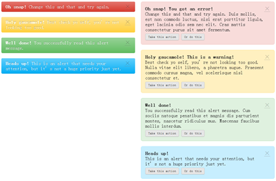
这一块是主要针对操作的信息提示样式的设置,如“success”,“warning”,“error”,“alert”等等。
1、基本警告信息条(Basic alerts)
				<div class="alertMessage error">
					<a href="#" class="close">×</a>
					<p><strong>Oh snap!</strong> Change this and that and try again.</p>
				</div>
				<div class="alertMessage warning">
					<a href="#" class="close">×</a>
					<p><strong>Holy gaucamole!</strong> Best check yo self, you’re not looking too good.</p>
				</div>
				<div class="alertMessage success">
					<a href="#" class="close">×</a>
					<p><strong>Well done!</strong> You successfully read this alert message.</p>
				</div>
				<div class="alertMessage info">
					<a href="#" class="close">×</a>
					<p><strong>Heads up!</strong> This is an alert that needs your attention, but it’s not a huge priority just yet.</p>
				</div>
CSS Code:
				.alertMessage {
					background-color: rgba(0, 0, 0, 0.15);
					background-repeat: repeat-x;
					background-image: -khtml-gradient(linear, left top, left bottom, from(transparent), to(rgba(0, 0, 0, 0.15)));
					background-image: -moz-linear-gradient(transparent, rgba(0, 0, 0, 0.15));
					background-image: -ms-linear-gradient(transparent, rgba(0, 0, 0, 0.15));
					background-image: -webkit-gradient(linear, left top, left bottom, color-stop(0%, transparent), color-stop(100%, rgba(0, 0, 0, 0.15)));
					background-image: -webkit-linear-gradient(transparent, rgba(0, 0, 0, 0.15));
					background-image: -o-linear-gradient(transparent, rgba(0, 0, 0, 0.15));
					background-image: linear-gradient(transparent, rgba(0, 0, 0, 0.15));
					-ms-filter: "progid:DXImageTransform.Microsoft.gradient(startColorstr='#00000000', endColorstr='#15000000')";
					filter: "progid:DXImageTransform.Microsoft.gradient(startColorstr='#00000000', endColorstr='#15000000')";
					background-color: #e6e6e6;
					margin-bottom: 18px;
					padding: 8px 15px;
					color: #fff;
					text-shadow: 0 -1px 0 rgba(0, 0, 0, 0.3);
					border-bottom: 1px solid rgba(0, 0, 0, 0.3);
					-webkit-border-radius: 4px;
					-moz-border-radius: 4px;
					border-radius: 4px;
				}
				.alertMessage p {
					color: #fff;
					margin-bottom: 0;
				}
				.alertMessage p + p {
					margin-top: 5px;
				}
				.alertMessage.error {
					background-color: #d83a2e;
					background-repeat: repeat-x;
					background-image: -khtml-gradient(linear, left top, left bottom, from(#e4776f), to(#d83a2e));
					background-image: -moz-linear-gradient(#e4776f, #d83a2e);
					background-image: -ms-linear-gradient(#e4776f, #d83a2e);
					background-image: -webkit-gradient(linear, left top, left bottom, color-stop(0%, #e4776f), color-stop(100%, #d83a2e));
					background-image: -webkit-linear-gradient(#e4776f, #d83a2e);
					background-image: -o-linear-gradient(#e4776f, #d83a2e);
					background-image: linear-gradient(#e4776f, #d83a2e);
					border-bottom-color: #b32b21;
				}
				.alertMessage.warning {
					background-color: #ffd040;
					background-repeat: repeat-x;
					background-image: -khtml-gradient(linear, left top, left bottom, from(#ffe38d), to(#ffd040));
					background-image: -moz-linear-gradient(#ffe38d, #ffd040);
					background-image: -ms-linear-gradient(#ffe38d, #ffd040);
					background-image: -webkit-gradient(linear, left top, left bottom, color-stop(0%, #ffe38d), color-stop(100%, #ffd040));
					background-image: -webkit-linear-gradient(#ffe38d, #ffd040);
					background-image: -o-linear-gradient(#ffe38d, #ffd040);
					background-image: linear-gradient(#ffe38d, #ffd040);
					border-bottom-color: #ffc40d;
				}
				.alertMessage.success {
					background-color: #62bc62;
					background-repeat: repeat-x;
					background-image: -khtml-gradient(linear, left top, left bottom, from(#97d397), to(#62bc62));
					background-image: -moz-linear-gradient(#97d397, #62bc62);
					background-image: -ms-linear-gradient(#97d397, #62bc62);
					background-image: -webkit-gradient(linear, left top, left bottom, color-stop(0%, #97d397), color-stop(100%, #62bc62));
					background-image: -webkit-linear-gradient(#97d397, #62bc62);
					background-image: -o-linear-gradient(#97d397, #62bc62);
					background-image: linear-gradient(#97d397, #62bc62);
					border-bottom-color: #46a546;
				}
				.alertMessage.info {
					background-color: #04aef4;
					background-repeat: repeat-x;
					background-image: -khtml-gradient(linear, left top, left bottom, from(#62cffc), to(#04aef4));
					background-image: -moz-linear-gradient(#62cffc, #04aef4);
					background-image: -ms-linear-gradient(#62cffc, #04aef4);
					background-image: -webkit-gradient(linear, left top, left bottom, color-stop(0%, #62cffc), color-stop(100%, #04aef4));
					background-image: -webkit-linear-gradient(#62cffc, #04aef4);
					background-image: -o-linear-gradient(#62cffc, #04aef4);
					background-image: linear-gradient(#62cffc, #04aef4);
					border-bottom-color: #049cdb;
				}
				.alertMessage .close {
					float: right;
					margin-top: -2px;
					color: #000;
					font-size: 20px;
					font-weight: bold;
					text-shadow: 0 1px 0 #ffffff;
					filter: alpha(opacity=20);
					-khtml-opacity: 0.2;
					-moz-opacity: 0.2;
					opacity: 0.2;
				}
				 .alertMessage .close:hover {
					text-decoration: none;
					filter: alpha(opacity=40);
					-khtml-opacity: 0.4;
					-moz-opacity: 0.4;
					opacity: 0.4;
				}
接下来我们在上面的基础上制作一批块状信息条:
HTML Code:
				<div class="alertMessage blockMessage error">
					<a href="#" class="close">×</a>
					<p><strong>Oh snap! You got an error!</strong> Change this and that and try again. Duis mollis, est non commodo luctus, nisi erat porttitor ligula, eget lacinia odio sem nec elit. Cras mattis consectetur purus sit amet fermentum.</p>
					<p><a href="#" class="btn small">Take this action</a> <a href="#" class="btn small">Or do this</a></p>
				</div>
				<div class="alertMessage blockMessage warning">
					<a href="#" class="close">×</a>
					<p><strong>Holy gaucamole! This is a warning!</strong> Best check yo self, you’re not looking too good. Nulla vitae elit libero, a pharetra augue. Praesent commodo cursus magna, vel scelerisque nisl consectetur et.</p>
					<p><a href="#" class="btn small">Take this action</a> <a href="#" class="btn small">Or do this</a></p>
				</div>
				<div class="alertMessage blockMessage success">
					<a href="#" class="close">×</a>
					<p><strong>Well done!</strong> You successfully read this alert message. Cum sociis natoque penatibus et magnis dis parturient montes, nascetur ridiculus mus. Maecenas faucibus mollis interdum.</p>
					<p><a href="#" class="btn small">Take this action</a> <a href="#" class="btn small">Or do this</a></p>
				</div>
				<div class="alertMessage blockMessage info">
					<a href="#" class="close">×</a>
					<p><strong>Heads up!</strong> This is an alert that needs your attention, but it’s not a huge priority just yet.</p>
					<p><a href="#" class="btn small">Take this action</a> <a href="#" class="btn small">Or do this</a></p>
				</div>
CSS Code:
				.blockMessage {
					margin-bottom: 18px;
					padding: 14px;
					color: #404040;
					color: rgba(0, 0, 0, 0.8);
					*color: #404040;  /* IE 6-7 */
					text-shadow: 0 1px 0 rgba(255, 255, 255, 0.25);
					-webkit-border-radius: 6px;
					-moz-border-radius: 6px;
					border-radius: 6px;
				}
				.blockMessage p {
					color: #404040;
					color: rgba(0, 0, 0, 0.8);
					*color: #404040; /* IE 6-7 */
					margin-right: 30px;
					margin-bottom: 0;
				}
				.blockMessage ul {
					margin-bottom: 0;
				}
				.blockMessage strong {
					display: block;
				}
				.blockMessage.error {
					background: #f8dcda;
					border: 1px solid #f4c8c5;
				}
				.blockMessage.warning {
					background: #fff0c0;
					border: 1px solid #ffe38d;
				}
				.blockMessage.success {
					background: #dff1df;
					border: 1px solid #bbe2bb;
				}
				.blockMessage.info {
					background: #c7eefe;
					border: 1px solid #ade6fe;
				}
效果:
上面这几部分内容是我们平时在Web页面制作中最常见的几部分,我把相关的代码从BootStrap拆分出来,有些并做了小小的修改,仅供参考。其实Bootstrap中不仅这几个部分,他还包含了“Popovers”和“LessCss”等,因为“Popovers”部分大家感兴趣的话可以从下截下来的源码中学习一下,有关于LessCSS部分,我将在后面专会花一节内容来介绍这个LessCSS。
本文大部分内容来自于Bootstrap, from Twitter。如果你对本文的内容感兴趣或者想了解更多有关于这方面的内容可以点击这里,或者像我一样直接从Bootstrap on GitHub »把他的源码整下来学习,因为这个都是开源的。
人个提议,大家要是有空可以结合前面《OOCSS——概念篇》和《OOCSS——核心篇》以及小鱼大侠在WebReBuild 2011第五届年会讲的《WebRebuild 分享: 支付宝CSS样式架构》,如果你功底在深一点,加上Mark Otto(马克奥托)写的《Bootstrap.less》,去制作一份你自己的CSS框架,这样是不是也很NB的呀。扯了一大堆,希望对大家有所帮助。
如需转载类请注明出处:W3CPLUS


