

Jquery和CSS3打造靓丽的动画进度条
作者:大漠 日期:2011-04-15 点击:1068

今天在做项目中碰到一个需要用制作一个动画的进度条,一开始搞不清楚是怎么一回事,后在google中搜索了css progress bar,真的太多这样的资料,后随便弄了一个。今天贴出来与大家分享。跟我一起走吧>>>>。
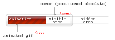
CSS Globe为我们提供了一种简易实现动画进度条的方法。只需要3个元素,1个内容块和2个内嵌元素即可实现一个漂亮的动态进度条效果。只是需要注意的 是,这个效果是比较漂亮,但并能实现实时载入。而是在页面首次载入的时候,会根据你的设置,以Gif动画的形式显示进度条的载入。也就是说,可以用来美 观,但不具有交互作用。如下图所示:
知道其实现原理,那我们就来看看几个实例的实现过程,上面也说了,我们做这个进度条只需要三个元素标签,现面我们先把HTML和CSS写入进来,然后分别介绍几个JS调用的方法:
HTML代码:
<div class="ui-progress-bar ui-container" id="progress_bar">
  <div  class="ui-progress">
    <span  class="ui-label">Done</span>
    </div>
</div>
CSS3 代码:
@-webkit-keyframes animate-stripes {
from {
background-position: 0 0;
}
to {
background-position: 44px 0;
}
}
.ui-progress-bar {
    position: relative;
    height: 15px;
    padding-right: 2px;
    background-color: #abb2bc;
    border-radius: 35px;
    -moz-border-radius: 35px;
    -webkit-border-radius: 35px;
    background: -webkit-gradient(linear, left bottom, left top, color-stop(0, #b6bcc6), color-stop(1, #9da5b0));
    background: -moz-linear-gradient(#9da5b0 0%, #b6bcc6 100%);
    -webkit-box-shadow: inset 0px 1px 2px 0px rgba(0, 0, 0, 0.5), 0px 1px 0px 0px #FFF;
    -moz-box-shadow: inset 0px 1px 2px 0px rgba(0, 0, 0, 0.5), 0px 1px 0px 0px #FFF;
    box-shadow: inset 0px 1px 2px 0px rgba(0, 0, 0, 0.5), 0px 1px 0px 0px #FFF;
    width: 200px;
    margin: 50px auto;
}
.ui-progress {
    position: relative;
    display: block;
    overflow: hidden;
    height: 13px;
    -moz-border-radius: 35px;
    -webkit-border-radius: 35px;
    border-radius: 35px;
    -webkit-background-size: 44px 44px;
    background-color: #74d04c;
    background: -webkit-gradient(linear, 0 0, 44 44,
    color-stop(0.00, rgba(255,255,255,0.17)),
    color-stop(0.25, rgba(255,255,255,0.17)),
    color-stop(0.26, rgba(255,255,255,0)),
    color-stop(0.50, rgba(255,255,255,0)),
    color-stop(0.51, rgba(255,255,255,0.17)),
    color-stop(0.75, rgba(255,255,255,0.17)),
    color-stop(0.76, rgba(255,255,255,0)),
    color-stop(1.00, rgba(255,255,255,0))
    ), -webkit-gradient(linear, left bottom, left top, color-stop(0, #74d04c), color-stop(1, #9bdd62));
    background: -moz-repeating-linear-gradient(top left -30deg,
    rgba(255,255,255,0.17),
    rgba(255,255,255,0.17) 15px,
    rgba(255,255,255,0) 15px,
    rgba(255,255,255,0) 30px
    ), -moz-linear-gradient(#710300 0%, #0073BA 100%);
    -webkit-box-shadow: inset 0px 1px 0px 0px #dbf383, inset 0px -1px 1px #58c43a;
    -moz-box-shadow: inset 0px 1px 0px 0px #dbf383, inset 0px -1px 1px #58c43a;
    box-shadow: inset 0px 1px 0px 0px #dbf383, inset 0px -1px 1px #58c43a;
    border: 1px solid #4c8932;
    -webkit-animation: animate-stripes 2s linear infinite;
}
.ui-progress span.ui-label {
    font-size: 1.0em;
    position: absolute;
    right: 0;
    line-height: 13px;
    padding-right: 12px;
    color: rgba(0,0,0,0.6);
    text-shadow: rgba(255,255,255, 0.45) 0 1px 0px;
    white-space: nowrap;
}
我们现在先来看看经过css3修饰后的效果:

下面我们就需要关键的一步了,如何实现其动画效果。我们先调用需要的jquery版本库
<script type="text/javascript" src="js/jquery.min.js"></script>
第一种方法:
我们在页面中加入以入JQ:
(function( $ ){
  $.fn.animateProgress = function(progress, callback) {
    return this.each(function() {
      $(this).animate({
        width: progress+'%'
      }, {
        duration: 2000,

        // swing or linear
        easing: 'swing',

        // this gets called every step of the animation, and updates the label
        step: function( progress ){
          var labelEl = $('.ui-label', this),
          valueEl = $('.value', labelEl);


          if (Math.ceil(progress) < 20 && $('.ui-label', this).is(":visible")) {
            labelEl.hide();
          }else{
          if (labelEl.is(":hidden")) {
            labelEl.fadeIn();
           };
         }


        if (Math.ceil(progress) == 100) {
            labelEl.text('Done');
            setTimeout(function() {
             labelEl.fadeOut();
            }, 1000);
          }else{
           valueEl.text(Math.ceil(progress) + '%');
         }
        },
        complete: function(scope, i, elem) {
          if (callback) {
          callback.call(this, i, elem );
          };
        }
      });
    });
  };
})( jQuery );


$(function() {
  // Hide the label at start
  $('#progress_bar .ui-progress .ui-label').hide();
  // Set initial value
  $('#progress_bar .ui-progress').css('width', '7%');


  // Simulate some progress
  $('#progress_bar .ui-progress').animateProgress(43, function() {
  $(this).animateProgress(79, function() {
      setTimeout(function() {
      $('#progress_bar .ui-progress').animateProgress(100, function() {
      $('#main_content').slideDown();
      $('#fork_me').fadeIn();
     });
    }, 2000);
  });
 });
});
现在可以到浏览器看看我们的动画效果了

第二种方法:
首先我们HTML不变,为了效果更好看一点,我们把CSS换成:
.ui-progress-bar{
  width:200px;
  height:13px;
  background:red;
  position:relative;
  border: 1px solid #ccc;
  padding: 1px;

}

.ui-progress {
  position:absolute;
  width:200px;
  height:13px;
  background:blue;
  top:1px;
  left:1px;
  text-align:left;
  vertical-align:middle;
  line-height:13px;
  overflow:hidden;
  color:#fff;
}

.ui-label{
  position:absolute;
  display:block;
  background:green;
  width:200px;
  height:25px;
  left:0%;
  z-index:1000;
  top:0px;
}
然后加上JQ代码:
<script type="text/javascript">
    $(document).ready(function(){
      var bar = document.getElementsByTagName("span")[0];
      for(var i=0;i<=100;i++){
       (function(){
          var pos=i;
          setTimeout(function(){
            bar.style.left =pos+"%";
            bar.parentNode.firstChild.nodeValue = pos+"%";
          },pos*50)
        })()
      }
});

</script>
第三种:
这种方法我们还更简单一点,只面要两个标签,当然我们在前面的基础上不变,只是把相应的CSS换一下:
@-webkit-keyframes animate-stripes {
from {
  background-position: 0 0;
}
to {
  background-position: 44px 0;
}
}
.ui-progress {
    position: relative;
    height: 15px;
    padding-right: 2px;
    background-color: #abb2bc;
    border-radius: 35px;
    -moz-border-radius: 35px;
    -webkit-border-radius: 35px;
    background: -webkit-gradient(linear, left bottom, left top, color-stop(0, #b6bcc6), color-stop(1, #9da5b0));
    background: -moz-linear-gradient(#9da5b0 0%, #b6bcc6 100%);
    -webkit-box-shadow: inset 0px 1px 2px 0px rgba(0, 0, 0, 0.5), 0px 1px 0px 0px #FFF;
    -moz-box-shadow: inset 0px 1px 2px 0px rgba(0, 0, 0, 0.5), 0px 1px 0px 0px #FFF;
    box-shadow: inset 0px 1px 2px 0px rgba(0, 0, 0, 0.5), 0px 1px 0px 0px #FFF;
    width: 200px;
    margin: 50px auto;
}
.ui-progress span.ui-label{
    position: relative;
    display: block;
    overflow: hidden;
    height: 13px;
    -moz-border-radius: 35px;
    -webkit-border-radius: 35px;
    border-radius: 35px;
    -webkit-background-size: 44px 44px;
    background-color: #74d04c;
    background: -webkit-gradient(linear, 0 0, 44 44,
    color-stop(0.00, rgba(255,255,255,0.17)),
    color-stop(0.25, rgba(255,255,255,0.17)),
    color-stop(0.26, rgba(255,255,255,0)),
    color-stop(0.50, rgba(255,255,255,0)),
    color-stop(0.51, rgba(255,255,255,0.17)),
    color-stop(0.75, rgba(255,255,255,0.17)),
    color-stop(0.76, rgba(255,255,255,0)),
    color-stop(1.00, rgba(255,255,255,0))
    ), -webkit-gradient(linear, left bottom, left top, color-stop(0, #74d04c), color-stop(1, #9bdd62));
    background: -moz-repeating-linear-gradient(top left -30deg,
    rgba(255,255,255,0.17),
    rgba(255,255,255,0.17) 15px,
    rgba(255,255,255,0) 15px,
    rgba(255,255,255,0) 30px
    ), -moz-linear-gradient(#710300 0%, #0073BA 100%);
    -webkit-box-shadow: inset 0px 1px 0px 0px #dbf383, inset 0px -1px 1px #58c43a;
    -moz-box-shadow: inset 0px 1px 0px 0px #dbf383, inset 0px -1px 1px #58c43a;
    box-shadow: inset 0px 1px 0px 0px #dbf383, inset 0px -1px 1px #58c43a;
    border: 1px solid #4c8932;
    -webkit-animation: animate-stripes 2s linear infinite;
}
现在我们加上不同的JQ:
<script type="text/javascript">
    var progress_node_id = "ui-progress";
    function SetProgress(progress) {
      if (progress) {
        $("." + progress_node_id + " > span").css("width", String(progress) + "%");
        $("." + progress_node_id + " > span").html(String(progress) + "%");
      }
    }
  var i = 0;
  function doProgress() {
    if (i > 100) {
      return;
    }
    if (i <= 100) {
      setTimeout("doProgress()", 500);
      SetProgress(i);
                i++;
        }
  }
$(document).ready(function() {
  doProgress();
});
这样一来就能看到效果了。怎么不难吧!感兴趣的朋友一起吧,希望这篇博文能帮助像我这样的初学者。
如需转载请注明出处:W3CPLUS


