

CSS3伪元素应用——CSS3 Button
作者:大漠 日期:2012-03-20 点击:2568

有关于CSS3制作buttons,本站前面介绍了多个案例:
当然,除了上面的制作方法以外网上还有大把的制作方法,比如说webdesignshock.com整理了一个《CSS and CSS3 buttons, 110 best sets !》一文中,搜集了各式各样的“Button”制作方法。不过众多方法中,我个人认为有几个教程介绍的是相当不错的,首推Pixify.com介绍Google+的“button”制作方法——《Use Gootle to Improve Your Ui》一文,另外还有一篇文章——《Google+ Styled Buttons》,在此基础上进行了扩展,使其更具简单化。其次是BootStrap写的Buttons也是相当的靓丽。同时BonBob写的《3D Buttons》和Martin Angelov 写的《动画buttons》也是相当有典型性。
既然有这么多种按例了,还写Buttons的制作不是在浪费时间吗?说真的是有点,不过今天逛Blog发现Sergio Camalich用伪类写的Buttons相当的漂亮:
仔细学习了一回,现将相关实现的代码贴上来与大家分享。(^_^)自力更生才能丰衣足食嘛。废话就不多说了,一直来看代码吧:
HTML Markup
下面DEMO用到的HTML结构相当的简单,就是一个链接标签:
<a href="#" class="btn btn_demo1">Click me!</a>
CSS Code
这里先写一下下面DEMO中Buttons共用的一些样式:
			/*btn*/
			.btn {
				background-color:#3bb3e0;
				padding:10px;
				position:relative;
				font-family: 'Open Sans', sans-serif;
				font-size:12px;
				text-decoration:none;
				color:#fff;
				border: solid 1px #186f8f;
				background-image: linear-gradient(bottom, rgb(44,160,202) 0%, rgb(62,184,229) 100%);
				background-image: -o-linear-gradient(bottom, rgb(44,160,202) 0%, rgb(62,184,229) 100%);
				background-image: -moz-linear-gradient(bottom, rgb(44,160,202) 0%, rgb(62,184,229) 100%);
				background-image: -webkit-linear-gradient(bottom, rgb(44,160,202) 0%, rgb(62,184,229) 100%);
				background-image: -ms-linear-gradient(bottom, rgb(44,160,202) 0%, rgb(62,184,229) 100%);
				background-image: -webkit-gradient(linear,left bottom,left top,color-stop(0, rgb(44,160,202)),color-stop(1, rgb(62,184,229)));
				-webkit-box-shadow: inset 0px 1px 0px #7fd2f1, 0px 1px 0px #fff;
				-moz-box-shadow: inset 0px 1px 0px #7fd2f1, 0px 1px 0px #fff;
				box-shadow: inset 0px 1px 0px #7fd2f1, 0px 1px 0px #fff;
				-webkit-border-radius: 5px;
				-moz-border-radius: 5px;
				-o-border-radius: 5px;
				border-radius: 5px;
			}
DEMO一

我在上图简单的标明了一下,其中buttons底下的灰色,主要使用了“::before”来实现的,然后在“buttons”按下时增加了一个效果,具体看代码吧:
			.btn_demo1::before {
				background-color:#ccd0d5;
				content:"";
				display:block;
				position:absolute;
				width:100%;
				height:100%;
				padding:8px;
				left:-8px;
				top:-8px;
				z-index:-1;
				-webkit-border-radius: 5px;
				-moz-border-radius: 5px;
				-o-border-radius: 5px;
				border-radius: 5px;
				-webkit-box-shadow: inset 0px 1px 1px #909193, 0px 1px 0px #fff;
				-moz-box-shadow: inset 0px 1px 1px #909193, 0px 1px 0px #fff;
				-o-box-shadow: inset 0px 1px 1px #909193, 0px 1px 0px #fff;
				box-shadow: inset 0px 1px 1px #909193, 0px 1px 0px #fff;
			}

			.btn_demo1:active {
				padding-bottom:9px;
				padding-left:10px;
				padding-right:10px;
				padding-top:11px;
				top:1px;
				background-image: linear-gradient(bottom, rgb(62,184,229) 0%, rgb(44,160,202) 100%);
				background-image: -o-linear-gradient(bottom, rgb(62,184,229) 0%, rgb(44,160,202) 100%);
				background-image: -moz-linear-gradient(bottom, rgb(62,184,229) 0%, rgb(44,160,202) 100%);
				background-image: -webkit-linear-gradient(bottom, rgb(62,184,229) 0%, rgb(44,160,202) 100%);
				background-image: -ms-linear-gradient(bottom, rgb(62,184,229) 0%, rgb(44,160,202) 100%);
				background-image: -webkit-gradient(
				linear,
				left bottom,
				left top,
				color-stop(0, rgb(62,184,229)),
				color-stop(1, rgb(44,160,202))
				);
			}
DEMO二
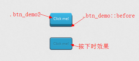
这个DEMO制作的是一个“3D Button”的效果,但和BonBob写的3D Buttons效果还是有点不同的,大家要是感兴趣的可以拿上他们做个对比:
			/*demo2*/
			.btn_demo2 {
				border: none;
				background-image: linear-gradient(bottom, rgb(44,160,202) 0%, rgb(62,184,229) 100%);
				background-image: -o-linear-gradient(bottom, rgb(44,160,202) 0%, rgb(62,184,229) 100%);
				background-image: -moz-linear-gradient(bottom, rgb(44,160,202) 0%, rgb(62,184,229) 100%);
				background-image: -webkit-linear-gradient(bottom, rgb(44,160,202) 0%, rgb(62,184,229) 100%);
				background-image: -ms-linear-gradient(bottom, rgb(44,160,202) 0%, rgb(62,184,229) 100%);
				background-image: -webkit-gradient(linear,left bottom,left top,color-stop(0, rgb(44,160,202)),color-stop(1, rgb(62,184,229)));
				-webkit-box-shadow: inset 0px 1px 0px #7fd2f1, 0px 6px 0px #156785;
				-moz-box-shadow: inset 0px 1px 0px #7fd2f1, 0px 6px 0px #156785;
				-o-box-shadow: inset 0px 1px 0px #7fd2f1, 0px 6px 0px #156785;
				box-shadow: inset 0px 1px 0px #7fd2f1, 0px 6px 0px #156785;
			}
			.btn_demo2::before {
				background-color:#072239;
				content:"";
				display:block;
				position:absolute;
				width:100%;
				height:100%;
				padding-left:2px;
				padding-right:2px;
				padding-bottom:4px;
				left:-2px;
				top:5px;
				z-index:-1;
				-webkit-border-radius: 6px;
				-moz-border-radius: 6px;
				-o-border-radius: 6px;
				border-radius: 6px;
				-webkit-box-shadow: 0px 1px 0px #fff;
				-moz-box-shadow: 0px 1px 0px #fff;
				-o-box-shadow: 0px 1px 0px #fff;
				box-shadow: 0px 1px 0px #fff;
			}

			.btn_demo2:active {
				color:#156785;
				text-shadow: 0px 1px 1px rgba(255,255,255,0.3);
				background:rgb(44,160,202);
				-webkit-box-shadow: inset 0px 1px 0px #7fd2f1, inset 0px -1px 0px #156785;
				-moz-box-shadow: inset 0px 1px 0px #7fd2f1, inset 0px -1px 0px #156785;
				-o-box-shadow: inset 0px 1px 0px #7fd2f1, inset 0px -1px 0px #156785;
				box-shadow: inset 0px 1px 0px #7fd2f1, inset 0px -1px 0px #156785;
				top:7px;
			}

			.btn_demo2:active::before {
				top:-2px;
			}
DEMO3

这种效果是相当的牛,让我再次体会到CSS3的强大。使用一个“::before”居能实现“button”的分裂效果,真是不可想像,这真是应了那句老话“没有做不到的,只有想不到的”。不扯别的了,直接看代码:
			/*demo3*/
			.btn_demo3 {
				padding:10px 20px;
				border: none;
				border-left:solid 1px #2ab7ec;
				margin-left:35px;
				background-image: linear-gradient(bottom, rgb(44,160,202) 0%, rgb(62,184,229) 100%);
				background-image: -o-linear-gradient(bottom, rgb(44,160,202) 0%, rgb(62,184,229) 100%);
				background-image: -moz-linear-gradient(bottom, rgb(44,160,202) 0%, rgb(62,184,229) 100%);
				background-image: -webkit-linear-gradient(bottom, rgb(44,160,202) 0%, rgb(62,184,229) 100%);
				background-image: -ms-linear-gradient(bottom, rgb(44,160,202) 0%, rgb(62,184,229) 100%);
				background-image: -webkit-gradient(linear,left bottom,left top,	color-stop(0, rgb(44,160,202)),	color-stop(1, rgb(62,184,229)));
				-moz-border-radius: 0 5px 5px 0;
				-webkit-border-radius: 0 5px 5px 0;
				border-radius: 0 5px 5px 0;
				-webkit-box-shadow: inset 0px 1px 0px #2ab7ec, 0px 5px 0px 0px #156785, 0px 10px 5px #999;
				-moz-box-shadow: inset 0px 1px 0px #2ab7ec, 0px 5px 0px 0px #156785, 0px 10px 5px #999;
				-o-box-shadow: inset 0px 1px 0px #2ab7ec, 0px 5px 0px 0px #156785, 0px 10px 5px #999;
				box-shadow: inset 0px 1px 0px #2ab7ec, 0px 5px 0px 0px #156785, 0px 10px 5px #999;
			}

			.btn_demo3:active {
				top:3px;
				background-image: linear-gradient(bottom, rgb(62,184,229) 0%, rgb(44,160,202) 100%);
				background-image: -o-linear-gradient(bottom, rgb(62,184,229) 0%, rgb(44,160,202) 100%);
				background-image: -moz-linear-gradient(bottom, rgb(62,184,229) 0%, rgb(44,160,202) 100%);
				background-image: -webkit-linear-gradient(bottom, rgb(62,184,229) 0%, rgb(44,160,202) 100%);
				background-image: -ms-linear-gradient(bottom, rgb(62,184,229) 0%, rgb(44,160,202) 100%);
				background-image: -webkit-gradient(linear,left bottom,left top,color-stop(0, rgb(62,184,229)),color-stop(1, rgb(44,160,202)));
				-webkit-box-shadow: inset 0px 1px 0px #2ab7ec, 0px 2px 0px 0px #156785, 0px 5px 3px #999;
				-moz-box-shadow: inset 0px 1px 0px #2ab7ec, 0px 2px 0px 0px #156785, 0px 5px 3px #999;
				-o-box-shadow: inset 0px 1px 0px #2ab7ec, 0px 2px 0px 0px #156785, 0px 5px 3px #999;
				box-shadow: inset 0px 1px 0px #2ab7ec, 0px 2px 0px 0px #156785, 0px 5px 3px #999;
			}

			.btn_demo3::before {
				background-color:#2561b4;
				content:"1";
				width:35px;
				max-height:29px;
				height:100%;
				position:absolute;
				display:block;
				padding-top:8px;
				top:0px;
				left:-36px;
				font-size:16px;
				font-weight:bold;
				color:#8fd1ea;
				text-shadow:1px 1px 0px #07526e;
				border-right:solid 1px #07526e;
				background-image: linear-gradient(bottom, rgb(10,94,125) 0%, rgb(14,139,184) 100%);
				background-image: -o-linear-gradient(bottom, rgb(10,94,125) 0%, rgb(14,139,184) 100%);
				background-image: -moz-linear-gradient(bottom, rgb(10,94,125) 0%, rgb(14,139,184) 100%);
				background-image: -webkit-linear-gradient(bottom, rgb(10,94,125) 0%, rgb(14,139,184) 100%);
				background-image: -ms-linear-gradient(bottom, rgb(10,94,125) 0%, rgb(14,139,184) 100%);
				background-image: -webkit-gradient(linear,left bottom,left top,color-stop(0, rgb(10,94,125)),	color-stop(1, rgb(14,139,184)));
				-moz-border-radius: 5px 0 0 5px;
				-webkit-border-radius: 5px 0 0 5px;
				border-radius: 5px 0 0 5px;
				-webkit-box-shadow:inset 0px 1px 0px #2ab7ec, 0px 5px 0px 0px #032b3a, 0px 10px 5px #999 ;
				-moz-box-shadow:inset 0px 1px 0px #2ab7ec, 0px 5px 0px 0px #032b3a, 0px 10px 5px #999 ;
				-o-box-shadow:inset 0px 1px 0px #2ab7ec, 0px 5px 0px 0px #032b3a, 0px 10px 5px #999 ;
				box-shadow:inset 0px 1px 0px #2ab7ec, 0px 5px 0px 0px #032b3a, 0px 10px 5px #999 ;
				text-align: center;
			}

			.btn_demo3:active::before {
				top:-3px;
				-webkit-box-shadow:inset 0px 1px 0px #2ab7ec, 0px 5px 0px 0px #032b3a, 1px 1px 0px 0px #044a64, 2px 2px 0px 0px #044a64, 2px 5px 0px 0px #044a64, 6px 4px 2px #0b698b, 0px 10px 5px #999 ;
				-moz-box-shadow:inset 0px 1px 0px #2ab7ec, 0px 5px 0px 0px #032b3a, 1px 1px 0px 0px #044a64, 2px 2px 0px 0px #044a64, 2px 5px 0px 0px #044a64, 6px 4px 2px #0b698b, 0px 10px 5px #999 ;
				-o-box-shadow:inset 0px 1px 0px #2ab7ec, 0px 5px 0px 0px #032b3a, 1px 1px 0px 0px #044a64, 2px 2px 0px 0px #044a64, 2px 5px 0px 0px #044a64, 6px 4px 2px #0b698b, 0px 10px 5px #999 ;
				box-shadow:inset 0px 1px 0px #2ab7ec, 0px 5px 0px 0px #032b3a, 1px 1px 0px 0px #044a64, 2px 2px 0px 0px #044a64, 2px 5px 0px 0px #044a64, 6px 4px 2px #0b698b, 0px 10px 5px #999 ;
			}

			/*Second button*/

			.second_button::before {
				content:"2";
			}

			/*Third button*/

			.third_button::before {
				content:"3";
			}
DEMO四
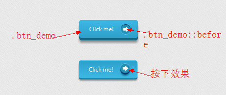
这个效果在“::before”上使用了一个背景图片,当然大家还可以用相应的HTML实体符来代码,比如在《CSS3和HTML实体符制作带图片效果的Buttons》介绍的一样,不过此例使用的是一张背景图,详细的看代码:
		/*DEMO4*/
		.btn_demo4 {
			border: none;
			padding:10px 20px;
			padding-right:50px;
			background-image: linear-gradient(bottom, rgb(44,160,202) 0%, rgb(62,184,229) 100%);
			background-image: -o-linear-gradient(bottom, rgb(44,160,202) 0%, rgb(62,184,229) 100%);
			background-image: -moz-linear-gradient(bottom, rgb(44,160,202) 0%, rgb(62,184,229) 100%);
			background-image: -webkit-linear-gradient(bottom, rgb(44,160,202) 0%, rgb(62,184,229) 100%);
			background-image: -ms-linear-gradient(bottom, rgb(44,160,202) 0%, rgb(62,184,229) 100%);
			background-image: -webkit-gradient(	linear,left bottom,left top,color-stop(0, rgb(44,160,202)),color-stop(1, rgb(62,184,229)));
			-webkit-border-radius: 5px;
			-moz-border-radius: 5px;
			border-radius: 5px;
			-webkit-box-shadow: inset 0px 1px 0px #2ab7ec, 0px 5px 0px 0px #156785, 0px 10px 5px #999;
			-moz-box-shadow: inset 0px 1px 0px #2ab7ec, 0px 5px 0px 0px #156785, 0px 10px 5px #999;
			-o-box-shadow: inset 0px 1px 0px #2ab7ec, 0px 5px 0px 0px #156785, 0px 10px 5px #999;
			box-shadow: inset 0px 1px 0px #2ab7ec, 0px 5px 0px 0px #156785, 0px 10px 5px #999;
		}

		.btn_demo4:active {
			top:3px;
			background-image: linear-gradient(bottom, rgb(62,184,229) 0%, rgb(44,160,202) 100%);
			background-image: -o-linear-gradient(bottom, rgb(62,184,229) 0%, rgb(44,160,202) 100%);
			background-image: -moz-linear-gradient(bottom, rgb(62,184,229) 0%, rgb(44,160,202) 100%);
			background-image: -webkit-linear-gradient(bottom, rgb(62,184,229) 0%, rgb(44,160,202) 100%);
			background-image: -ms-linear-gradient(bottom, rgb(62,184,229) 0%, rgb(44,160,202) 100%);
			background-image: -webkit-gradient(linear,left bottom,left top,color-stop(0, rgb(62,184,229)),color-stop(1, rgb(44,160,202)));
			-webkit-box-shadow: inset 0px 1px 0px #2ab7ec, 0px 2px 0px 0px #156785, 0px 5px 3px #999;
			-moz-box-shadow: inset 0px 1px 0px #2ab7ec, 0px 2px 0px 0px #156785, 0px 5px 3px #999;
			-o-box-shadow: inset 0px 1px 0px #2ab7ec, 0px 2px 0px 0px #156785, 0px 5px 3px #999;
			box-shadow: inset 0px 1px 0px #2ab7ec, 0px 2px 0px 0px #156785, 0px 5px 3px #999;
		}

		.btn_demo4::before {
			background-color:#2591b4;
			background-image:url(images/right_arrow.png);
			background-repeat:no-repeat;
			background-position:center center;
			content:"";
			width:20px;
			height:20px;
			position:absolute;
			right:15px;
			top:50%;
			margin-top:-9px;
			-webkit-border-radius: 50%;
			-moz-border-radius: 50%;
			border-radius: 50%;
			-webkit-box-shadow: inset 0px 1px 0px #052756, 0px 1px 0px #60c9f0;
			-moz-box-shadow: inset 0px 1px 0px #052756, 0px 1px 0px #60c9f0;
			-o-box-shadow: inset 0px 1px 0px #052756, 0px 1px 0px #60c9f0;
			box-shadow: inset 0px 1px 0px #052756, 0px 1px 0px #60c9f0;
		}

		.btn_demo4:active::before {
			top:50%;
			margin-top:-12px;
			-webkit-box-shadow: inset 0px 1px 0px #60c9f0, 0px 3px 0px #0e3871, 0px 6px 3px #1a80a6;
			-moz-box-shadow: inset 0px 1px 0px #60c9f0, 0px 3px 0px #0e3871, 0px 6px 3px #1a80a6;
			-o-box-shadow: inset 0px 1px 0px #60c9f0, 0px 3px 0px #0e3871, 0px 6px 3px #1a80a6;
			box-shadow: inset 0px 1px 0px #60c9f0, 0px 3px 0px #0e3871, 0px 6px 3px #1a80a6;
		}
DEMO五
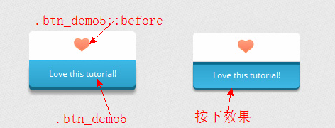
这个效果也使用了一张背景图,大家看代码吧,比我说的更清楚:
			/*DEMO 5*/
			.btn_demo5 {
				display:block;
				border: none;
				width: 240px;
				text-align: center;
				margin-top:40px;
				padding-bottom:10px;
				padding-top:10px;
				background-image: linear-gradient(bottom, rgb(44,160,202) 0%, rgb(62,184,229) 100%);
				background-image: -o-linear-gradient(bottom, rgb(44,160,202) 0%, rgb(62,184,229) 100%);
				background-image: -moz-linear-gradient(bottom, rgb(44,160,202) 0%, rgb(62,184,229) 100%);
				background-image: -webkit-linear-gradient(bottom, rgb(44,160,202) 0%, rgb(62,184,229) 100%);
				background-image: -ms-linear-gradient(bottom, rgb(44,160,202) 0%, rgb(62,184,229) 100%);
				background-image: -webkit-gradient(linear,left bottom,left top,color-stop(0, rgb(44,160,202)),color-stop(1, rgb(62,184,229)));
				-moz-border-radius: 0 0 5px 5px;
				-webkit-border-radius: 0 0 5px 5px;
				border-radius: 0 0 5px 5px;
				-webkit-box-shadow: inset 0px 1px 0px #2ab7ec, 0px 5px 0px 0px #156785, 0px 10px 5px #999;
				-moz-box-shadow: inset 0px 1px 0px #2ab7ec, 0px 5px 0px 0px #156785, 0px 10px 5px #999;
				-o-box-shadow: inset 0px 1px 0px #2ab7ec, 0px 5px 0px 0px #156785, 0px 10px 5px #999;
				box-shadow: inset 0px 1px 0px #2ab7ec, 0px 5px 0px 0px #156785, 0px 10px 5px #999;
			}

			.btn_demo5:active {
				top:0px;
				background-image: linear-gradient(bottom, rgb(62,184,229) 0%, rgb(44,160,202) 100%);
				background-image: -o-linear-gradient(bottom, rgb(62,184,229) 0%, rgb(44,160,202) 100%);
				background-image: -moz-linear-gradient(bottom, rgb(62,184,229) 0%, rgb(44,160,202) 100%);
				background-image: -webkit-linear-gradient(bottom, rgb(62,184,229) 0%, rgb(44,160,202) 100%);
				background-image: -ms-linear-gradient(bottom, rgb(62,184,229) 0%, rgb(44,160,202) 100%);
				background-image: -webkit-gradient(linear,left bottom,left top,color-stop(0, rgb(62,184,229)),color-stop(1, rgb(44,160,202)));
				-webkit-box-shadow: inset 0px 4px 1px #0b698b, 0px 2px 0px 0px #156785, 0px 5px 3px #999;
				-moz-box-shadow: 0px 2px 0px 1px #156785, 0px 5px 3px #999;
				-o-box-shadow: 0px 2px 0px 1px #156785, 0px 5px 3px #999;
				box-shadow: inset 0px 4px 1px #0b698b, 0px 2px 0px 0px #156785, 0px 5px 3px #999;
			}
			.btn_demo5::before {
				background: #fff url(images/heart.gif) no-repeat center;
				content:"";
				height:40px;
				width: 260px;
				position:absolute;
				top:-30px;
				left:0px;
				margin-top:-11px;
				z-index:-1;
				-moz-border-radius: 5px 5px 0 0;
				-webkit-border-radius: 5px 5px 0 0;
				border-radius: 5px 5px 0 0;
			}
			.btn_demo5:active::before {
				top: -30px;
				-webkit-box-shadow: 0px 3px 0px #ccc;
				-moz-box-shadow: 0px 3px 0px #ccc;
				-o-box-shadow: 0px 3px 0px #ccc;
				box-shadow: 0px 3px 0px #ccc;
			}
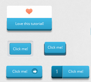
五个DEMO效果都出来了,不知道大家喜欢不喜欢。希望大家也能开动脑筋写写效果。希望能与大家一起分享。
在结束此文时,要非常感谢Sergio Camalich给我们带来这么好的教程《CSS Buttons with Pseudo-elements》。
如需转载烦请注明出处:W3CPLUS


